
Dashboard Design

2023-02
Ride Smart
Design Goal
Layout
Widget
Design System
Visual Design
Design Goal
01
About Project
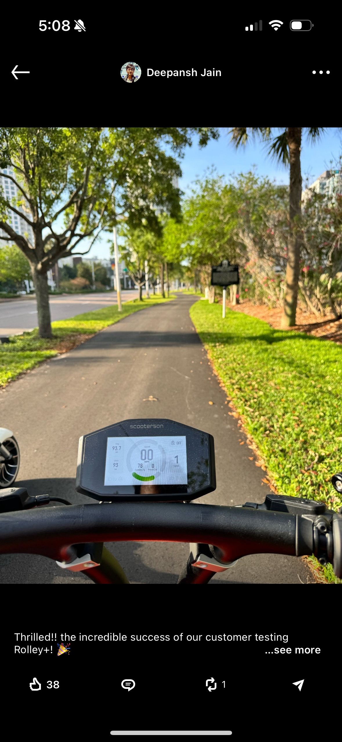
This Instrument Cluster Design is for the scooter- Rolley, manufactured by Scooterson Pte. Ltd.
Design Goal
Reduce Ambiguity
To prevent users erros, any ambiguity should be avoided. As a result, several optimizations are considered, such as reorganising layout basing on information intimacy, enhancing the feedback of users’ action on scooters.
Scenario-centred design
The Scooter Dashboard, as an overview of information, should not distract the rider. As a result, we eliminated as much unnecessary information as possible.
Consistency
The dashboard design is consistent with the scooter’s industrial design and scooterson’s VI.
Layout
02


137.5°
96


480
192


16
64
16
Layout
The dashboard UI is optimised basing on the following principles:
Proximity
The goal of a dashboard is to present information at a glance, so the maximum number of widgets are usually limited to 5-7.According to the principle of Proximity, group and organise the related elements together to make information easily reconginised.
Component Standardization
Use multiplies of 8px to layout , dimensions, padding and margin of elements as possible.
Symmetrical
Adopt a mathematical proportion to please users eyes asethetically.Adopt a symmetrical layout for a balance, harmony visual effect, in consistent with the scooter’s industrial design.
Widgets
03

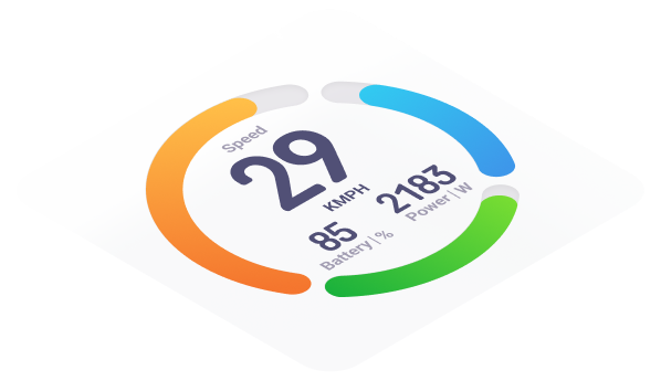
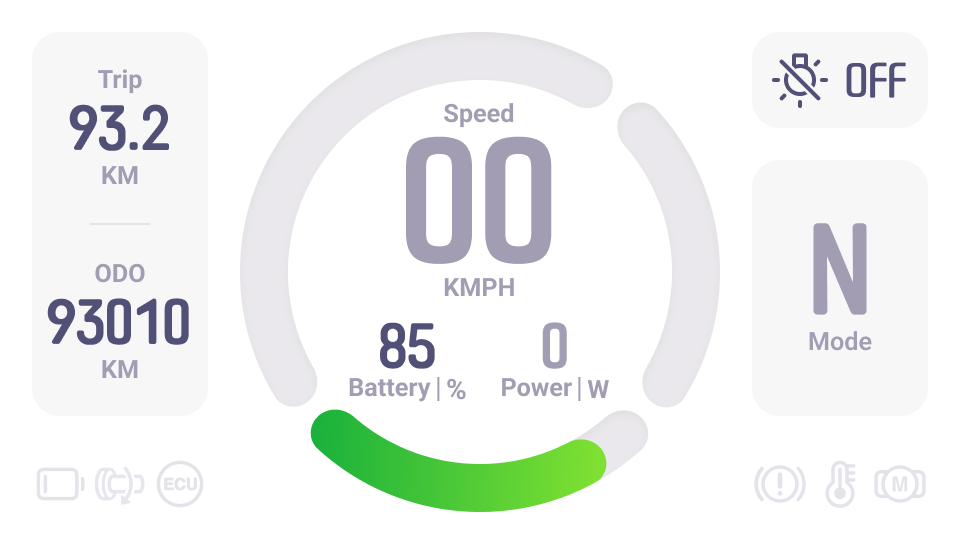
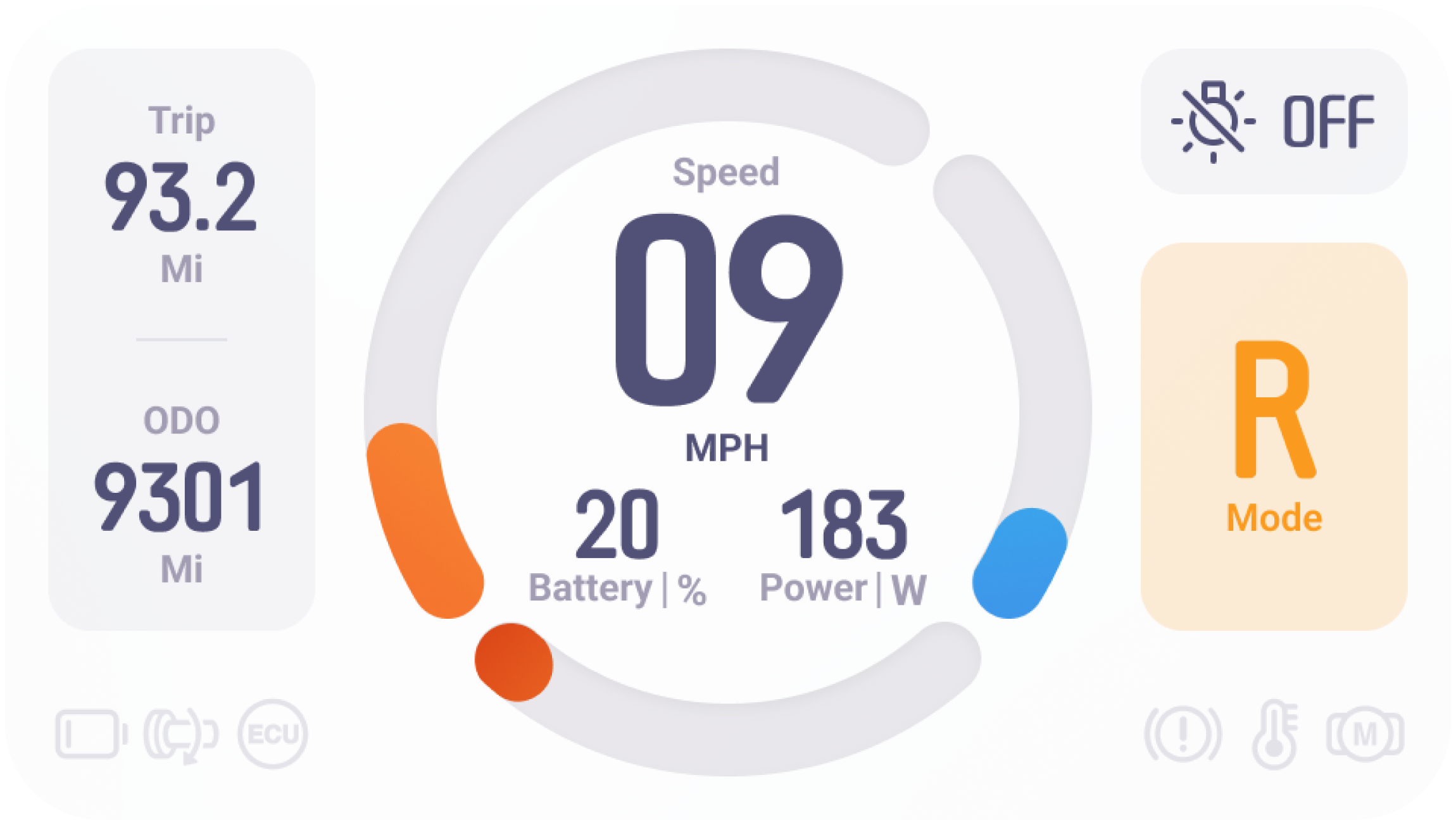
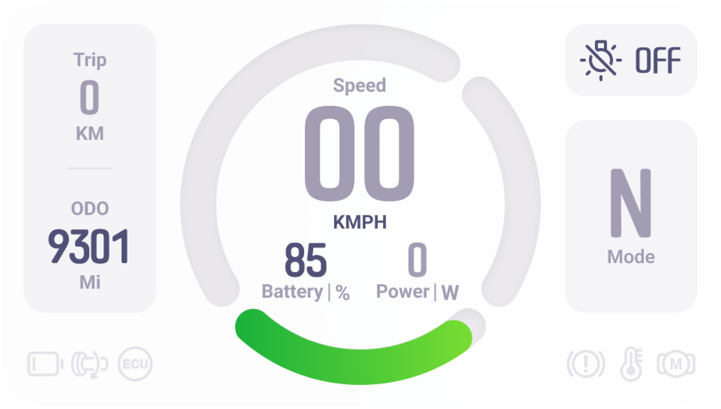
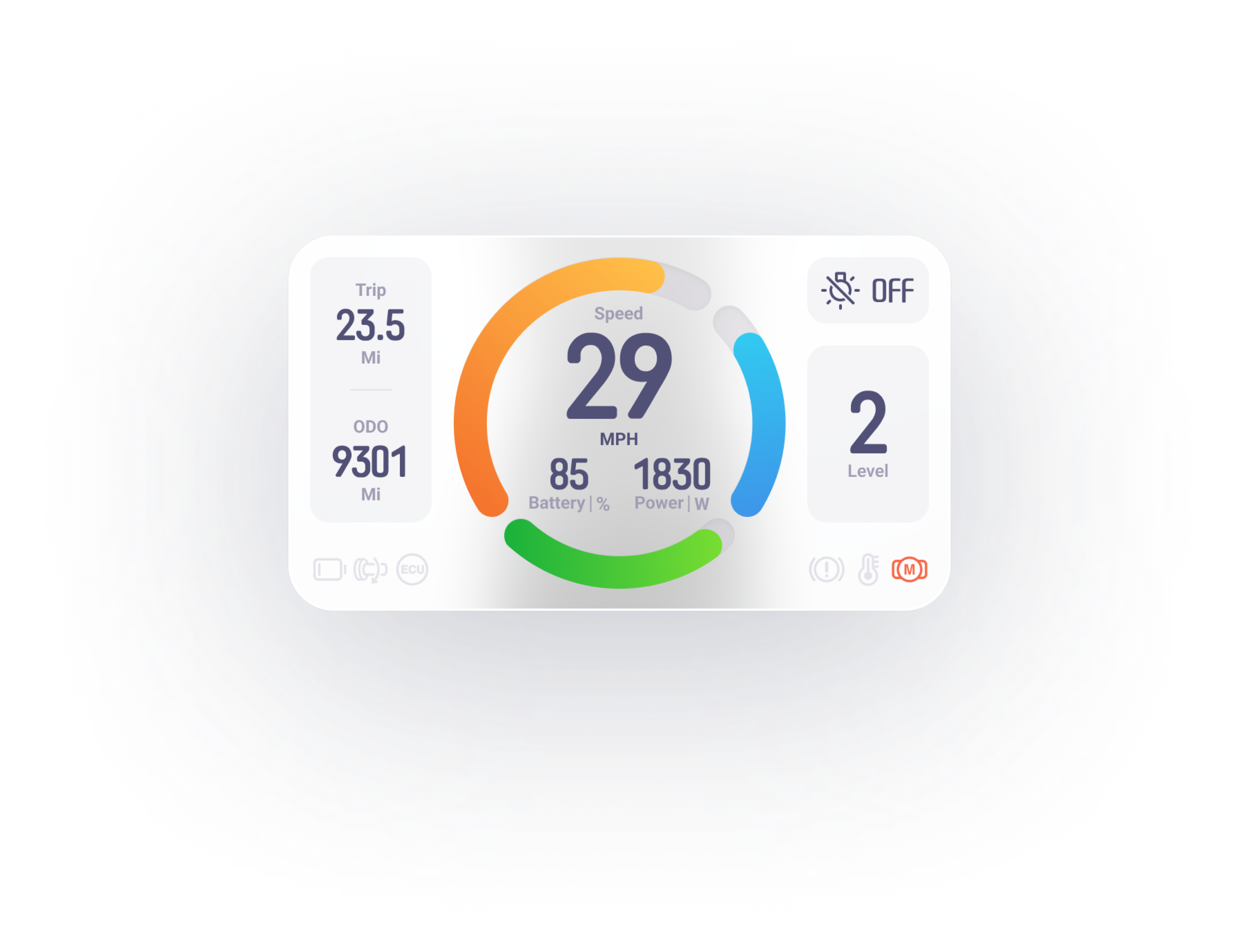
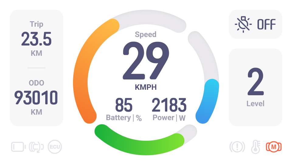
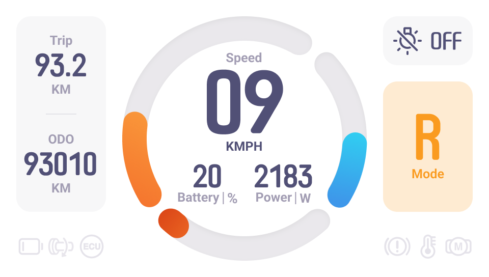
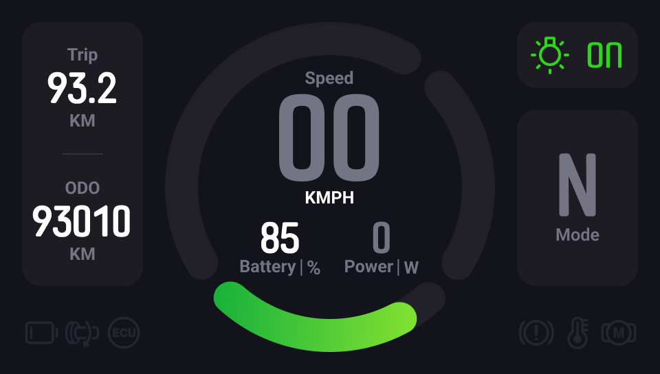
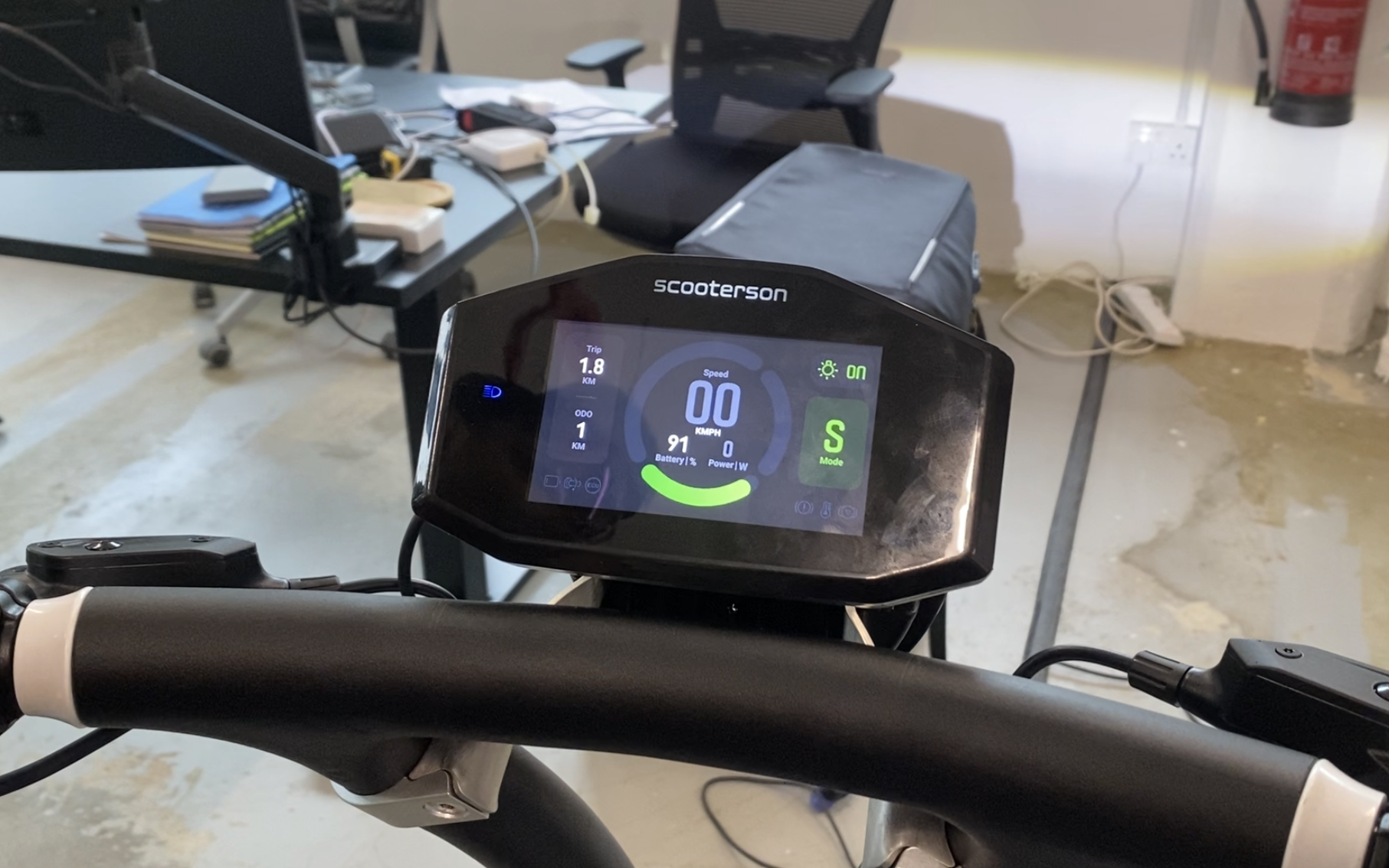
Main Dial
The Main Dial consists of three parts: speedometer, power indicator and battery capacity indicator.The circle was optimisied to add a slight gradient to mimic the natural light on objects, creating a vivid and dynamic effect

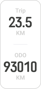
Trip / ODO
Trip and ODO are grouped together due to their similar layout.Both the two sections are meant to represent monitoring data.


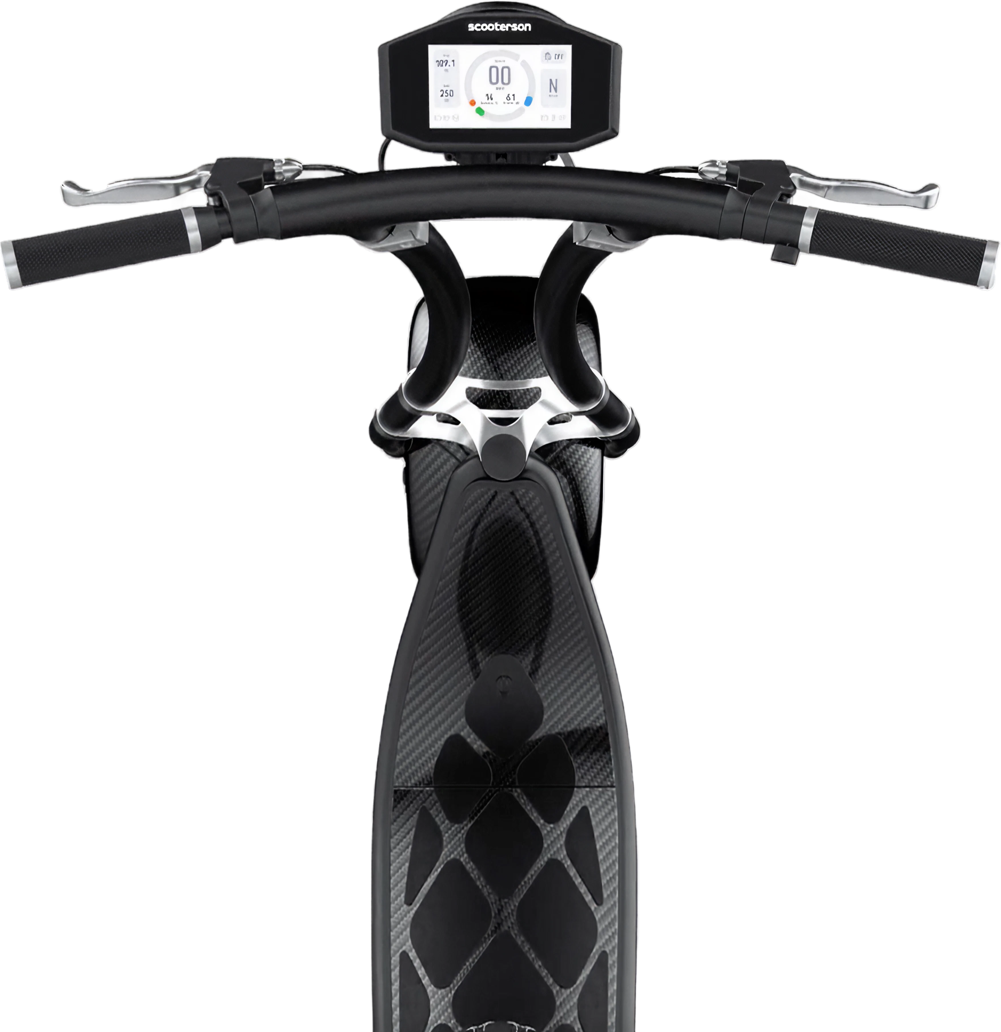
Headlight Switch
The icon remains consistent with the headlight icon on the handle ,giving riders a hint as to how to active it.
An clear feedback is designed to notify riders whether they has successfully turned on the headlight.

Mode / Level
Combine the mode and level indicator together due to their similar function.A clear feedback is required to inform riders that they have successfully triggered the correspondingaction.

Error Indicator
All error icons are redesigned to match the icon on the handle.
typography
04
The dashboard uses two fonts , one monofont for number, Roboto for text.
B
Num1
Headline
Num2
Caption
Font size and style are organized to provide a clear contrast and enough variations for different occasions.
A


137.5°


n
7n


For a better presentation of data and number, monospaced is used.The Reduced width of the number allows for more digits with limited space, which maintaining a good readability and recognition.The redesigned font is consistent with Scooterson’s VI.
C


The number series are created using the same principle to keep consistent.The number series has been redesigned for easier recognition and readability.
Design System
05
Primary font

light Mode
# 515076
Dark Mode
# ffffff
Secondary font

light Mode
# A29DB2
Dark Mode
# 747484
Background

light Mode
# ffffff
Dark Mode
# 13131C
Cell background

light Mode
# 55547B 5%
Dark Mode
# 1D1C23
Colour Palette
We extract a series of colours from our product’s industrial design. We make a series of colour varients basing on scooterson’s VI.

Normal
#2ED41A

Alert
# FA9B20

Error - light Mode
# F86848

Error - Dark Mode
# C5391A
Design System
06


iCON System
Errors are symbolised by a series of simple icons. All icons are designed under following principles:
24 dp icon system
To remain a easy recognition on different screens, we design the icons in a grid of 24dp icon system ( material design ).
consistensy
All icons are outlined in a style that matches the icons on the scooter's handle. In keeping with Rolley's fluid frame, all icons have curved lines and round corners.
easy-recognised
All icons are designed for easy and quick recognition to reduce ambiguity.

Mode
07
Neutral
Decrease the visual load to avoid distracting riders when scooters are in neutral.

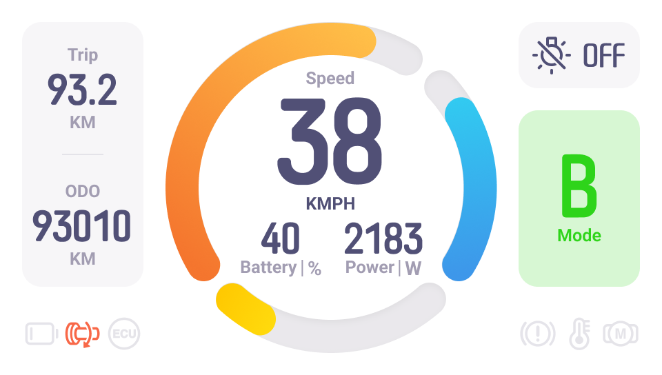

Boost
In a transient BOOST mode,a instant feedback on dashboard is required.

Riding
The scooter will have three levels, and each level will be presented on dashboard when triggered.

Reverse
Riders will be warned if they enter Reverse Mode.
battery Status
08
Low Battery
When battery is low, the battery indicator turns red to remind riders to charge their scooters.
Sufficient battery
Riders can plan their travels with confidence thanks to the green battery indication.
Alert for Battery is going to be low
As soon as the battery drops below 40%, the battery indicator will turn yellow. In this way, riders are alerted to be prepared.
Dark Mode
When the headlight is turned on, dark mode will be activated. This is the most natural way to switch between two modes.
09
Neutral Mode
Design Goal
Native
Harmony
Avoid using saturated colors in dark Mode, as they can visually vibrate against dark surfaces.
Contrast
Use a strong contrasting colour and font weight for riders to catch the most important information.
Consistency
The dark mode design is consistent with light mode design style.
Outcome
10
Dashboard Design

2023-02
Ride Smart
Design Goal
Layout
Widget
Design System
Visual Design
Design Goal
01
About Project
This Instrument Cluster Design is for the scooter- Rolley, manufactured by Scooterson Pte. Ltd.
Design Goal
Reduce Ambiguity
To prevent users erros, any ambiguity should be avoided. As a result, several optimizations are considered, such as reorganising layout basing on information intimacy, enhancing the feedback of users’ action on scooters.
Scenario-centred design
The Scooter Dashboard, as an overview of information, should not distract the rider. As a result, we eliminated as much unnecessary information as possible.
Consistency
The dashboard design is consistent with the scooter’s industrial design and scooterson’s VI.
Layout
02


137.5°
96


480
192


16
64
16
Layout
The dashboard UI is optimised basing on the following principles:
Proximity
The goal of a dashboard is to present information at a glance, so the maximum number of widgets are usually limited to 5-7.According to the principle of Proximity, group and organise the related elements together to make information easily reconginised.
Component Standardization
Use multiplies of 8px to layout , dimensions, padding and margin of elements as possible.
Symmetrical
Adopt a mathematical proportion to please users eyes asethetically.Adopt a symmetrical layout for a balance, harmony visual effect, in consistent with the scooter’s industrial design.
Widgets
03

Main Dial
The Main Dial consists of three parts: speedometer, power indicator and battery capacity indicator.The circle was optimisied to add a slight gradient to mimic the natural light on objects, creating a vivid and dynamic effect

Trip / ODO
Trip and ODO are grouped together due to their similar layout.Both the two sections are meant to represent monitoring data.

Headlight Switch
The icon remains consistent with the headlight icon on the handle ,giving riders a hint as to how to active it.
An clear feedback is designed to notify riders whether they has successfully turned on the headlight.

Mode / Level
Combine the mode and level indicator together due to their similar function.A clear feedback is required to inform riders that they have successfully triggered the correspondingaction.

Error Indicator
All error icons are redesigned to match the icon on the handle.
typography
04
The dashboard uses two fonts , one monofont for number, Roboto for text.
B
Num1
Headline
Num2
Caption
Font size and style are organized to provide a clear contrast and enough variations for different occasions.
A


137.5°


n
7n


For a better presentation of data and number, monospaced is used.The Reduced width of the number allows for more digits with limited space, which maintaining a good readability and recognition.The redesigned font is consistent with Scooterson’s VI.
C


The number series are created using the same principle to keep consistent.The number series has been redesigned for easier recognition and readability.
Design System
05
Primary font

light Mode
# 515076
Dark Mode
# ffffff
Secondary font

light Mode
# A29DB2
Dark Mode
# 747484
Background

light Mode
# ffffff
Dark Mode
# 13131C
Cell background

light Mode
# 55547B 5%
Dark Mode
# 1D1C23
Colour Palette
We extract a series of colours from our product’s industrial design. We make a series of colour varients basing on scooterson’s VI.

Normal
#2ED41A

Alert
# FA9B20

Error - light Mode
# F86848

Error - Dark Mode
# C5391A
Design System
06


iCON System
Errors are symbolised by a series of simple icons. All icons are designed under following principles:
24 dp icon system
To remain a easy recognition on different screens, we design the icons in a grid of 24dp icon system ( material design ).
consistensy
All icons are outlined in a style that matches the icons on the scooter's handle. In keeping with Rolley's fluid frame, all icons have curved lines and round corners.
easy-recognised
All icons are designed for easy and quick recognition to reduce ambiguity.

Mode
07
Neutral
Decrease the visual load to avoid distracting riders when scooters are in neutral.


Boost
In a transient BOOST mode,a instant feedback on dashboard is required.

Riding
The scooter will have three levels, and each level will be presented on dashboard when triggered.

Reverse
Riders will be warned if they enter Reverse Mode.
battery Status
08
Low Battery
When battery is low, the battery indicator turns red to remind riders to charge their scooters.
Sufficient battery
Riders can plan their travels with confidence thanks to the green battery indication.
Alert for Battery is going to be low
As soon as the battery drops below 40%, the battery indicator will turn yellow. In this way, riders are alerted to be prepared.
Dark Mode
When the headlight is turned on, dark mode will be activated. This is the most natural way to switch between two modes.
09
Neutral Mode
Design Goal
Native
Harmony
Avoid using saturated colors in dark Mode, as they can visually vibrate against dark surfaces.
Contrast
Use a strong contrasting colour and font weight for riders to catch the most important information.
Consistency
The dark mode design is consistent with light mode design style.
Outcome
10