
big banyan -EPMS design
Project
uI / UX Designer
My Role
August 2022
time


site b
site b
site b


site a
site b
site b
site b
site b
site b
site b
site b


site a
site b

health
site b
workplace 1
work place 2
workplace 3


room 1
room 2
room 3

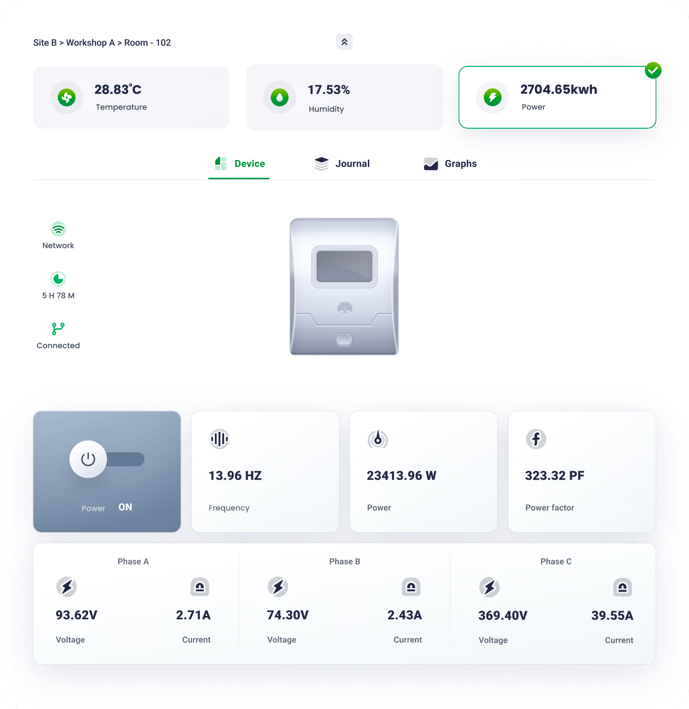
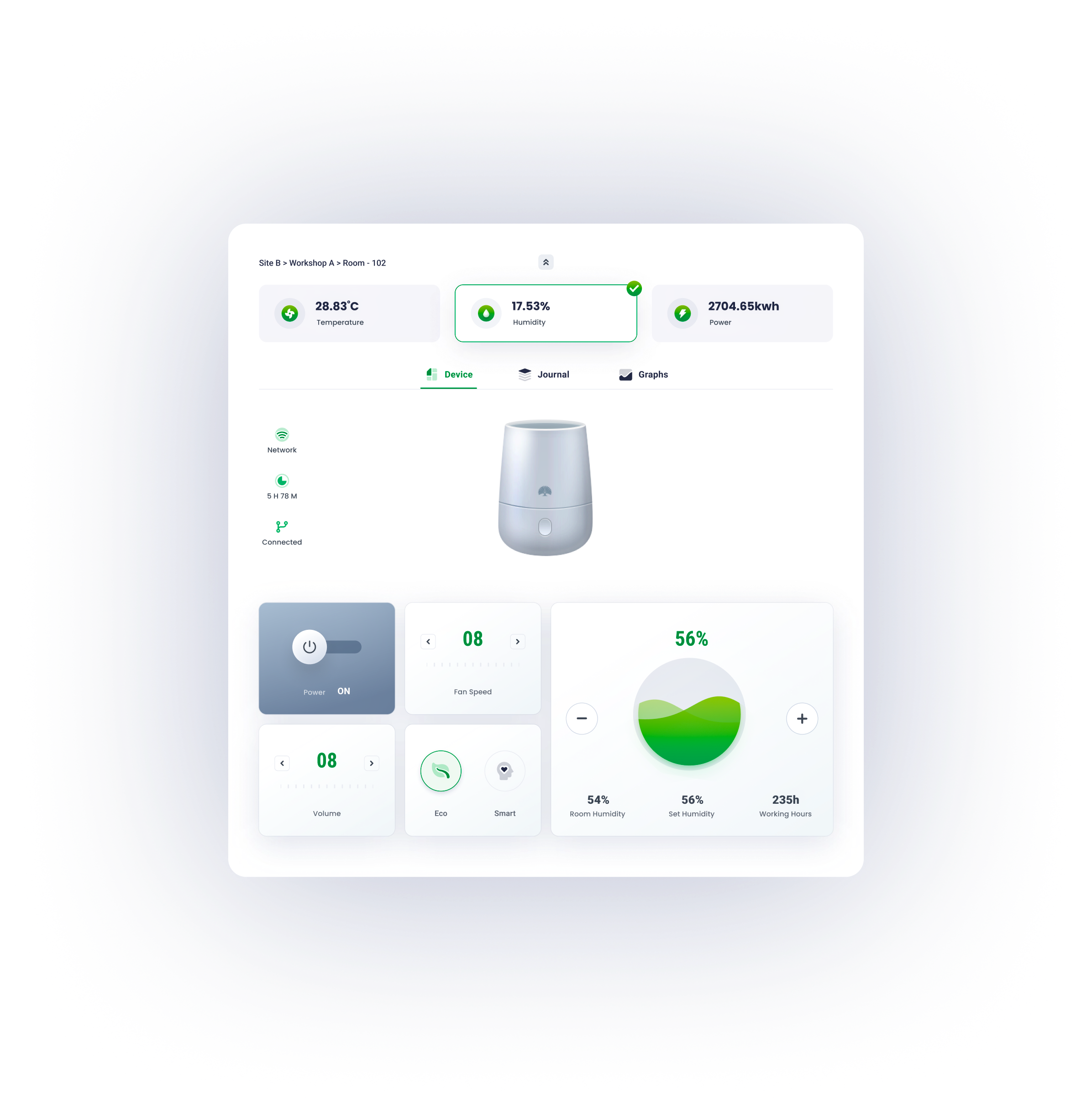
electricity
temperature
humid

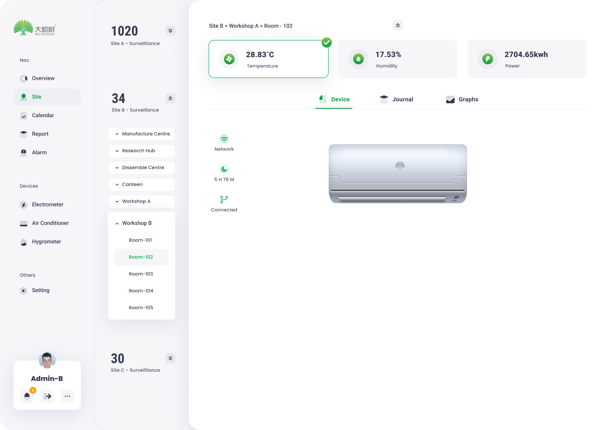
device
graph
journals

control
status
filter
graph
key data
filter
table
overview
reports
site management
alarm
device
profile

site b
site b


Solution
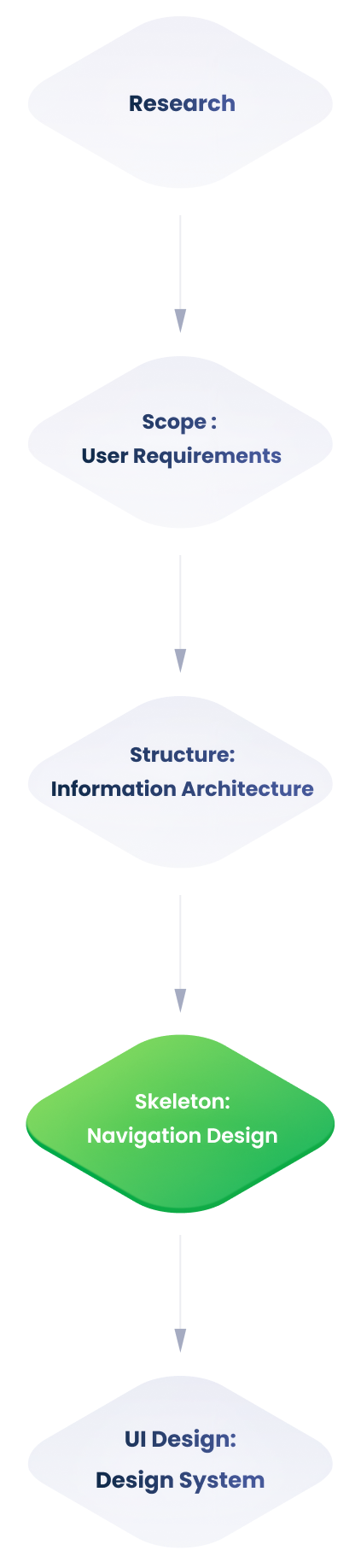
Following a detailed examination of the monitoring backend's information architecture, several difficulties emerged.
Problems
Due to the site page's high utility frequency and the need to simplify its structure, we focused on teasing out its information architecture.
Information Architecture
Users are unable to distinguish between adjustable items and monitoring data due to the ambiguous information hierarchy.
Users have difficulty in navigating because of deep information hierarchy.
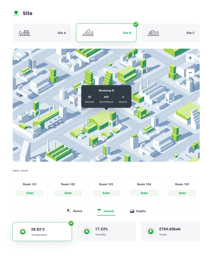
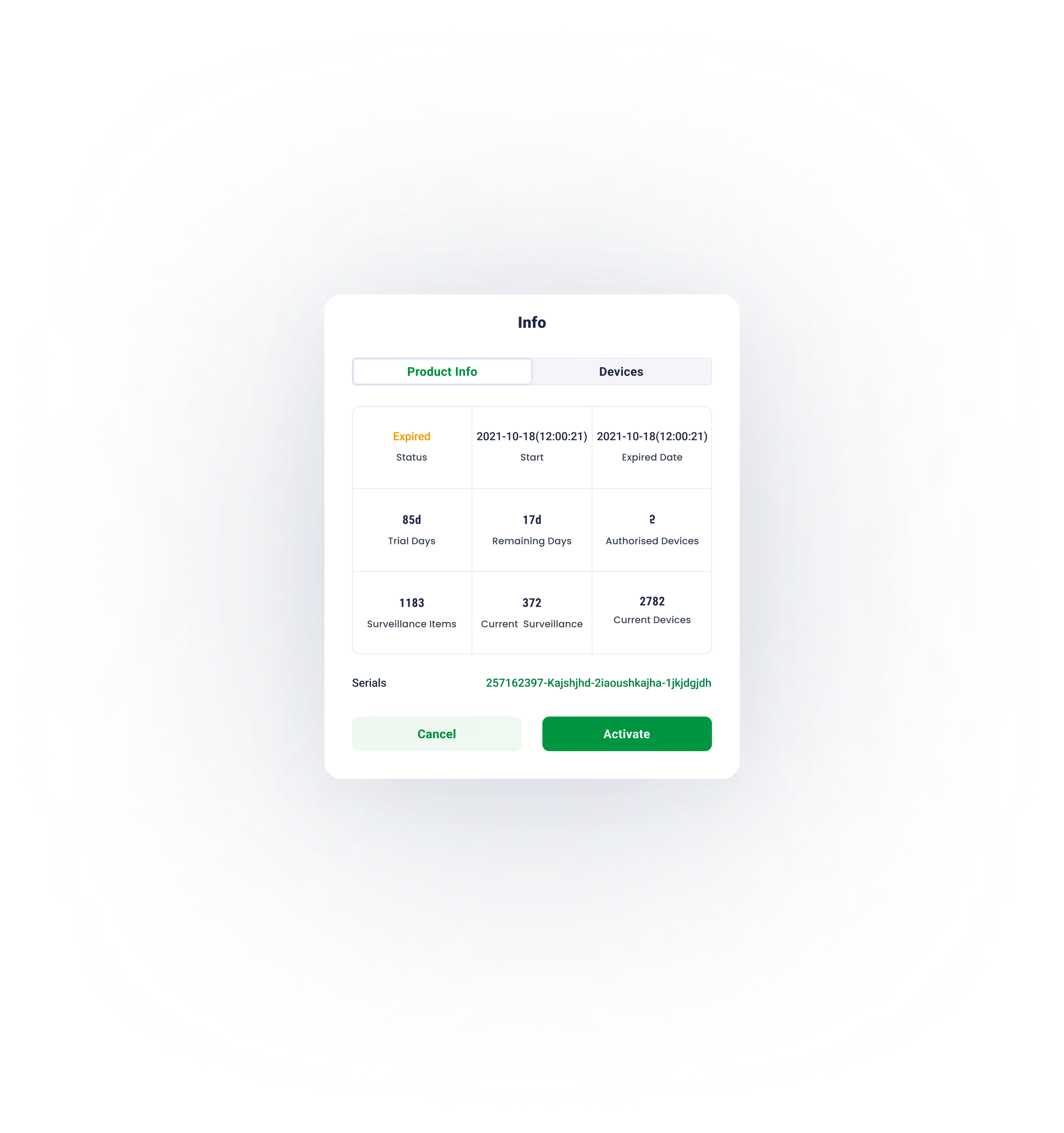
The monitoring backend requires customising. Therefore, extensibility of sites , surveillance objects and devices , has to be considered throughout the design process.
what is the project?
The Big Banyan is an environment monitoring and control system for factories, equipment rooms, and any other workplaces that require a stable operating environment. The complete system consists of a collection of devices, servers and a monitoring backend - the Environment and Power Monitoring System (EPMS). This project focuses on the design of the monitoring backend (EPMS) to improve data processing efficiency.
In the physical world, objects can be stacked or attached, and humans tend to interact with the nearest object. On the basis of this behaviour research, the content of EPMS will ba organised along the z-axis according to the user task’s urgency.


Organise content according to its information hierachry, the higher to right, the lower to left.
X axis
Organise content according to its information hierachry, the higher to bottom, the lower to top
y axis
01
Z axis
The z axis represents the depth of the content.
task processing area
Including details of a journal, transient task and control panel.
major information browsing area
Including journals, graphs and overview of all key data.
navigation
The navigation works as the first step for users to start a task
The EPMS content is organised into three sections based on the user behaviour research:
navigation
major processing area
task processing area.

Hierarchy Optimization
When devising the navigation, the pivotal principle is to guide users to the destination in the least frustrating way. Theoretically, it means decreasing user load ( consisting of cognitive load, visual load and action load). The primary goal of this navigation design is to reduce the visual load.
02

03
02
01
depth of information
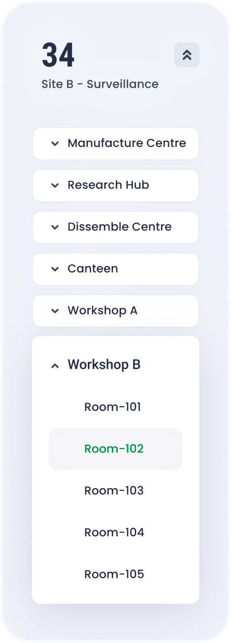
fixed sidebar
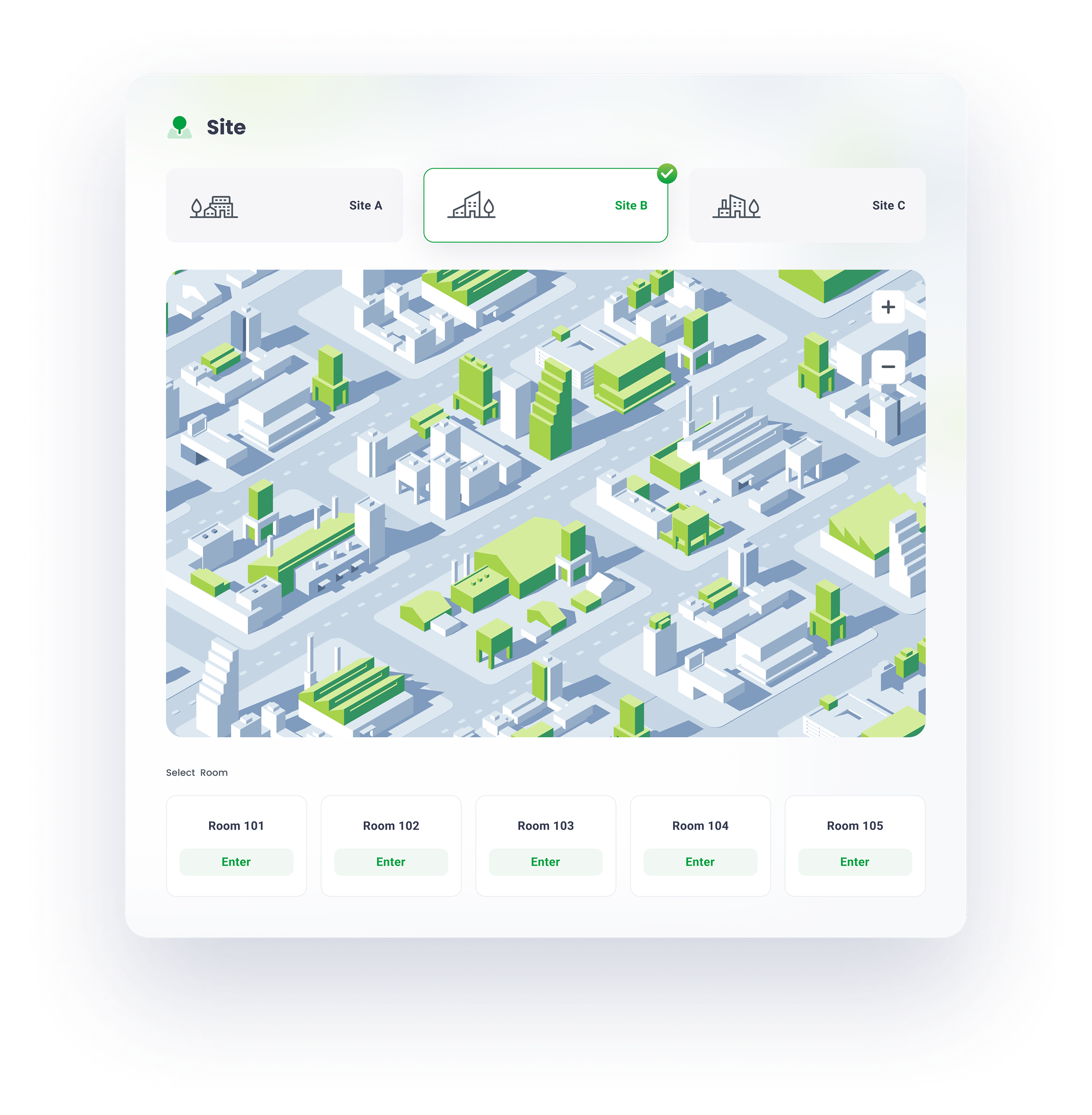
The fixed sidebar facilitates users’ navigation between different sites.

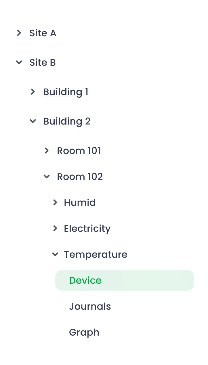
Traditional Tree-structure navigation
After we researched the preliminary version of this project, the sidebar at site page adopted a traditional tree-structure navigation.
The main advantage is the navigation can contain abundant selections with limited space, however, excessive unfolded tabs cause difficulty in navigating
Optimized
flat navigation
To reduce the visual load , the entire navigation is divided into several vertically-distributed chunks . According to the progressive disclourse principle, only the relevant information emerges when users scroll to the section. Consequently, the lengthy and complex task is completed by a series of simple tasks.
usability

depth of information

01
02
03
04
05

before

optimized


The usability shrinks as navigation hierarchy increases

The usability remains stable as navigation hierarchy increases
NavigationDesign
Modular design is about breaking down a design into small parts (modules), creating them independently, and then later combining them into a larger system.Because of their modularity, parts of these systems can be exchanged, added, removed and rearranged. This is great for consumers because they get to customize the system to fit their needs.
03

Modular for responsive design
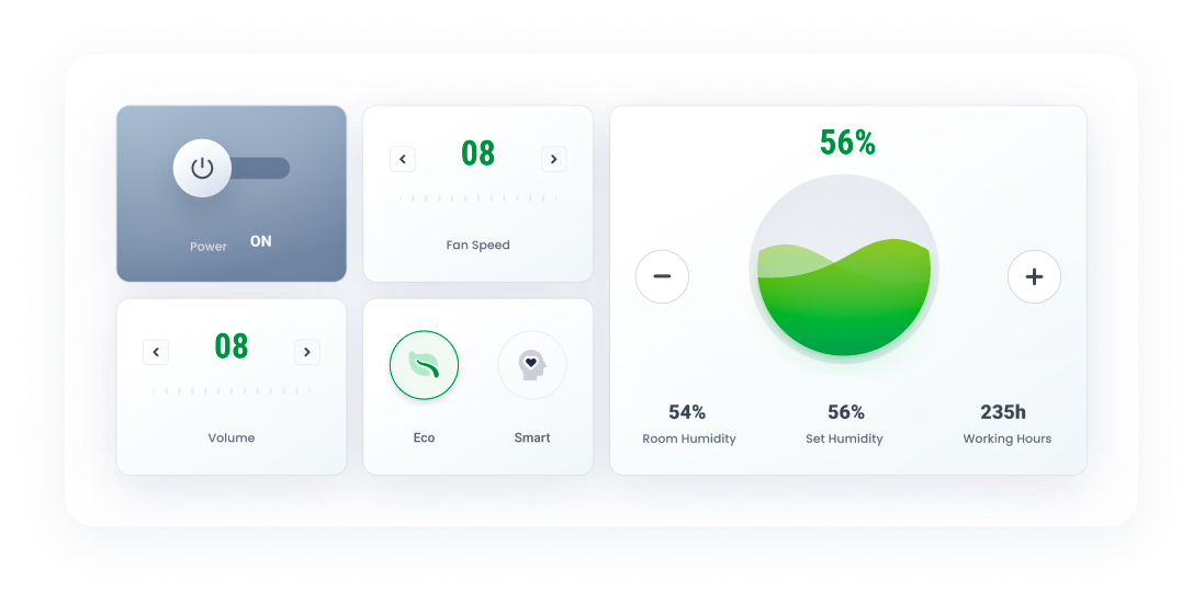
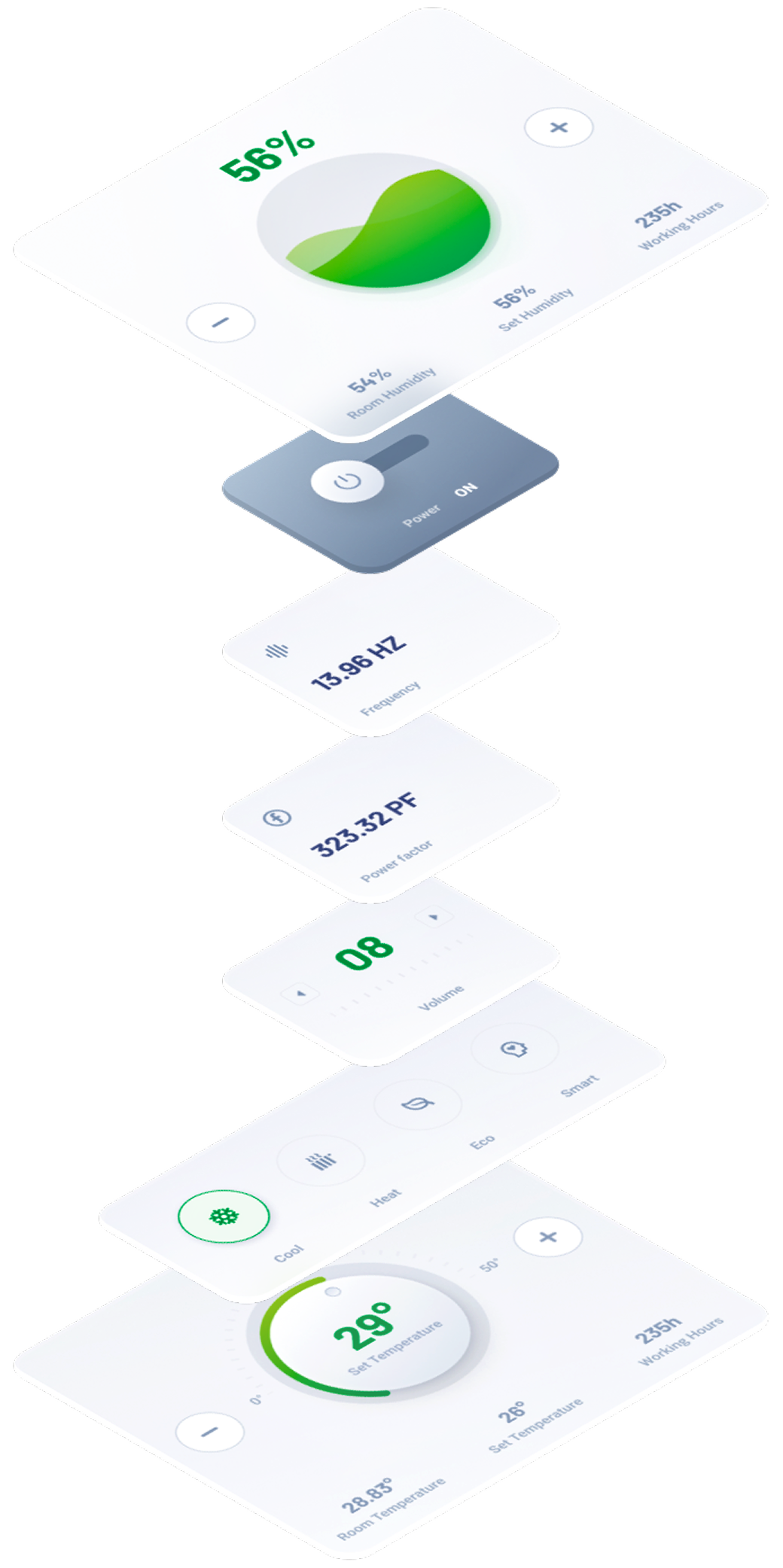
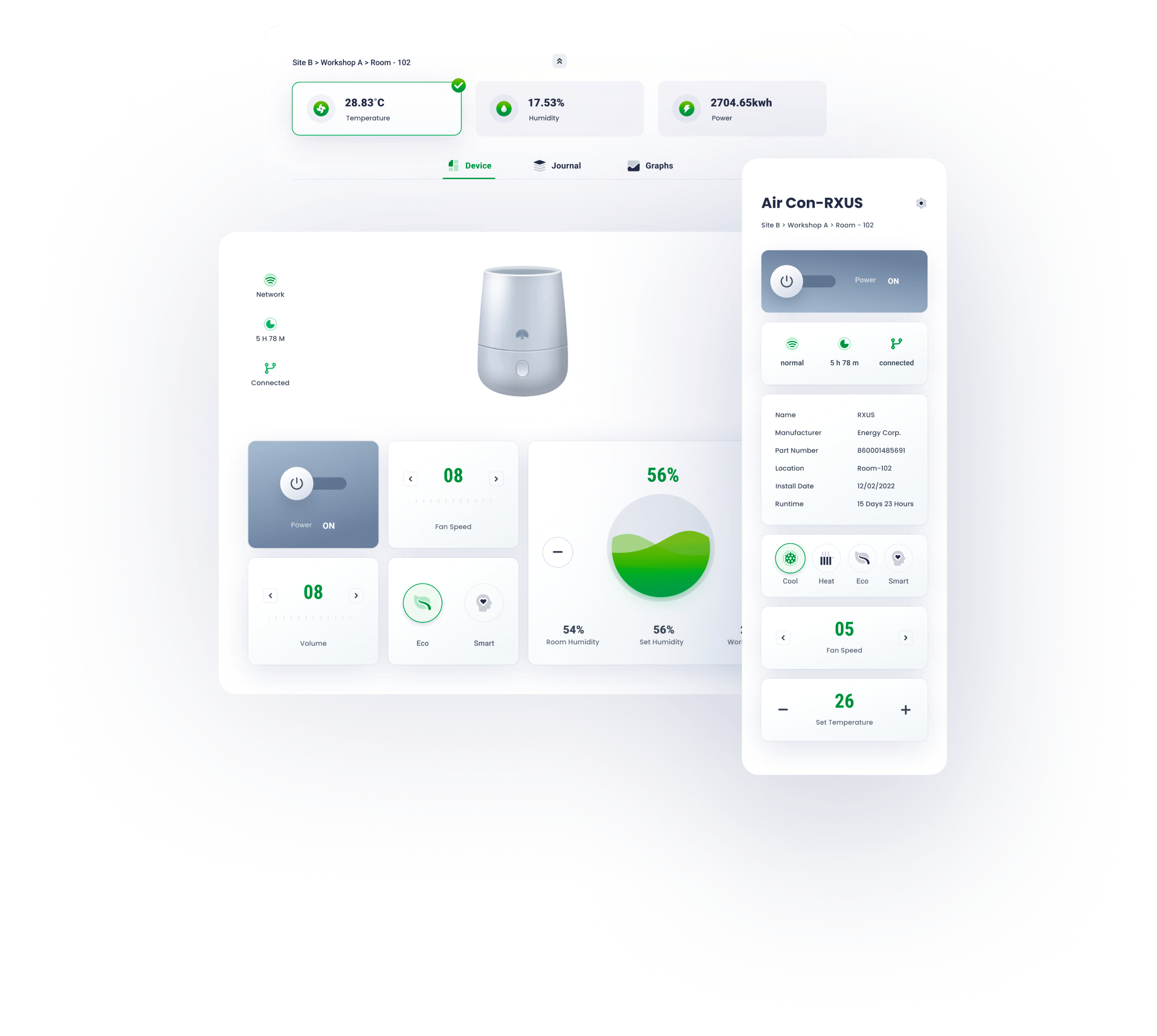
Sections here are the collections of organised modules basing on the function. For instance, a device’s control section contains the its status info, mode selections and so on.
Pages here are arranged and combined functional sections according to the requirements of a user’s task.
Modules here are the smallest functional units, including switches, control unit, status block, etc.

At mobile view, the nav will be folded , only appearing when triggering the hamburger icon. The task section will be seperated into an independent page.
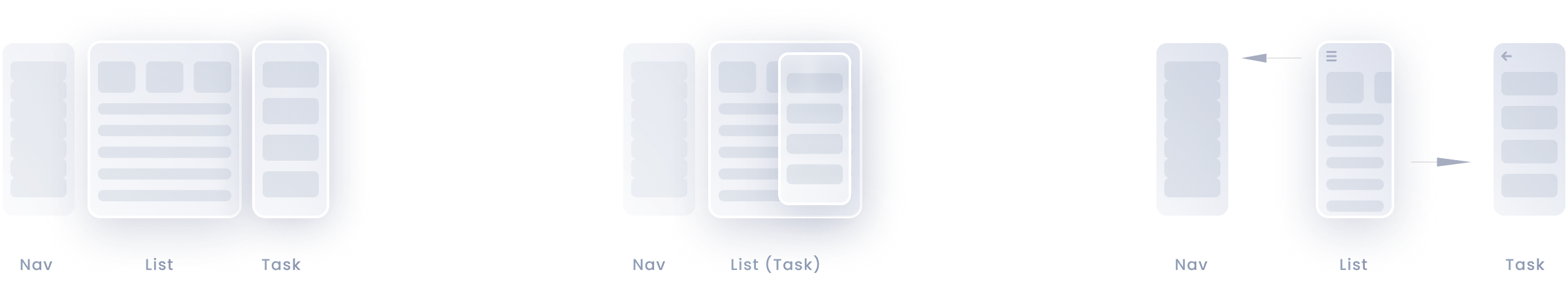
When the screen width is limited, dynamic layout can be achieved by altering the arrangement of modules or their position along the z-axis.
desktop
tablet
mobile
At desktop view, all sections can be tiled along the x axis.
At tablet view, task section is transient and emergs only when triggered
ModularDesign


Typography is critical in establishing hierarchy ,and it requires readability on all conditions.


H1
24pt
black
Roboto
H2
18pt
Bold
roboto
subtitle
14pt
Bold
roboto
Body
13pt
medium
roboto
Caption
12pt
medium
roboto


secondary colour
456ED4
100%
70%
40%
15%
On the colour wheel, the minor colour is chosen at a 90-degree angle from the major colour. This method adds a bit more dyanmic without losing elegance.
alert
FF9D00
100%
70%
40%
15%
Alert colour for alarms and errors
grey
505B85
100%
70%
40%
15%
The grey and its variants is utilised in font for expressing hierarchy.
Primary colour
00A141
100%
70%
40%
15%
The parimary colour and its variants derive from the brand idenity.
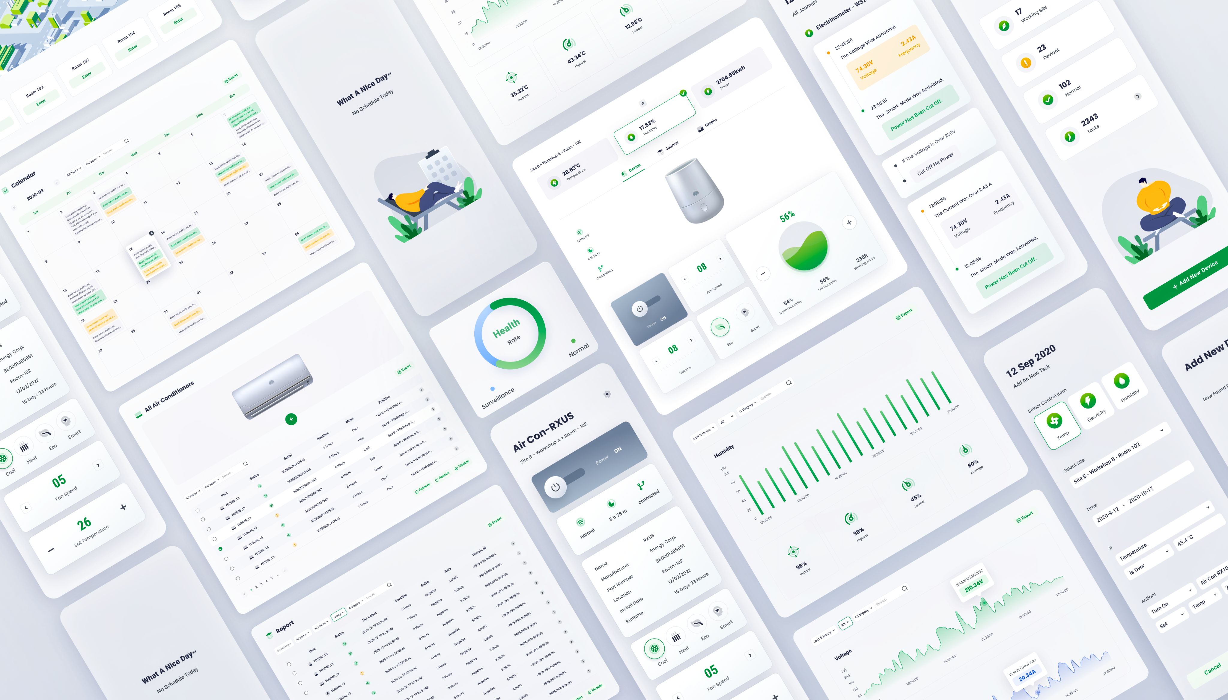
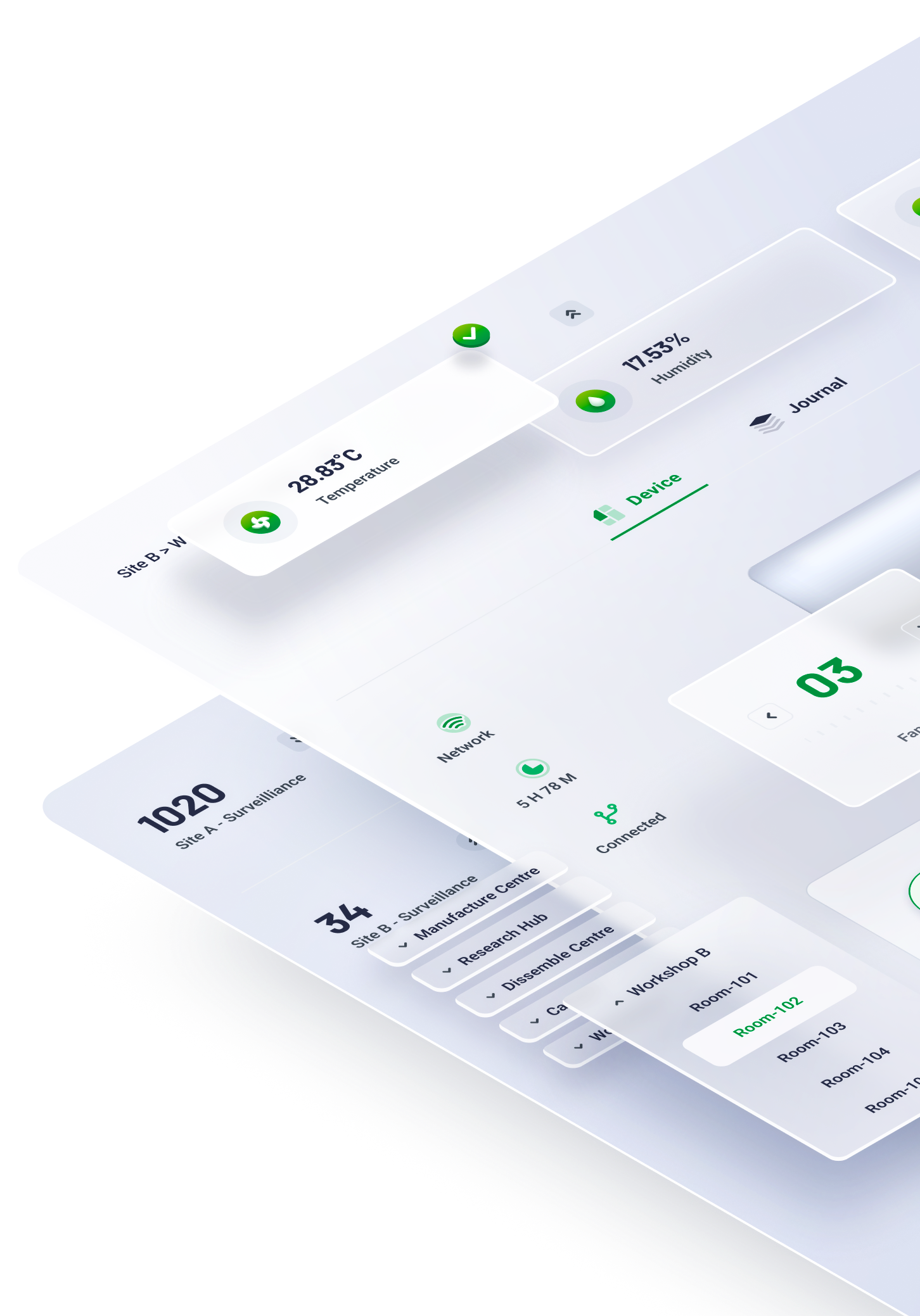
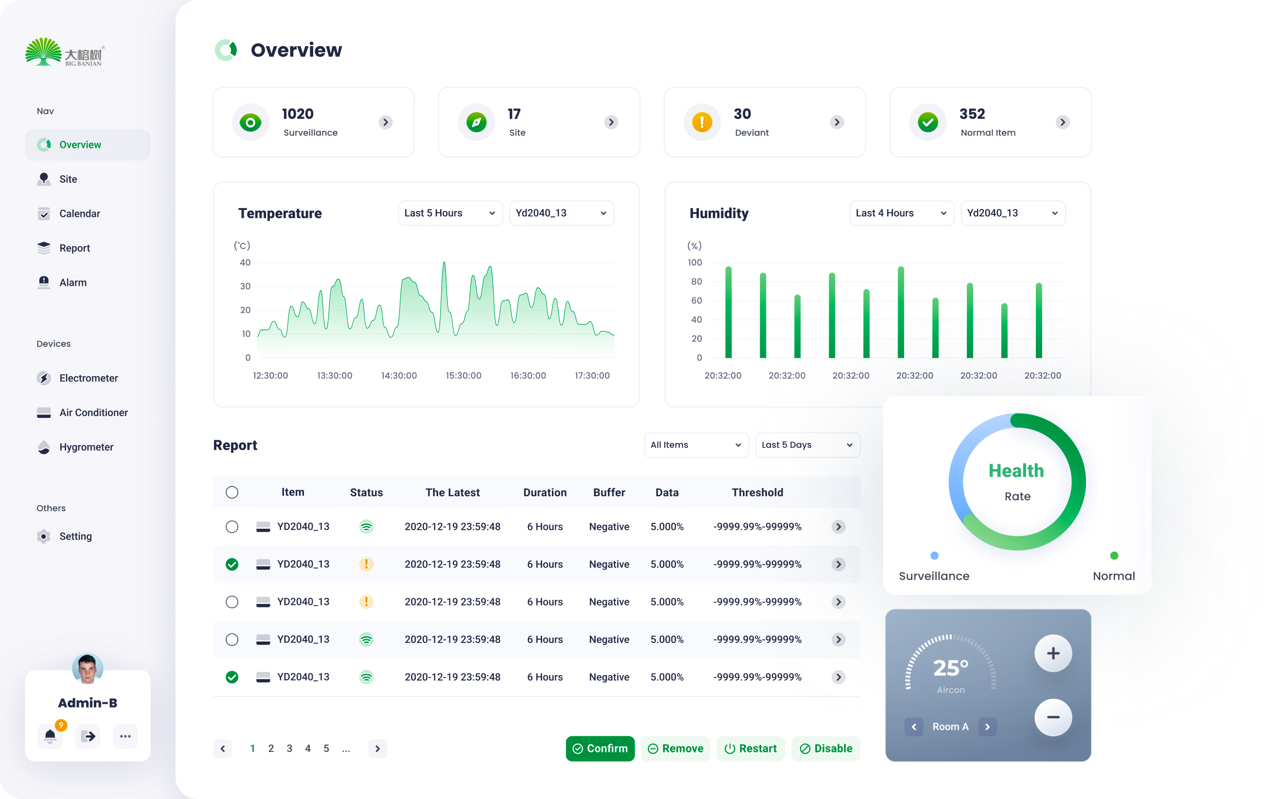
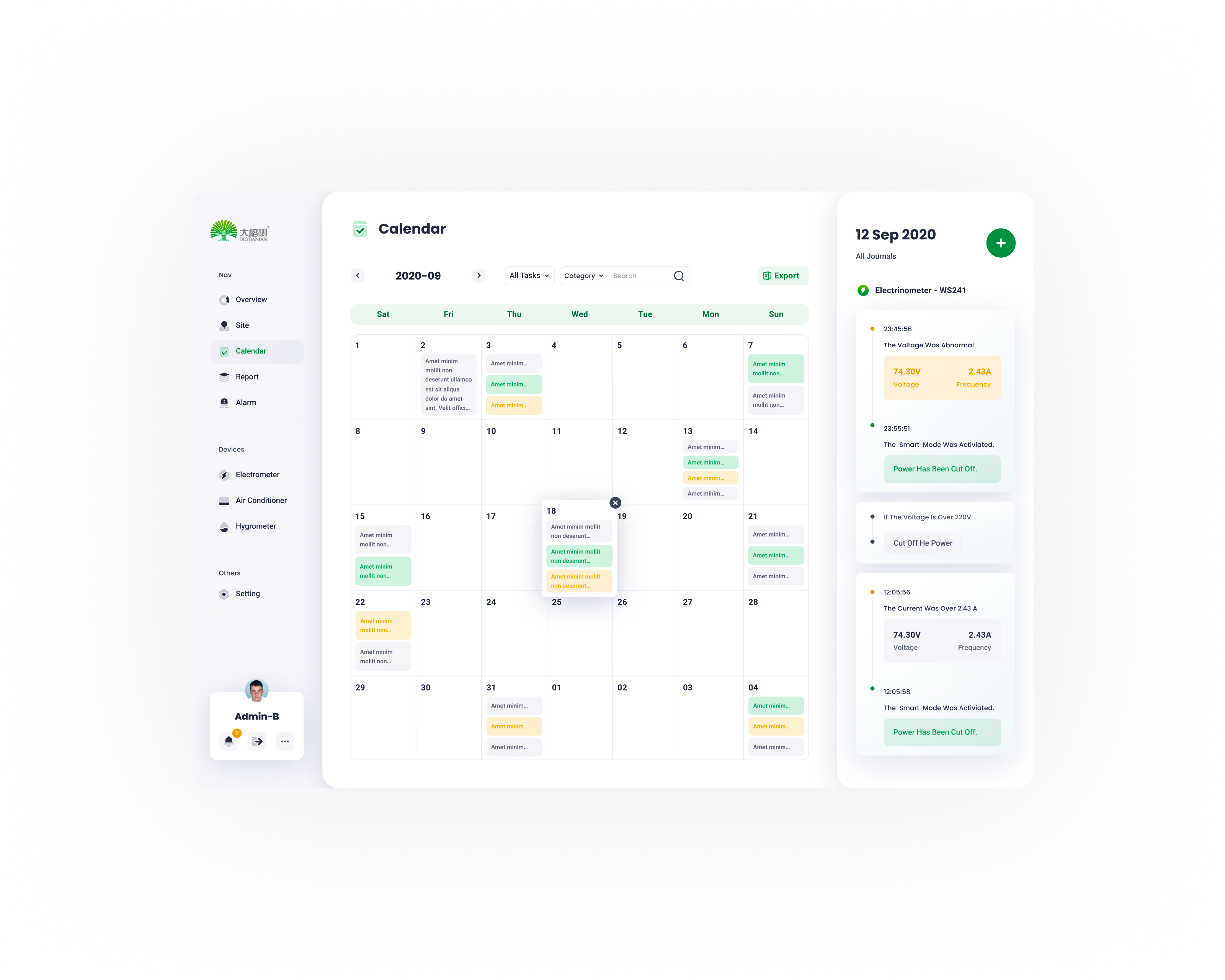
Overview
06
Via Modular design , a series of standardized charts and graphs can be rearranged and combined according to the customer’s requirements.
07
site
management


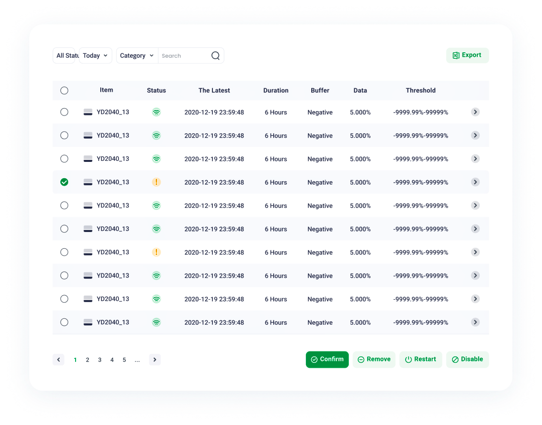
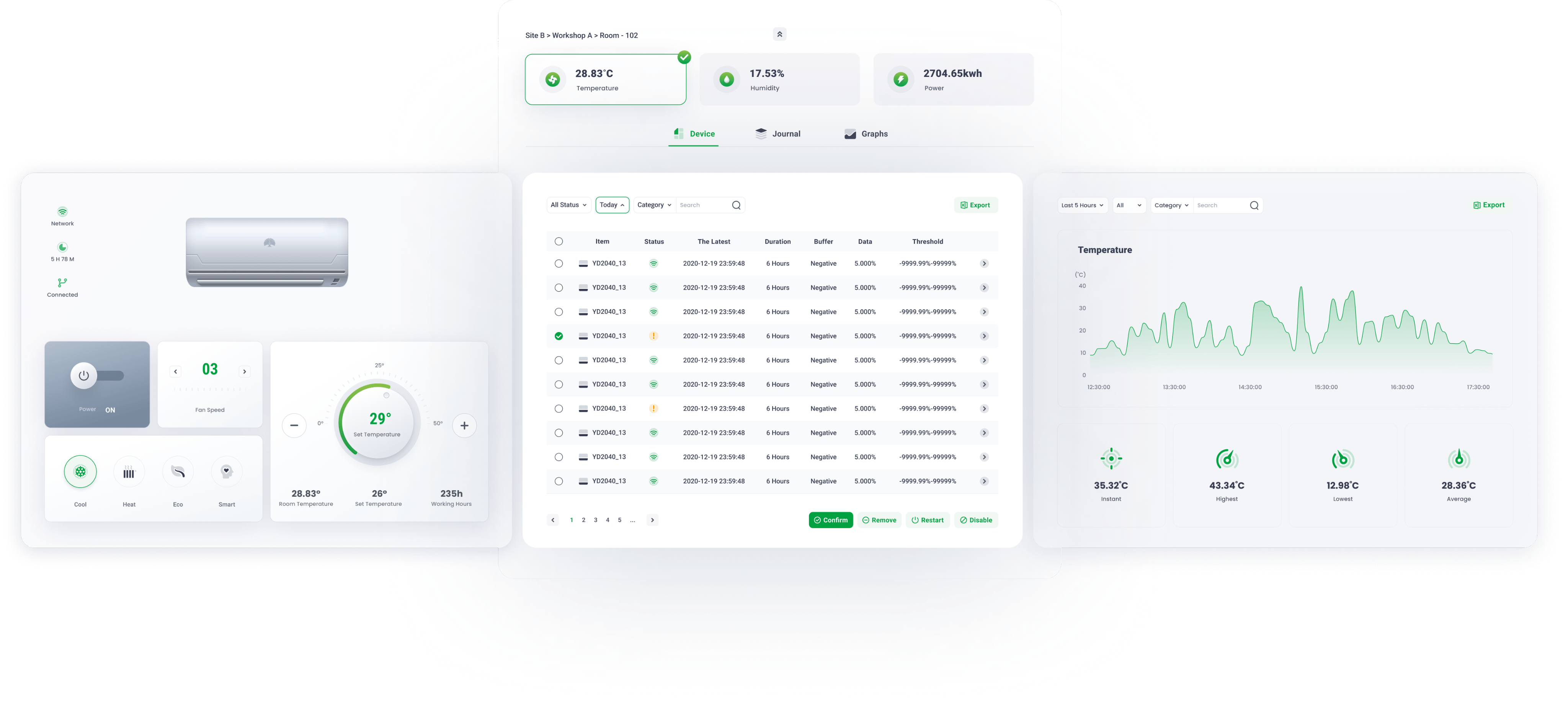
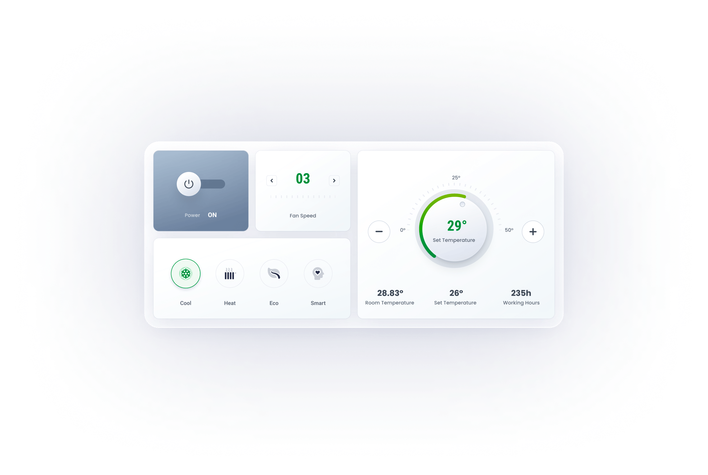
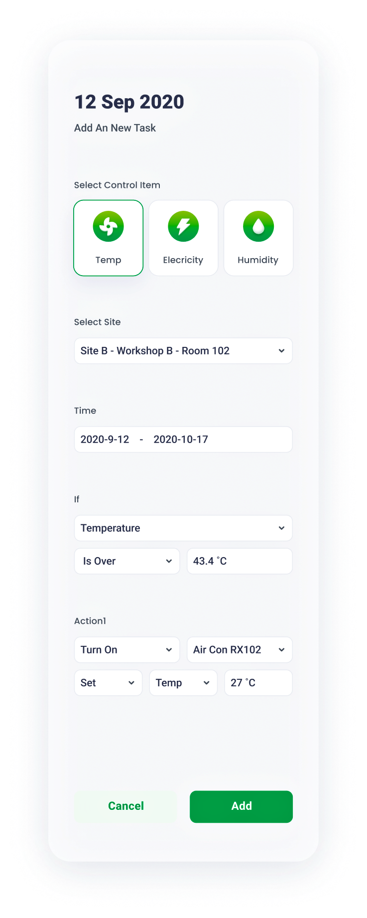
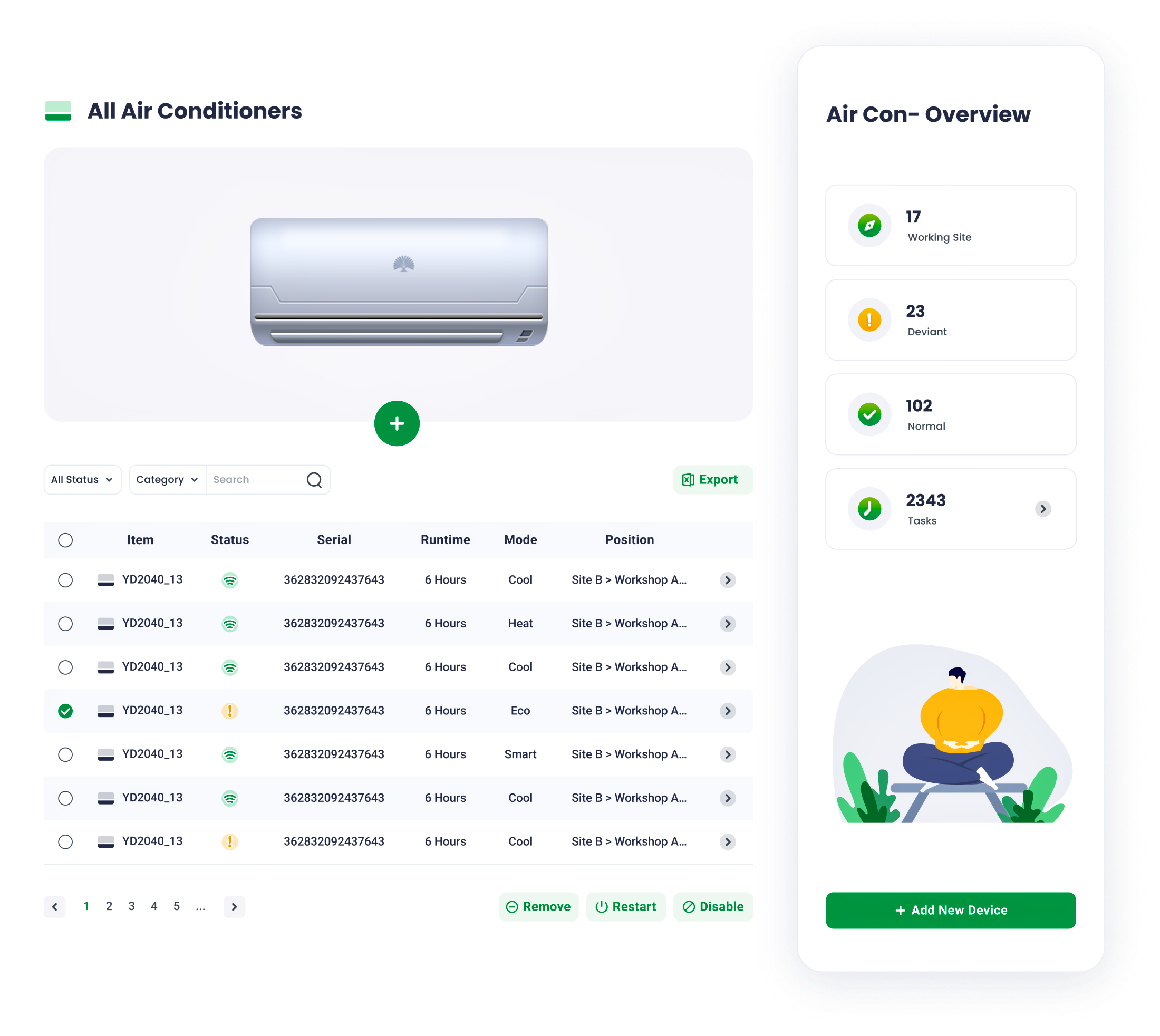
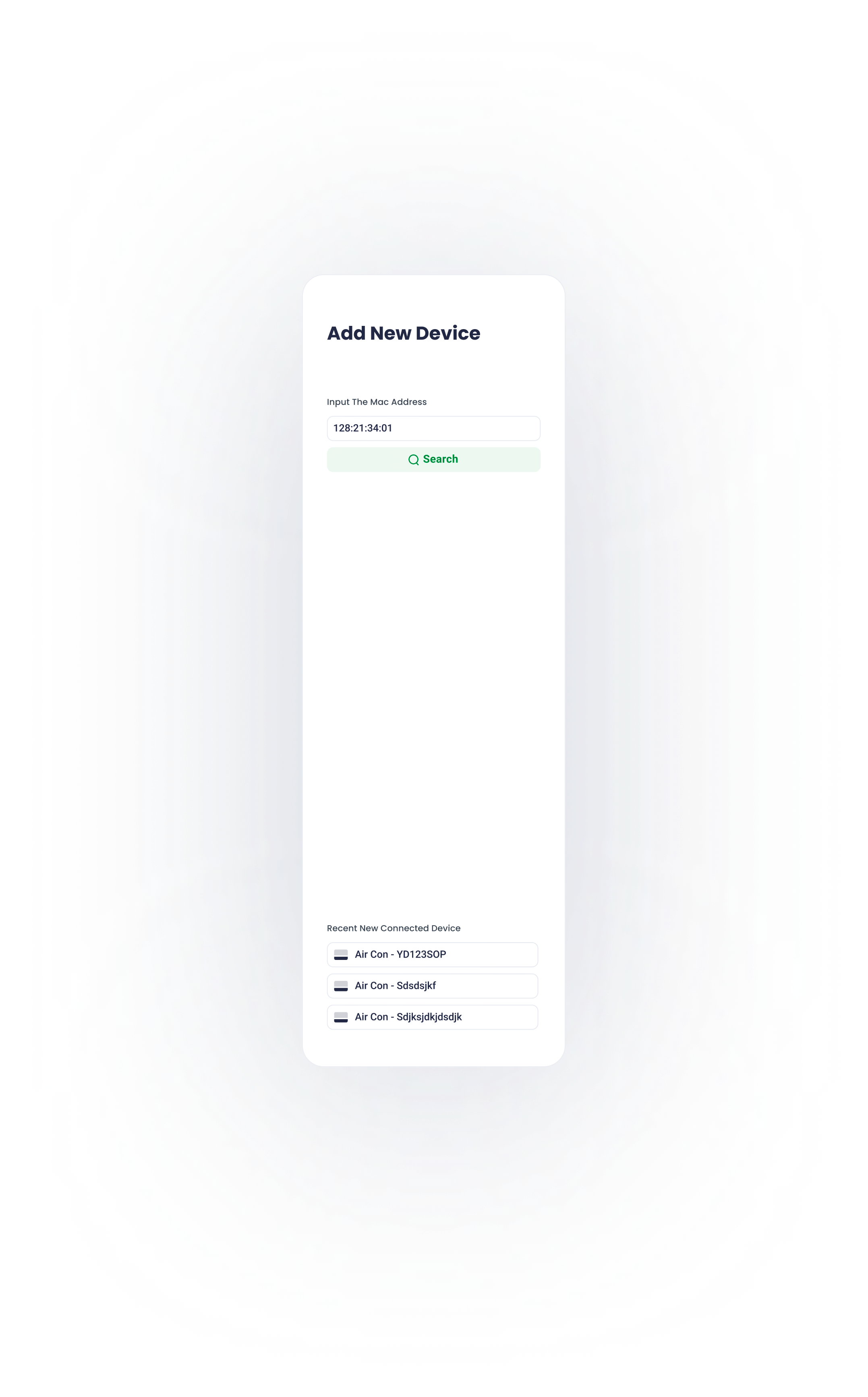
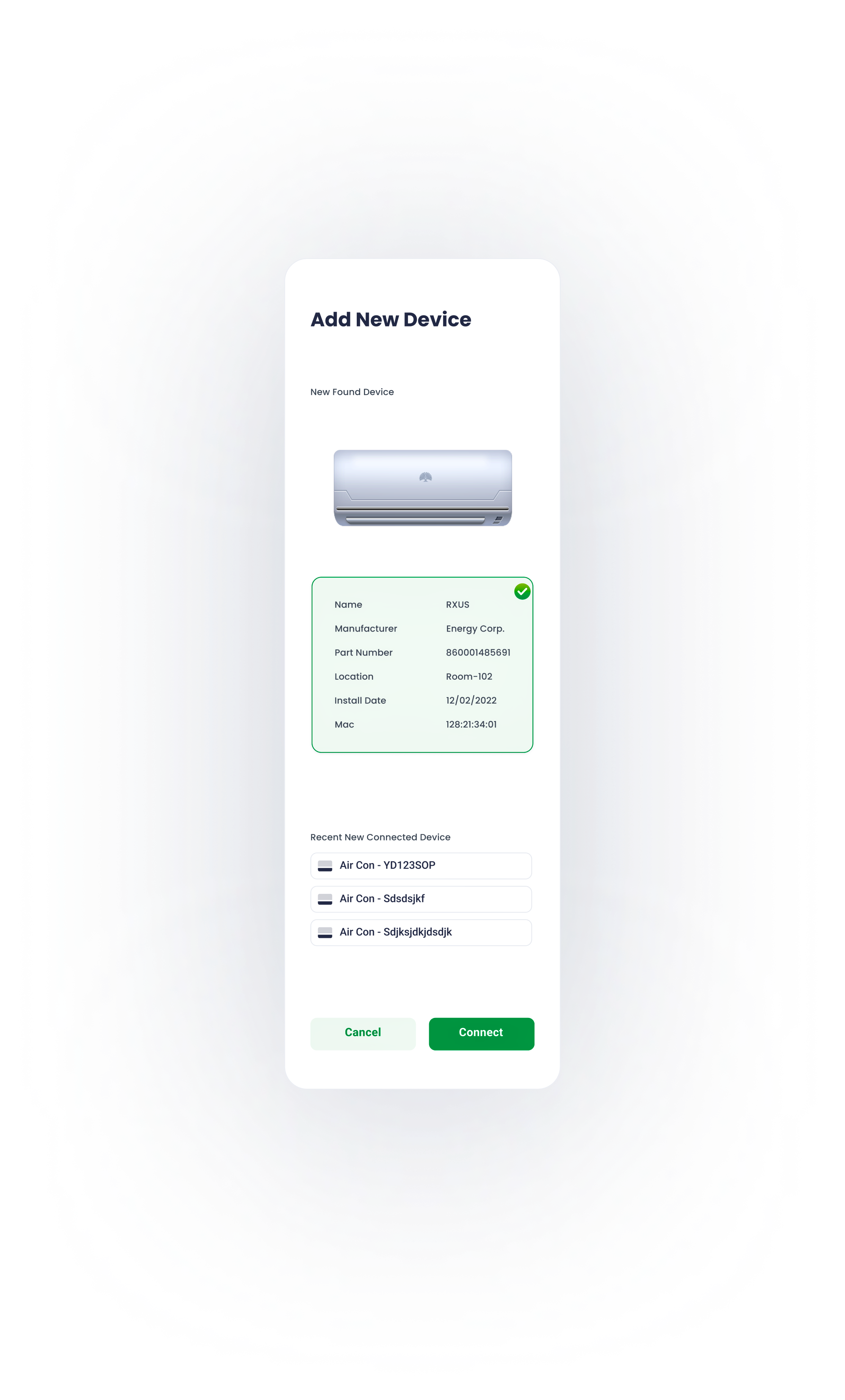
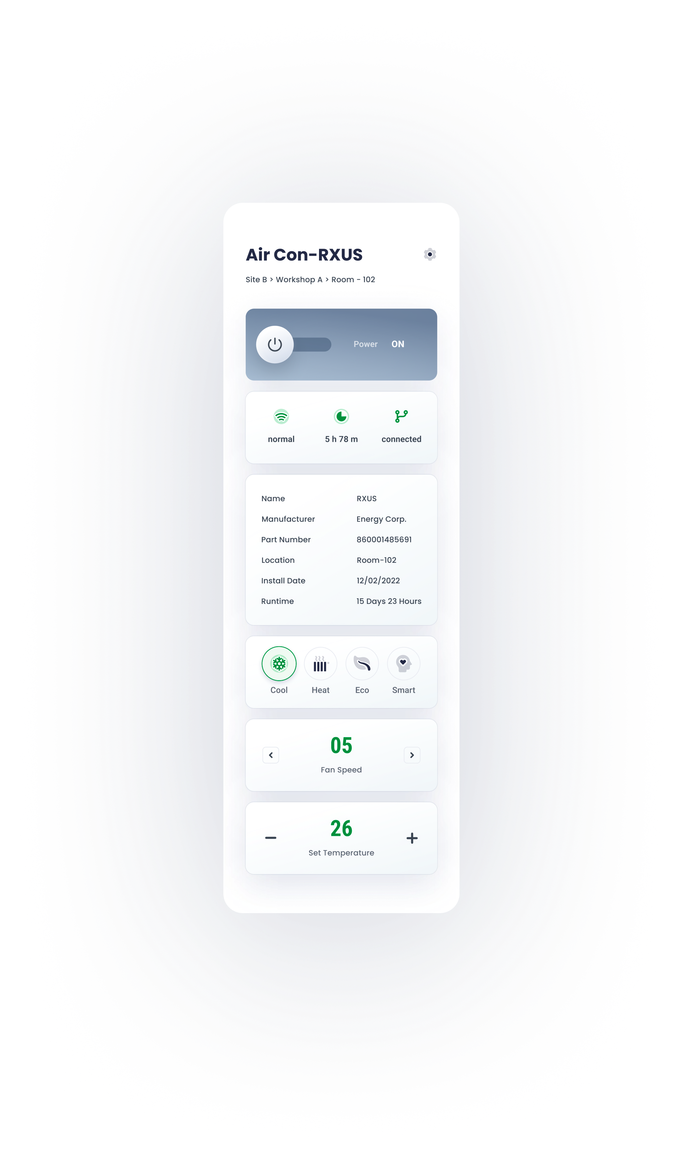
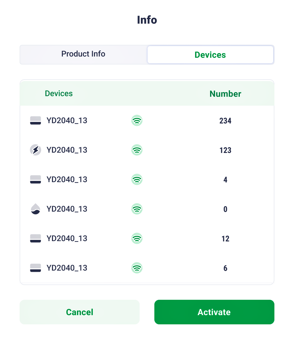
Device
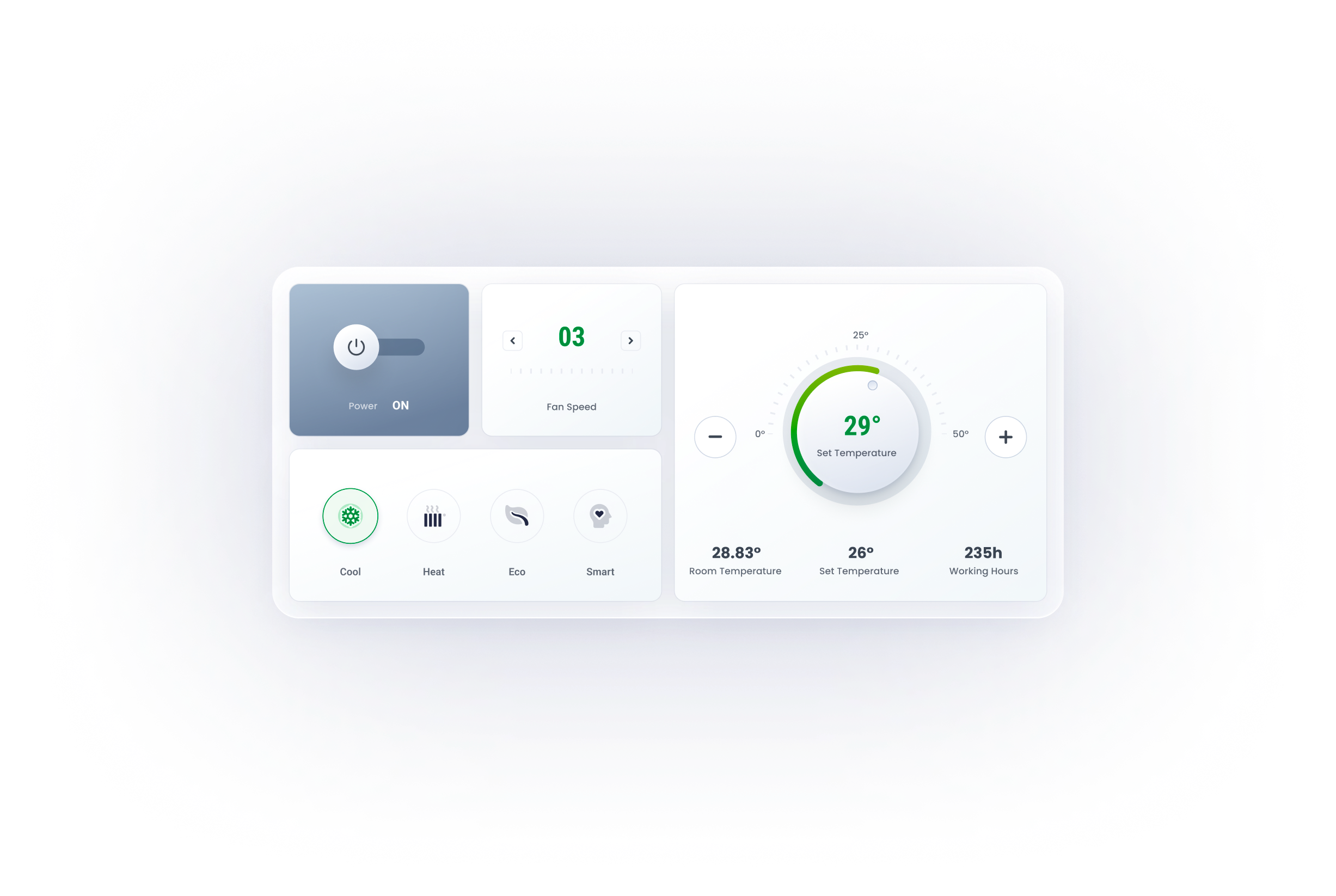
Remote control panel mimics the physical one, for a better affordance and user-friendly experience.


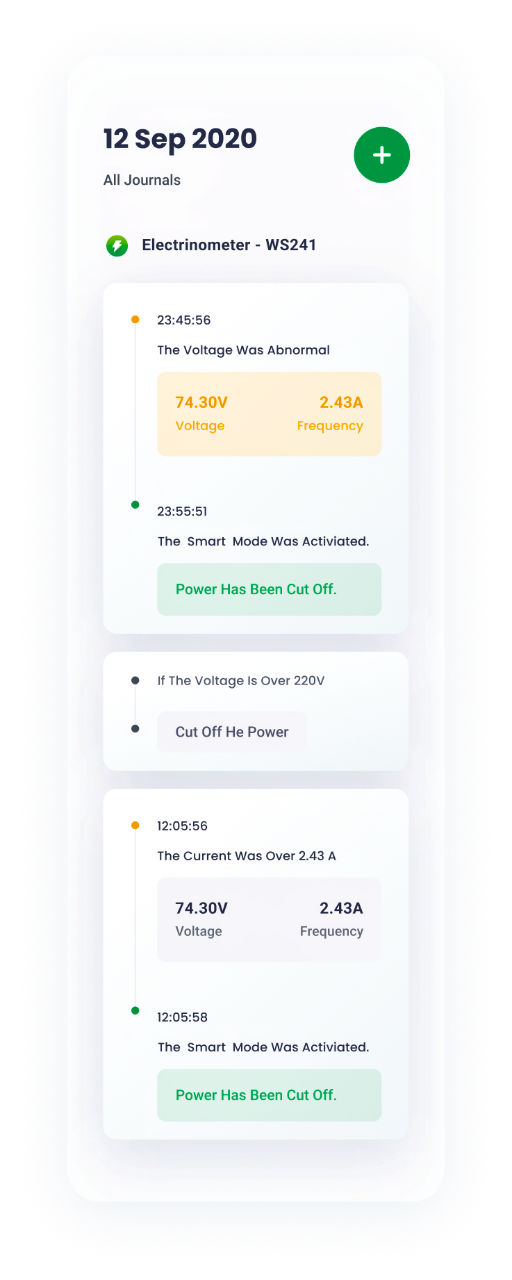
journal
Working journals are well-organized and straightforward.


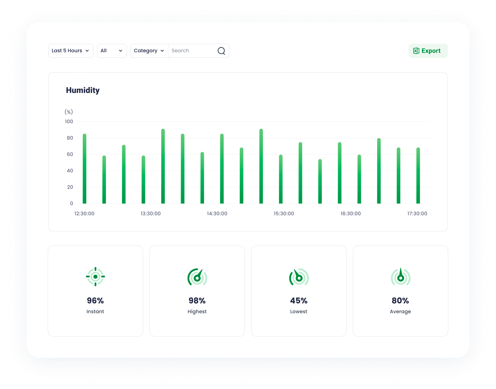
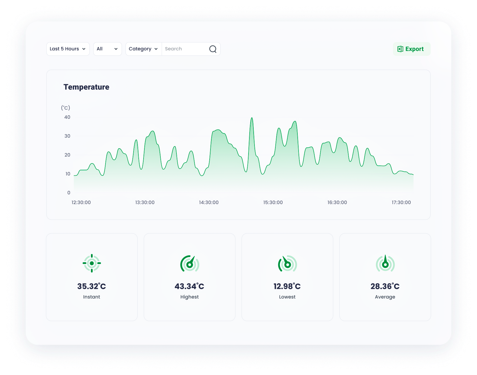
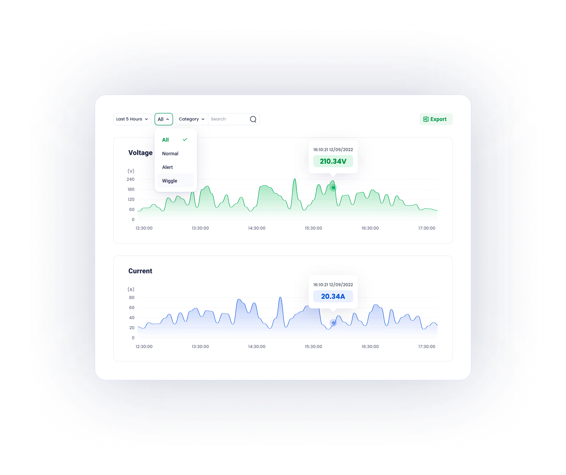
graphs
Well-designed graphs inform users of the data fluctuations over time , minimalist and data-oriented.


Due to hierarchy optimization and flat navigation, the site page divides a user's lengthy and difficult activity into a series of simple tasks that can be accomplished with minimal effort, resulting in a seamless and consistent user experience.


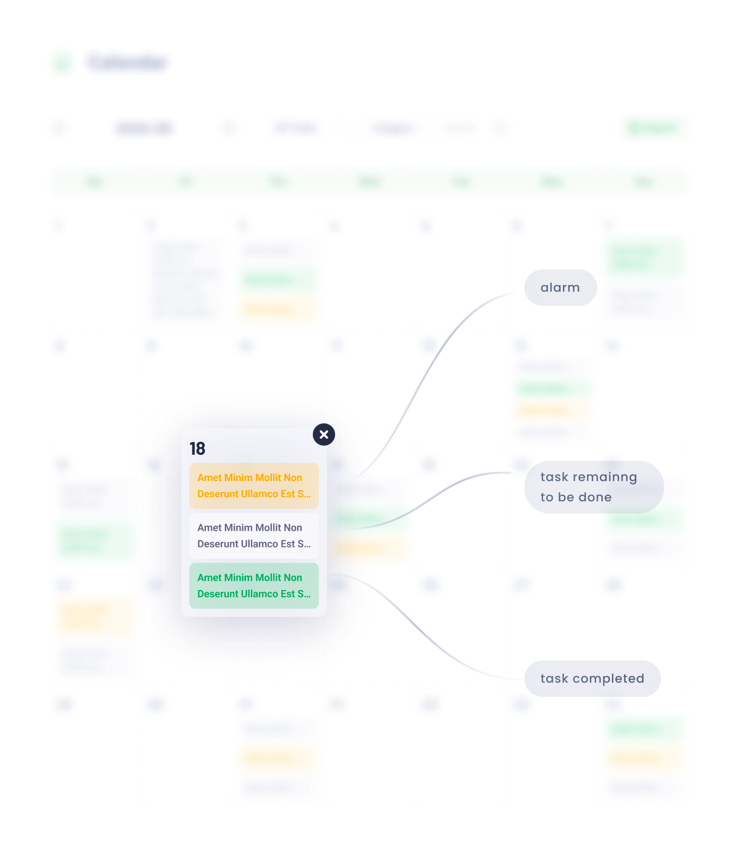
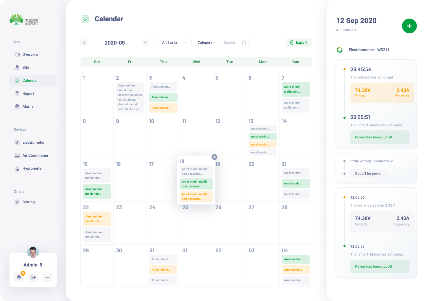
The calendar page serves as a hub of all devices’ operation journals and schedules.
08


Calendar Page
09
Devie configuration, installation, and status checking are all as simple as a click.
Device Management
10
Report
Top level filter enables users to obtain data basing on their requirements
11


Due to the modular design method, the login page fits all screen sizes.
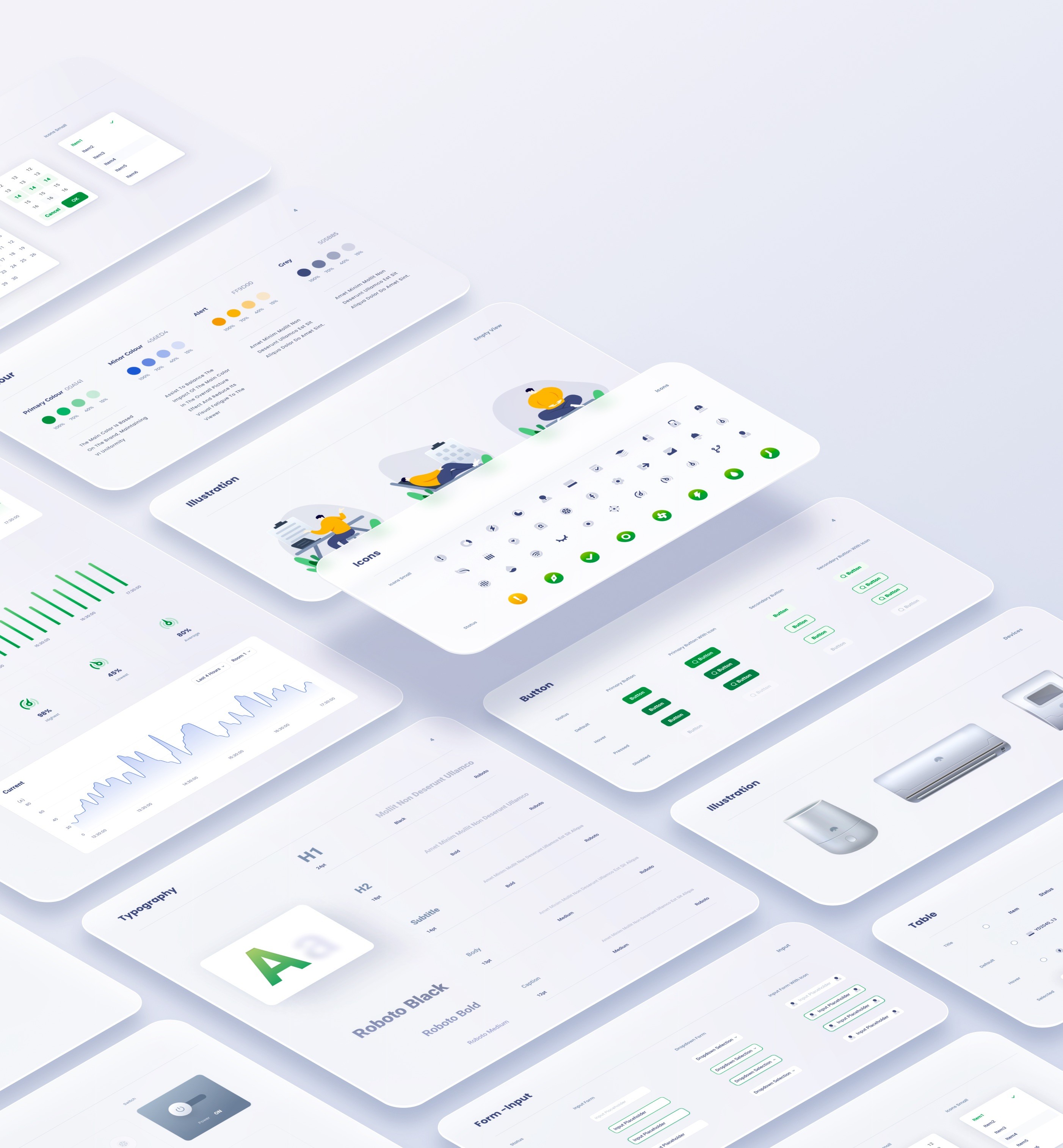
Design systems are made of many components, patterns, styles, and guidelines, which can help operationalize and optimize your design efforts.
12


big banyan -EPMS design
Project
uI / UX Designer
My Role
August 2022
time
site b
site b
site b


site a
site b
site b
site b
site b
site b
site b
site b


site a
site b

health
site b
workplace 1
work place 2
workplace 3

room 1
room 2
room 3

electricity
temperature
humid

device
graph
journals

control
status
filter
graph
key data
filter
table
overview
reports
site management
alarm
device
profile

site b
site b


Solution
Following a detailed examination of the monitoring backend's information architecture, several difficulties emerged.
Problems
Due to the site page's high utility frequency and the need to simplify its structure, we focused on teasing out its information architecture.
Information Architecture
Users are unable to distinguish between adjustable items and monitoring data due to the ambiguous information hierarchy.
Users have difficulty in navigating because of deep information hierarchy.
The monitoring backend requires customising. Therefore, extensibility of sites , surveillance objects and devices , has to be considered throughout the design process.
what is the project?
The Big Banyan is an environment monitoring and control system for factories, equipment rooms, and any other workplaces that require a stable operating environment. The complete system consists of a collection of devices, servers and a monitoring backend - the Environment and Power Monitoring System (EPMS). This project focuses on the design of the monitoring backend (EPMS) to improve data processing efficiency.
In the physical world, objects can be stacked or attached, and humans tend to interact with the nearest object. On the basis of this behaviour research, the content of EPMS will ba organised along the z-axis according to the user task’s urgency.


Organise content according to its information hierachry, the higher to right, the lower to left.
X axis
Organise content according to its information hierachry, the higher to bottom, the lower to top
y axis
01
Z axis
The z axis represents the depth of the content.
task processing area
Including details of a journal, transient task and control panel.
major information browsing area
Including journals, graphs and overview of all key data.
navigation
The navigation works as the first step for users to start a task
The EPMS content is organised into three sections based on the user behaviour research:
navigation
major processing area
task processing area.
Hierarchy Optimization
When devising the navigation, the pivotal principle is to guide users to the destination in the least frustrating way. Theoretically, it means decreasing user load ( consisting of cognitive load, visual load and action load). The primary goal of this navigation design is to reduce the visual load.
02

03
02
01
depth of information
fixed sidebar
The fixed sidebar facilitates users’ navigation between different sites.

Traditional Tree-structure navigation
After we researched the preliminary version of this project, the sidebar at site page adopted a traditional tree-structure navigation.
The main advantage is the navigation can contain abundant selections with limited space, however, excessive unfolded tabs cause difficulty in navigating
Optimized
flat navigation
To reduce the visual load , the entire navigation is divided into several vertically-distributed chunks . According to the progressive disclourse principle, only the relevant information emerges when users scroll to the section. Consequently, the lengthy and complex task is completed by a series of simple tasks.
usability

depth of information

01
02
03
04
05

before

optimized


The usability shrinks as navigation hierarchy increases

The usability remains stable as navigation hierarchy increases
NavigationDesign
Modular design is about breaking down a design into small parts (modules), creating them independently, and then later combining them into a larger system.Because of their modularity, parts of these systems can be exchanged, added, removed and rearranged. This is great for consumers because they get to customize the system to fit their needs.
03
Modular for responsive design
Sections here are the collections of organised modules basing on the function. For instance, a device’s control section contains the its status info, mode selections and so on.
Pages here are arranged and combined functional sections according to the requirements of a user’s task.
Modules here are the smallest functional units, including switches, control unit, status block, etc.
At mobile view, the nav will be folded , only appearing when triggering the hamburger icon. The task section will be seperated into an independent page.
desktop
tablet
mobile
When the screen width is limited, dynamic layout can be achieved by altering the arrangement of modules or their position along the z-axis.
At desktop view, all sections can be tiled along the x axis.
At tablet view, task section is transient and emergs only when triggered
ModularDesign

Typography is critical in establishing hierarchy ,and it requires readability on all conditions.


H1
24pt
black
Roboto
H2
18pt
Bold
roboto
subtitle
14pt
Bold
roboto
Body
13pt
medium
roboto
Caption
12pt
medium
roboto

secondary colour
456ED4
100%
70%
40%
15%
On the colour wheel, the minor colour is chosen at a 90-degree angle from the major colour. This method adds a bit more dyanmic without losing elegance.
alert
FF9D00
100%
70%
40%
15%
Alert colour for alarms and errors
grey
505B85
100%
70%
40%
15%
The grey and its variants is utilised in font for expressing hierarchy.
Primary colour
00A141
100%
70%
40%
15%
The parimary colour and its variants derive from the brand idenity.
Overview
06
Via Modular design , a series of standardized charts and graphs can be rearranged and combined according to the customer’s requirements.
07
site
management
Device
Remote control panel mimics the physical one, for a better affordance and user-friendly experience.


journal
Working journals are well-organized and straightforward.


graphs
Well-designed graphs inform users of the data fluctuations over time , minimalist and data-oriented.


Due to hierarchy optimization and flat navigation, the site page divides a user's lengthy and difficult activity into a series of simple tasks that can be accomplished with minimal effort, resulting in a seamless and consistent user experience.


The calendar page serves as a hub of all devices’ operation journals and schedules.
08

Calendar Page
09
Devie configuration, installation, and status checking are all as simple as a click.
Device Management
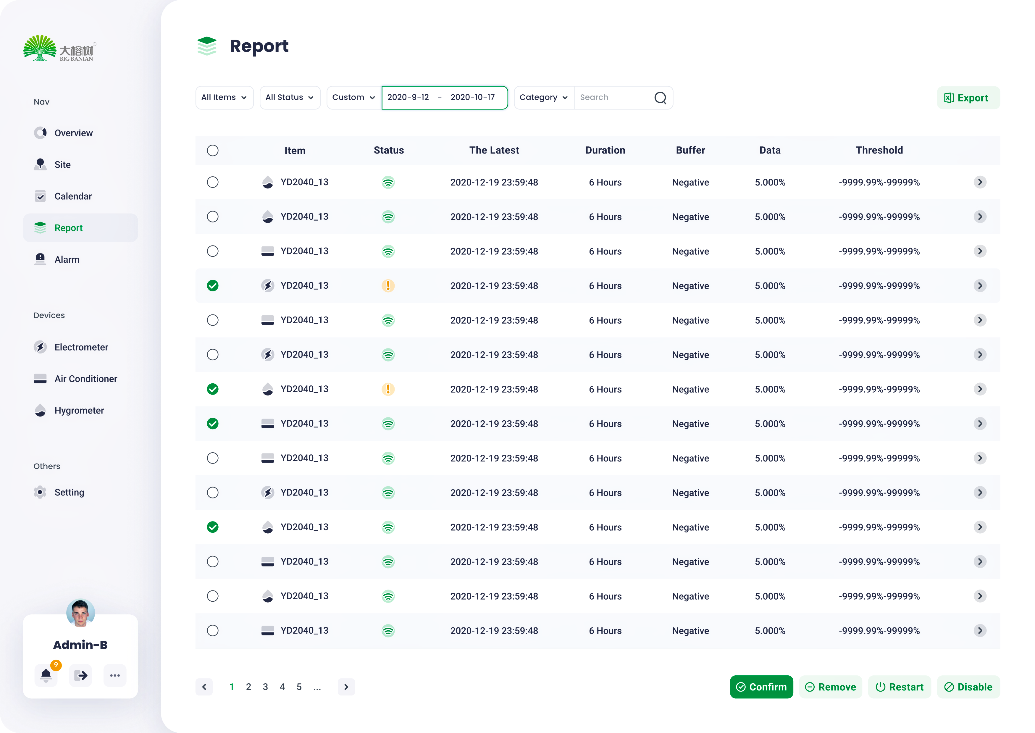
10
Report
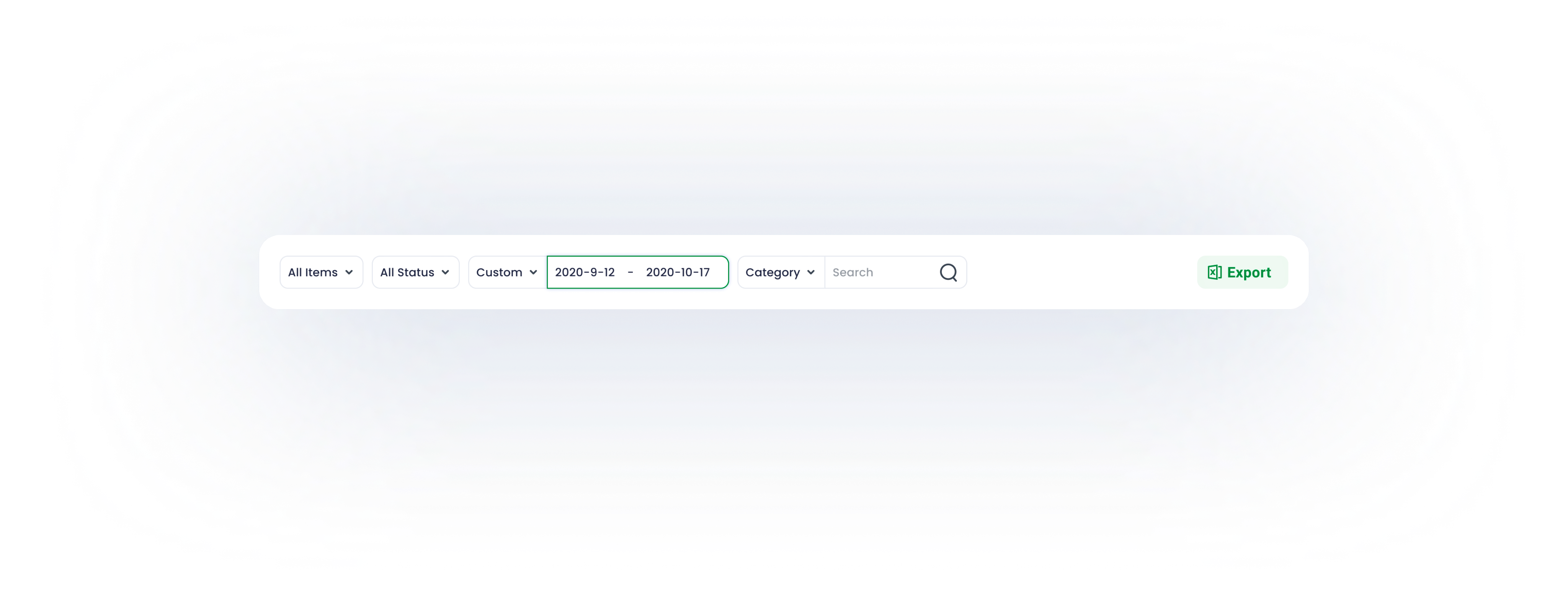
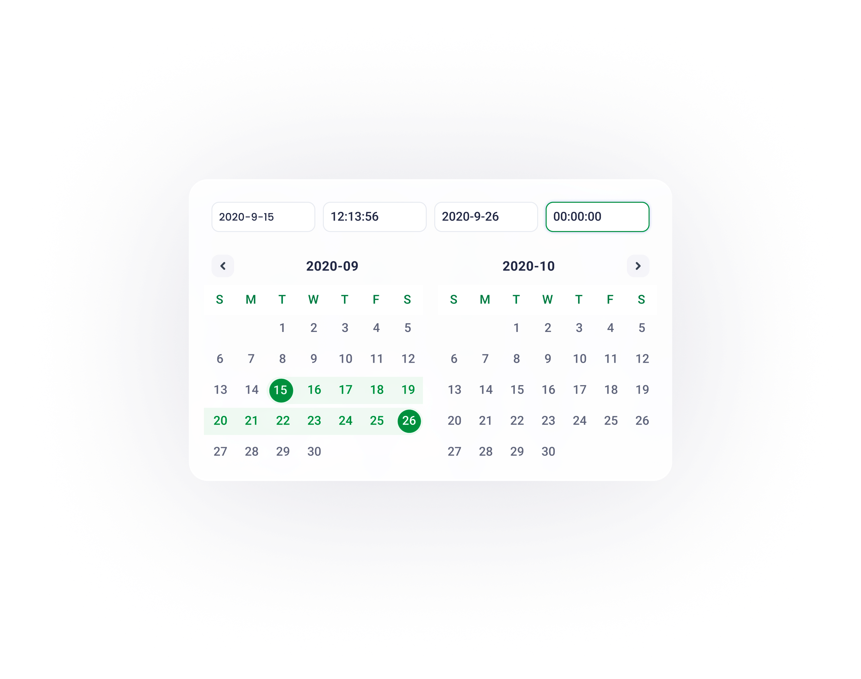
Top level filter enables users to obtain data basing on their requirements
11

Due to the modular design method, the login page fits all screen sizes.
Design systems are made of many components, patterns, styles, and guidelines, which can help operationalize and optimize your design efforts.
12


big banyan -EPMS design
Project
uI / UX Designer
My Role
August 2022
time
site b
site b
site b


site a
site b
site b
site b
site b
site b
site b
site b


site a
site b

health
site b
workplace 1
work place 2
workplace 3

room 1
room 2
room 3


electricity
temperature
humid


device
graph
journals

control
status
filter
graph
key data
filter
table
overview
reports
site management
alarm
device
profile

site b
site b


Solution
Problems
Following a detailed examination of the monitoring backend's information architecture, several difficulties emerged.
Information Architecture
Due to the site page's high utility frequency and the need to simplify its structure, we focused on teasing out its information architecture.
Users are unable to distinguish between adjustable items and monitoring data due to the ambiguous information hierarchy.
Users have difficulty in navigating because of deep information hierarchy.
The monitoring backend requires customising. Therefore, extensibility of sites , surveillance objects and devices , has to be considered throughout the design process.
what is the project?
The Big Banyan is an environment monitoring and control system for factories, equipment rooms, and any other workplaces that require a stable operating environment. The complete system consists of a collection of devices, servers and a monitoring backend - the Environment and Power Monitoring System (EPMS). This project focuses on the design of the monitoring backend (EPMS) to improve data processing efficiency.
In the physical world, objects can be stacked or attached, and humans tend to interact with the nearest object. On the basis of this behaviour research, the content of EPMS will ba organised along the z-axis according to the user task’s urgency.


Organise content according to its information hierachry, the higher to right, the lower to left.
X axis
Organise content according to its information hierachry, the higher to bottom, the lower to top
y axis
01
Z axis
The z axis represents the depth of the content.
task processing area
Including details of a journal, transient task and control panel.
major information browsing area
Including journals, graphs and overview of all key data.
navigation
The navigation works as the first step for users to start a task
The EPMS content is organised into three sections based on the user behaviour research:
navigation
major processing area
task processing area.
Hierarchy Optimization
When devising the navigation, the pivotal principle is to guide users to the destination in the least frustrating way. Theoretically, it means decreasing user load ( consisting of cognitive load, visual load and action load). The primary goal of this navigation design is to reduce the visual load.
02

01
03
02
depth of information
fixed sidebar
The fixed sidebar facilitates users’ navigation between different sites.

Traditional Tree-structure navigation
After we researched the preliminary version of this project, the sidebar at site page adopted a traditional tree-structure navigation.
The main advantage is the navigation can contain abundant selections with limited space, however, excessive unfolded tabs cause difficulty in navigating
Optimized
flat navigation
To reduce the visual load , the entire navigation is divided into several vertically-distributed chunks . According to the progressive disclourse principle, only the relevant information emerges when users scroll to the section. Consequently, the lengthy and complex task is completed by a series of simple tasks.
usability

depth of information

01
02
03
04
05

before

optimized


The usability shrinks as navigation hierarchy increases

The usability remains stable as navigation hierarchy increases
NavigationDesign
Modular design is about breaking down a design into small parts (modules), creating them independently, and then later combining them into a larger system.Because of their modularity, parts of these systems can be exchanged, added, removed and rearranged. This is great for consumers because they get to customize the system to fit their needs.
03
Modular for responsive design
Modules here are the smallest functional units, including switches, control unit, status block, etc.
Sections here are the collections of organised modules basing on the function. For instance, a device’s control section contains the its status info, mode selections and so on.
Pages here are arranged and combined functional sections according to the requirements of a user’s task.
At mobile view, the nav will be folded , only appearing when triggering the hamburger icon. The task section will be seperated into an independent page.
When the screen width is limited, dynamic layout can be achieved by altering the arrangement of modules or their position along the z-axis.
desktop
tablet
mobile
At desktop view, all sections can be tiled along the x axis.
At tablet view, task section is transient and emergs only when triggered
ModularDesign

Typography is critical in establishing hierarchy ,and it requires readability on all conditions.


H1
24pt
black
Roboto
H2
18pt
Bold
roboto
subtitle
14pt
Bold
roboto
Body
13pt
medium
roboto
Caption
12pt
medium
roboto

secondary colour
456ED4
100%
70%
40%
15%
On the colour wheel, the minor colour is chosen at a 90-degree angle from the major colour. This method adds a bit more dyanmic without losing elegance.
alert
FF9D00
100%
70%
40%
15%
Alert colour for alarms and errors
grey
505B85
100%
70%
40%
15%
The grey and its variants is utilised in font for expressing hierarchy.
Primary colour
00A141
100%
70%
40%
15%
The parimary colour and its variants derive from the brand idenity.
Overview
06
Via Modular design , a series of standardized charts and graphs can be rearranged and combined according to the customer’s requirements.
07
site
management

Device
Remote control panel mimics the physical one, for a better affordance and user-friendly experience.


journal
Working journals are well-organized and straightforward.


graphs
Well-designed graphs inform users of the data fluctuations over time , minimalist and data-oriented.


Due to hierarchy optimization and flat navigation, the site page divides a user's lengthy and difficult activity into a series of simple tasks that can be accomplished with minimal effort, resulting in a seamless and consistent user experience.


The calendar page serves as a hub of all devices’ operation journals and schedules.
08

Calendar Page
09
Devie configuration, installation, and status checking are all as simple as a click.
Device Management
10
Report
Top level filter enables users to obtain data basing on their requirements
11

Due to the modular design method, the login page fits all screen sizes.
Design systems are made of many components, patterns, styles, and guidelines, which can help operationalize and optimize your design efforts.
12
