
big banyan -EPMS design
Project
uI / UX Designer
My Role
August 2022
time


site b
site b
site b


site a
site b
site b
site b
site b
site b
site b
site b


site a
site b

health
site b
workplace 1
work place 2
workplace 3

room 1
room 2
room 3

electricity
temperature
humid

device
graph
journals

control
status
filter
graph
key data
filter
table
overview
reports
site management
alarm
device
profile

site b
site b


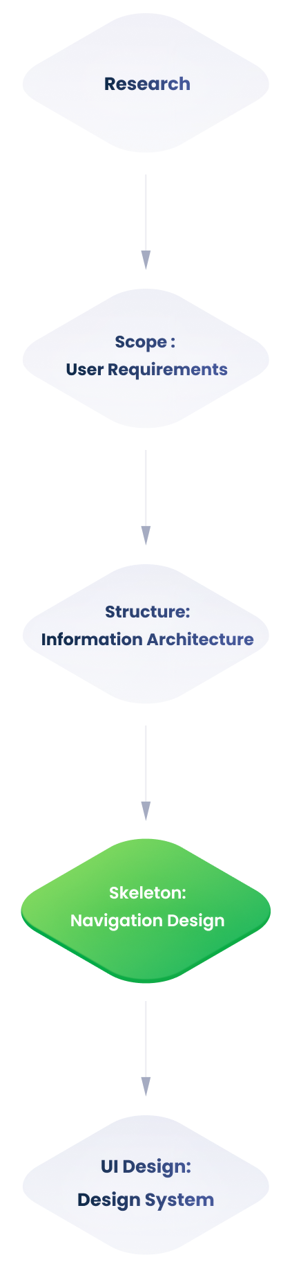
Solution
在对监控后端的信息架构进行全面梳理后,出现了若干难点
Problems
因首页使用频率极高且需简化结构,我们重点对其信息架构进行梳理与优化。
Information Architecture
由于信息层级模糊,用户无法区分可调整选项与监控数据
由于信息层级过深,用户在浏览界面时遇到了困难
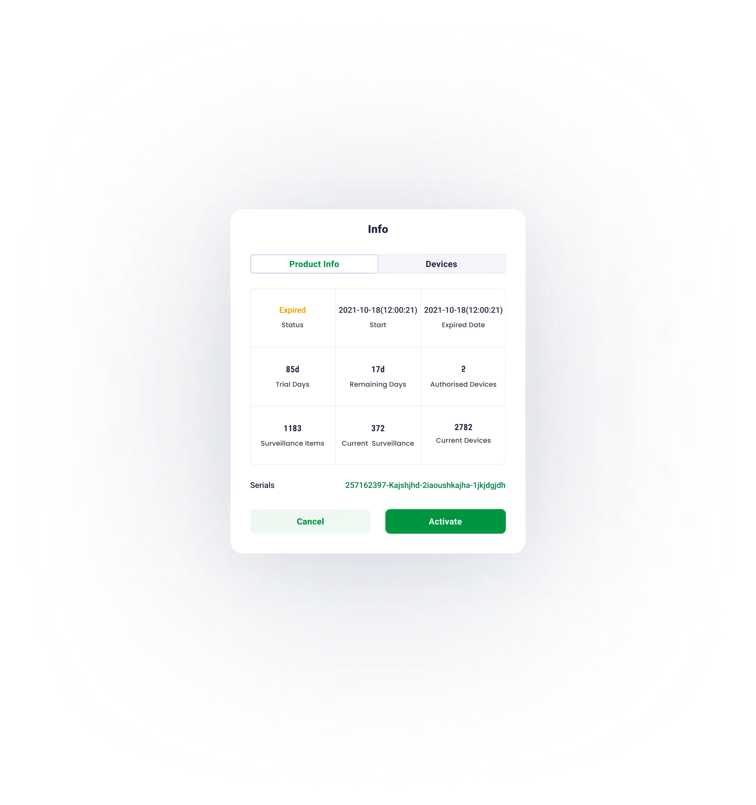
监控后端需要定制化。因此,在整个设计过程中,必须考虑站点、监控对象及设备的可扩展性。
what is the project?
Big Banyan是一款面向工厂、设备机房及所有需要稳定运行环境的工作场所的环境监控与控制系统。
该完整系统由设备集群、服务器与监控后端共同构成 —— 即环境与电力监控系统(EPMS)。本项目聚焦于监控后端(EPMS)的设计,旨在提升数据处理效率。
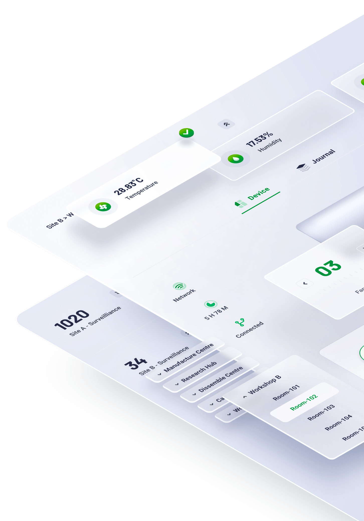
在物理世界中,物体可以被堆叠或挂载,且人类倾向于与最近的物体进行交互。基于此项行为研究,EPMS 的内容将沿着 Z 轴 并根据用户任务的紧急程度进行组织。

按信息层级组织内容 —— 层级越高偏向右,层级越低偏向左
X axis
y axis
按信息层级组织内容 —— 层级越高越靠下,层级越低越靠上
01
Z axis
Z 轴代表UI元素的视觉深度
task processing area
Including details of a journal, transient task and control panel.
major information browsing area
Including journals, graphs and overview of all key data.
navigation
The navigation works as the first step for users to start a task
基于用户行为研究,EPMS 内容被划分为三个部分
导航区
主要视图区
任务处理区

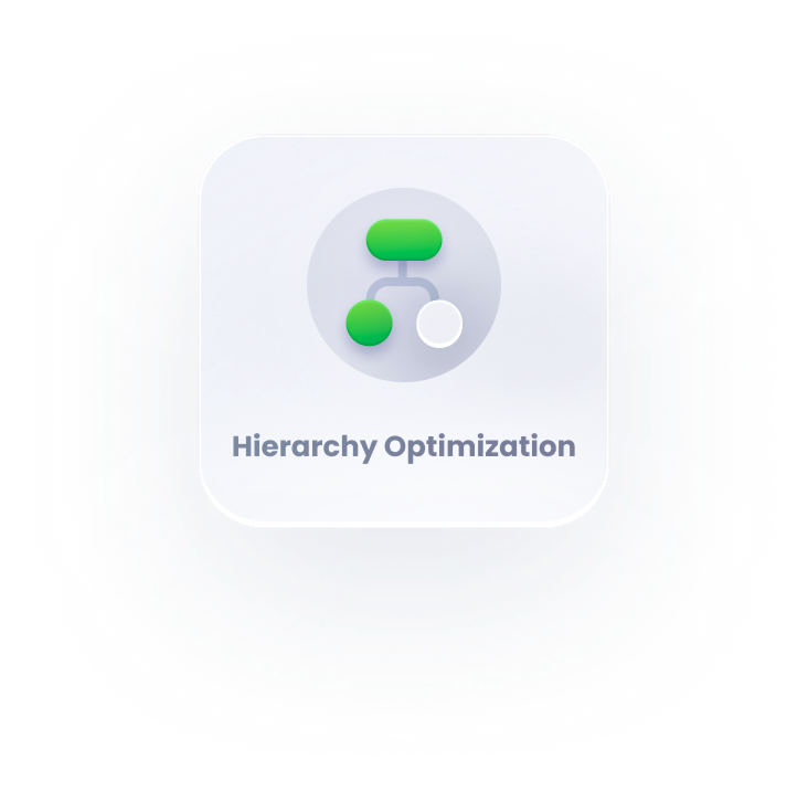
Hierarchy Optimization
设计导航时,核心原则是以最低限度的挫败感引导用户抵达目的地。从理论上讲,这意味着降低用户负荷(包含认知负荷、视觉负荷和动作负荷)。本次导航设计的主要目标是降低视觉负载。
02

03
02
01
depth of information
fixed sidebar
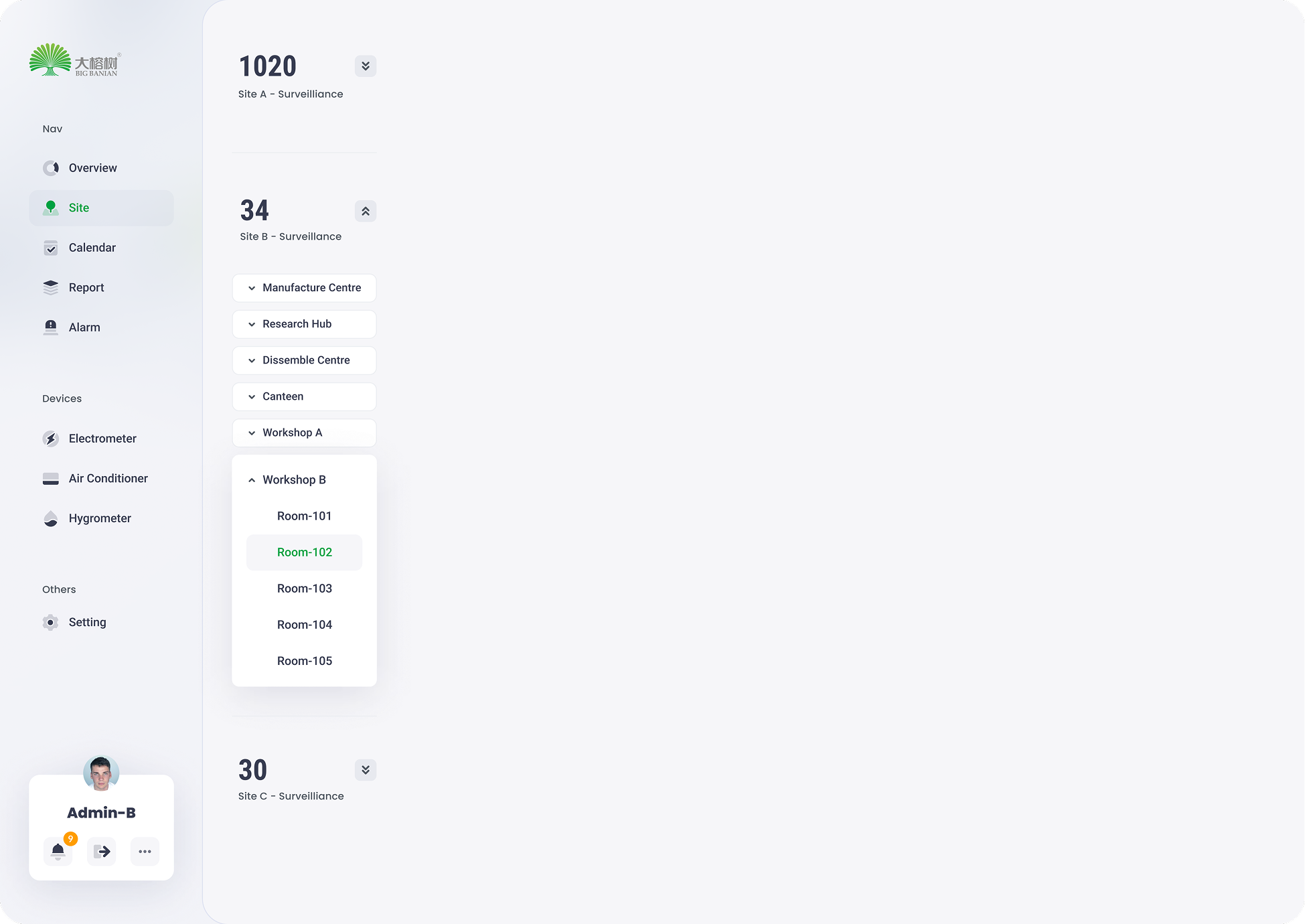
The fixed sidebar facilitates users’ navigation between different sites.

传统树状结构导航
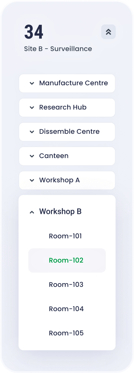
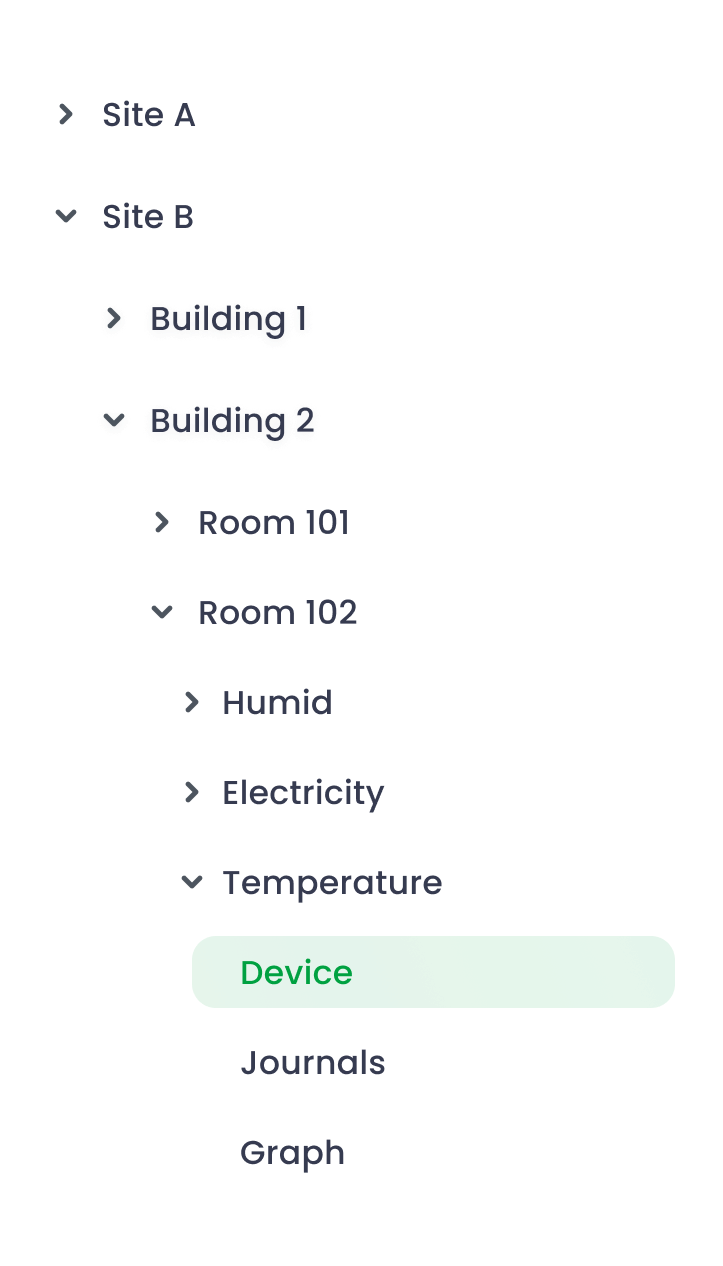
在对该项目初稿进行调研后,我们发现站点页面的侧边栏采用了传统树状结构导航。
其主要优势在于该导航方式能在有限空间内容纳大量选项;然而,过多未展开的标签页导致了导航困难。
优化型扁平化导航
为了降低视觉负载,整个导航被划分为若干垂直分布的模块。根据渐进式披露原则,仅当用户滚动到该区域时才显示相关信息。因此,将这项冗长复杂的任务拆解为一系列简单任务来完成。
usability

depth of information

01
02
03
04
05

before

optimized


The usability shrinks as navigation hierarchy increases

The usability remains stable as navigation hierarchy increases
NavigationDesign
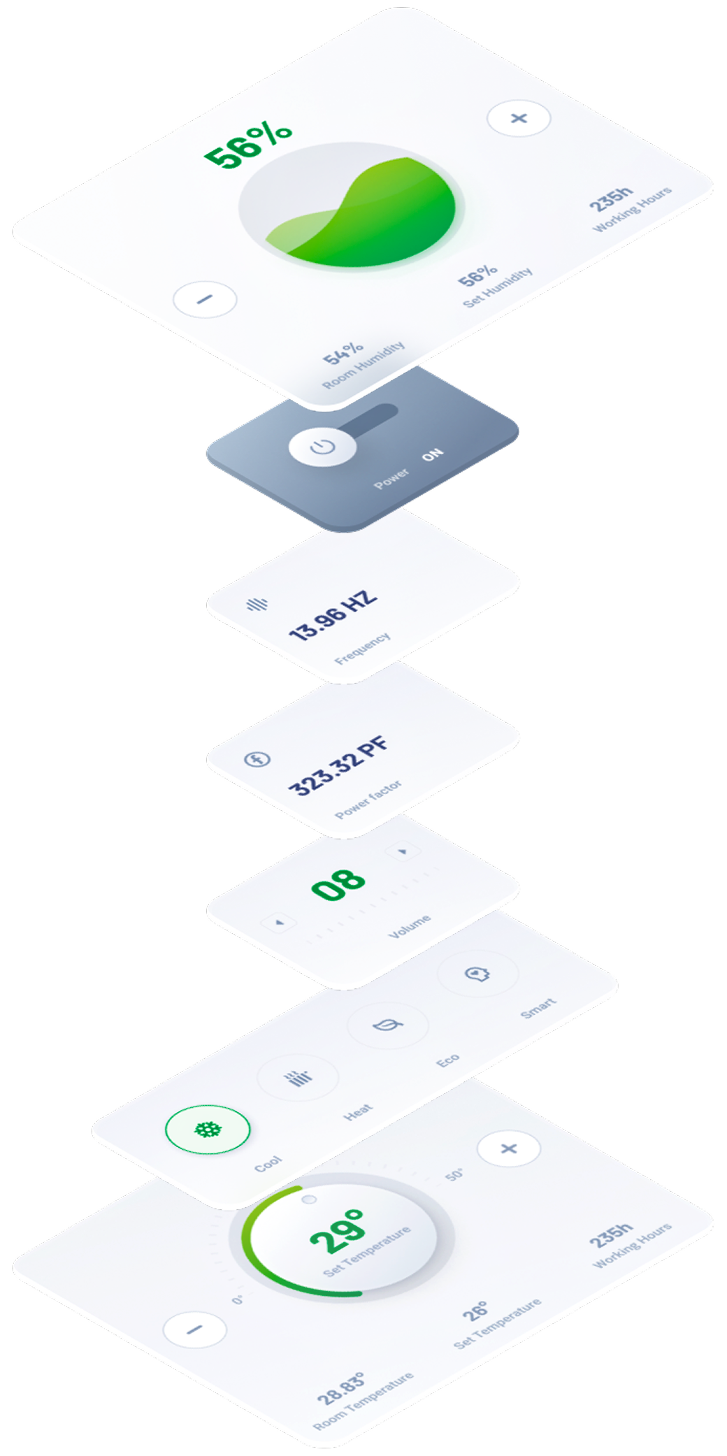
模块化设计是指将一个设计拆解为若干小单元(模块),分别创建这些模块,而后再将它们组合成一个更大的系统。
得益于其模块化特性,系统中的各个部件可以被替换、添加、移除或重新排列。这对用户而言非常有益,因为他们能够根据自身需求定制该系统。
03

Modular for responsive design
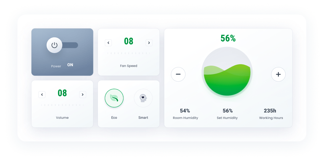
Section指的是基于功能逻辑、由组织有序的模块所构成的集合。例如,某一设备的控制板块包含了设备状态信息、模式选择等内容。
此处的页面,是根据用户任务需求,将各个功能板块排列组合而成的最终呈现。
此处的模块指的是最小的功能单元,包括开关、控制单元、状态块等
At mobile view, the nav will be folded , only appearing when triggering the hamburger icon. The task section will be seperated into an independent page.
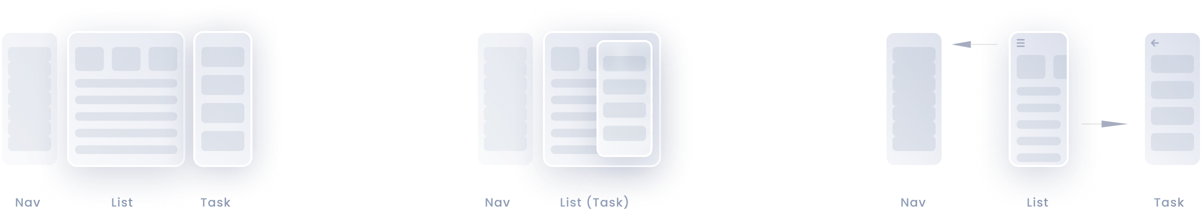
当屏幕宽度受限时,可通过改变模块的排列方式或它们沿 Z 轴的位置来实现动态布局
desktop
tablet
mobile
At desktop view, all sections can be tiled along the x axis.
At tablet view, task section is transient and emergs only when triggered
ModularDesign

Typography is critical in establishing hierarchy ,and it requires readability on all conditions.


H1
24pt
black
Roboto
H2
18pt
Bold
roboto
subtitle
14pt
Bold
roboto
Body
13pt
medium
roboto
Caption
12pt
medium
roboto

secondary colour
456ED4
100%
70%
40%
15%
On the colour wheel, the minor colour is chosen at a 90-degree angle from the major colour. This method adds a bit more dyanmic without losing elegance.
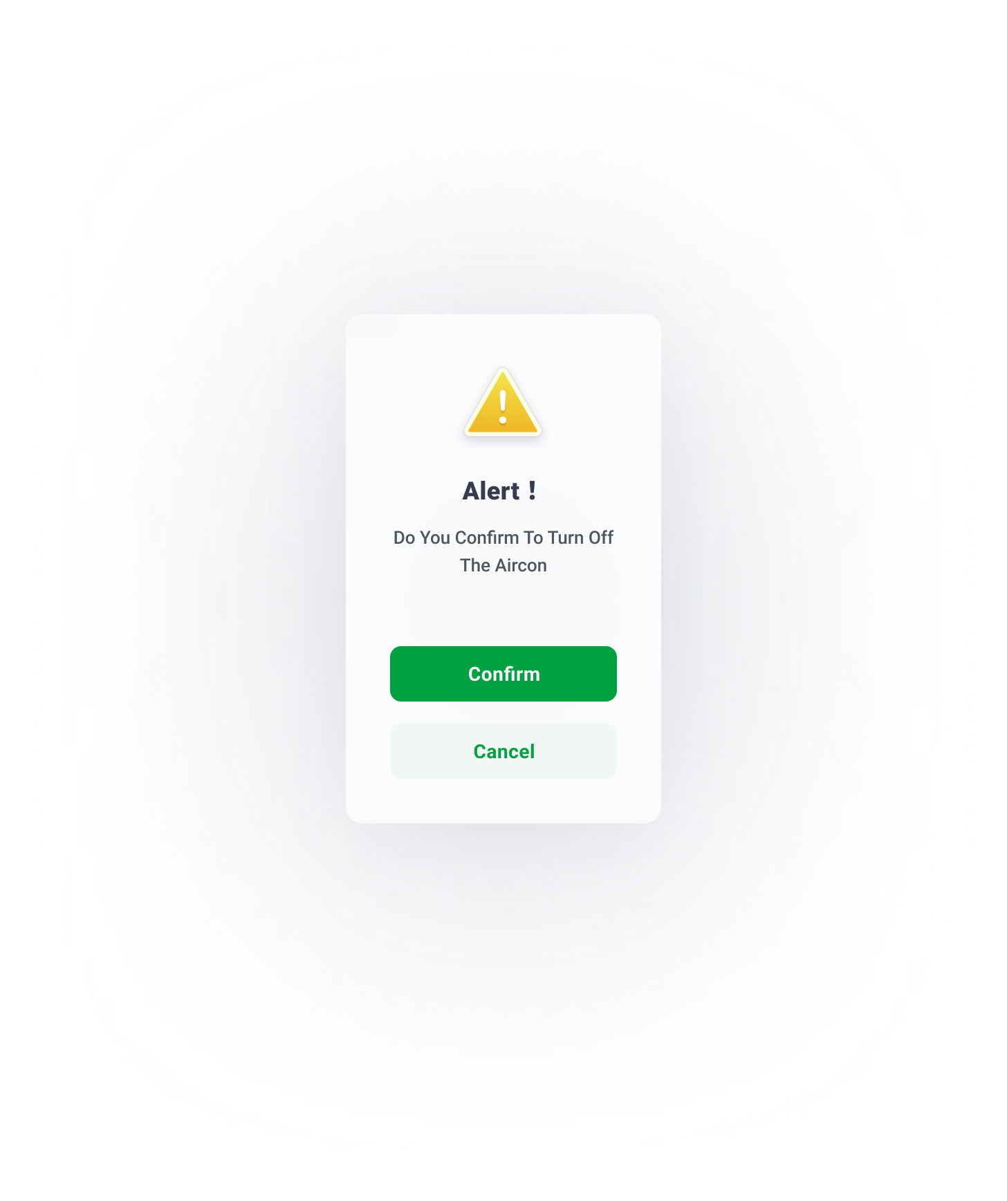
alert
FF9D00
100%
70%
40%
15%
Alert colour for alarms and errors
grey
505B85
100%
70%
40%
15%
The grey and its variants is utilised in font for expressing hierarchy.
Primary colour
00A141
100%
70%
40%
15%
The parimary colour and its variants derive from the brand idenity.
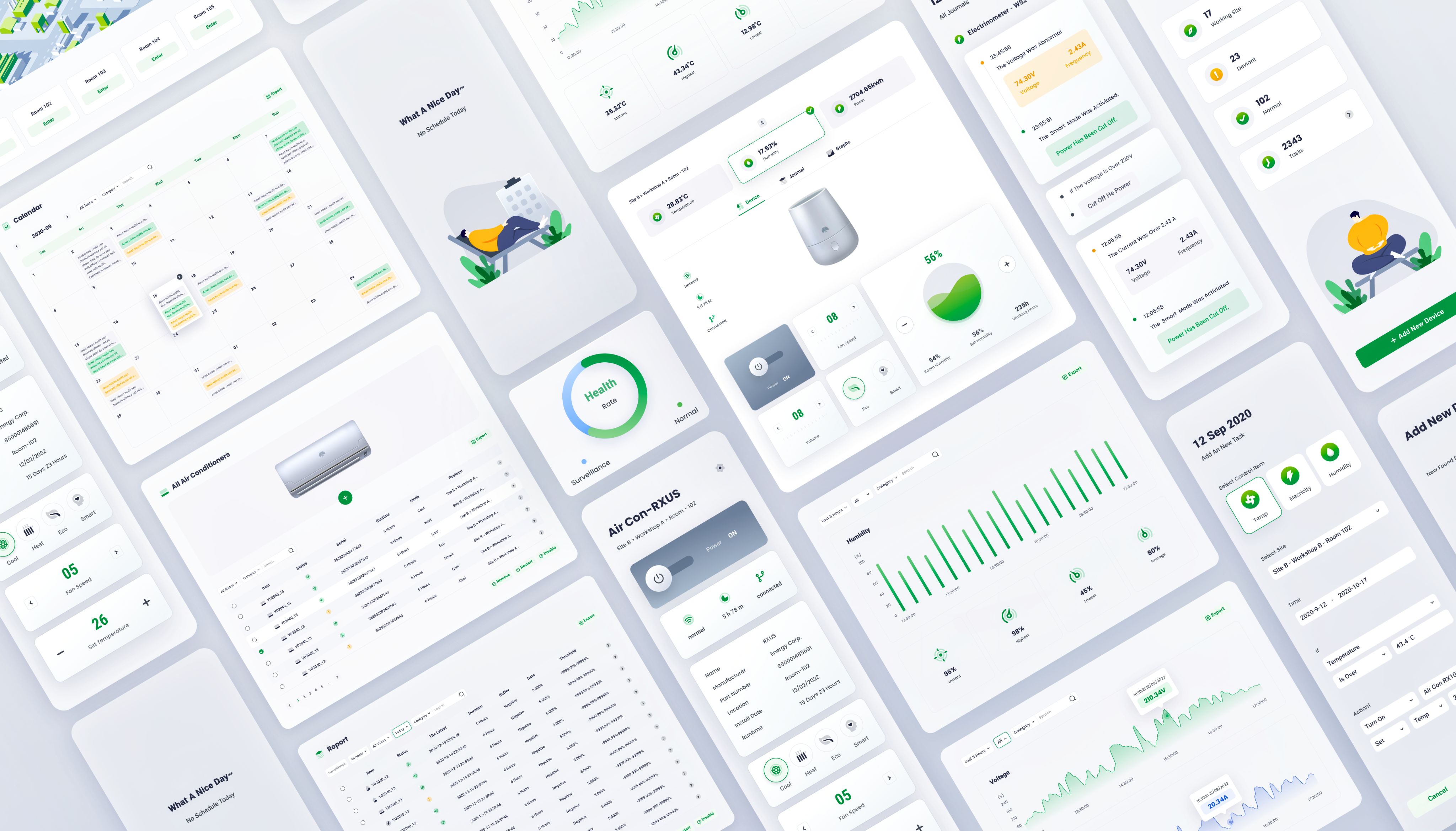
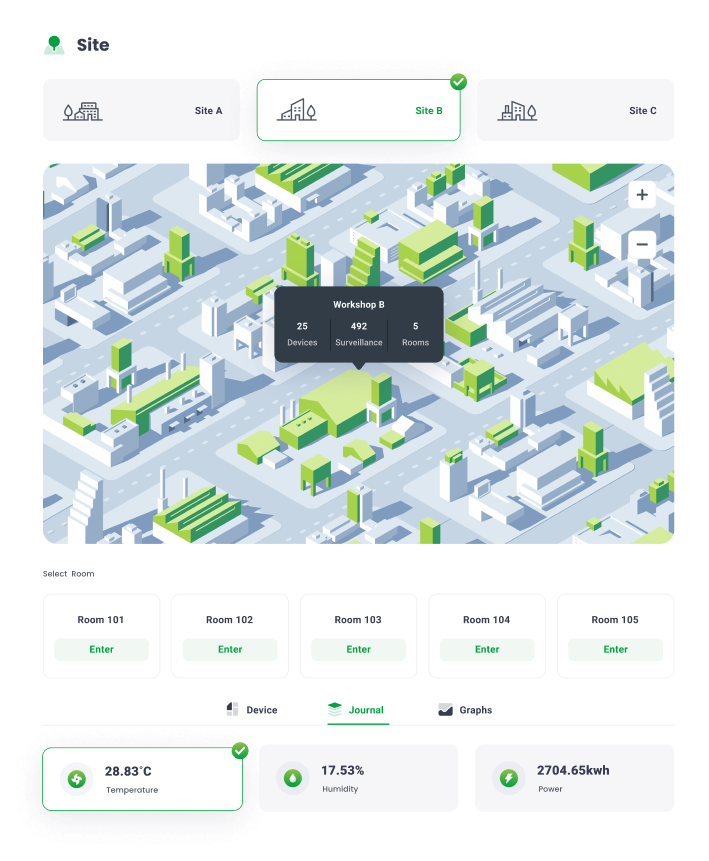
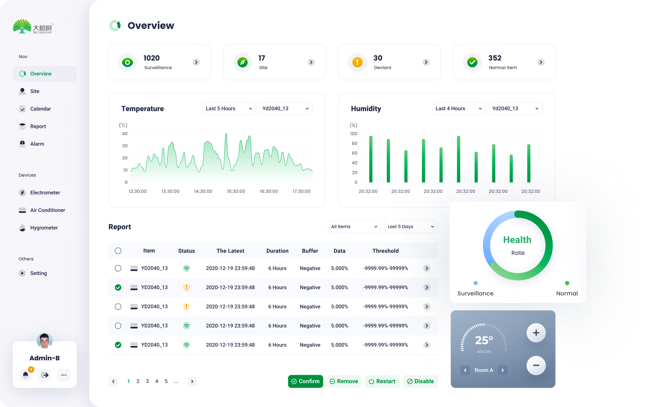
Overview
06
Via Modular design , a series of standardized charts and graphs can be rearranged and combined according to the customer’s requirements.
07
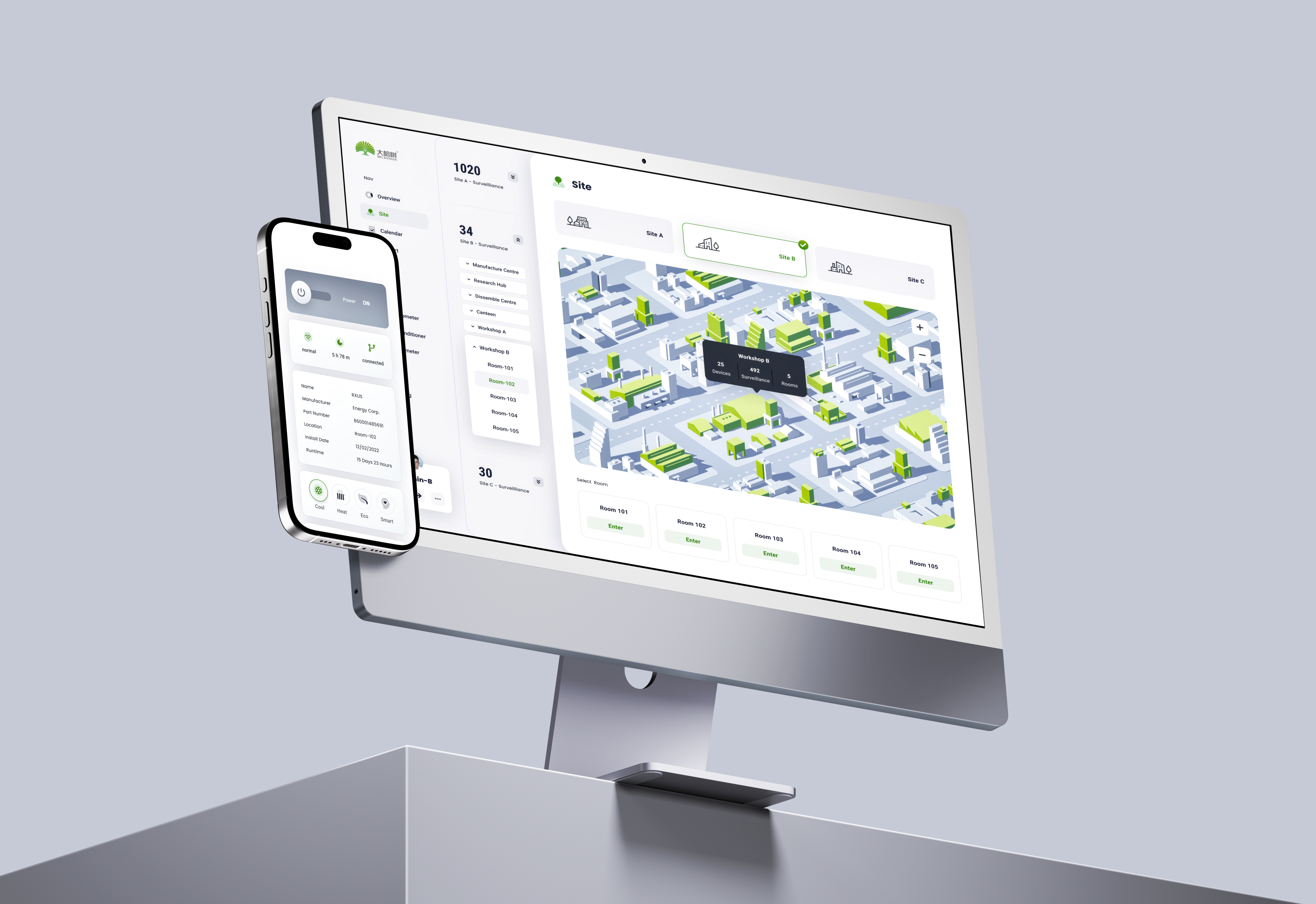
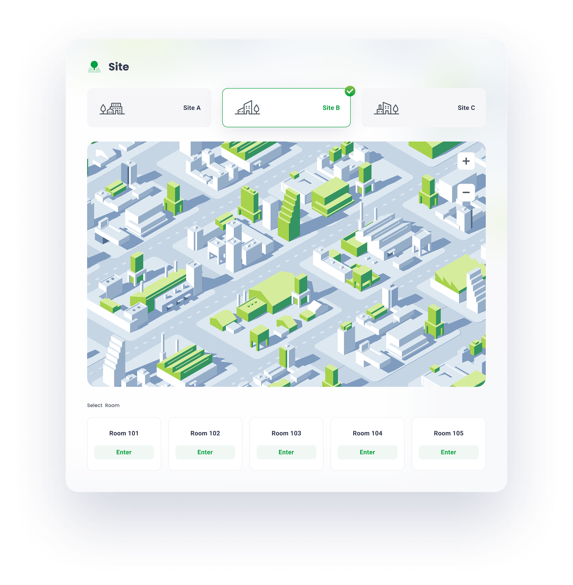
site
management
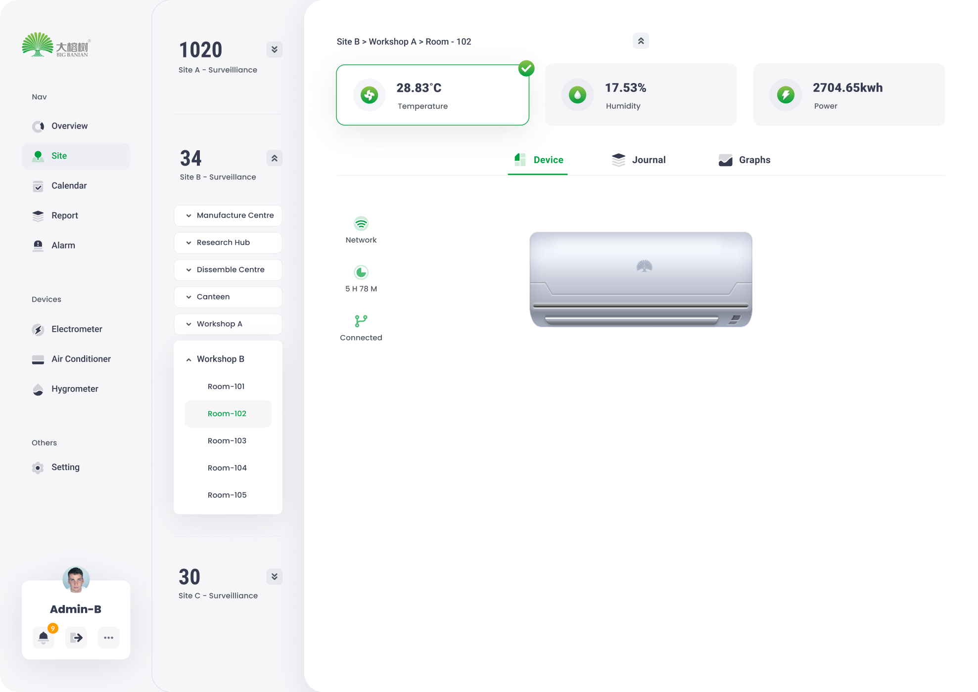
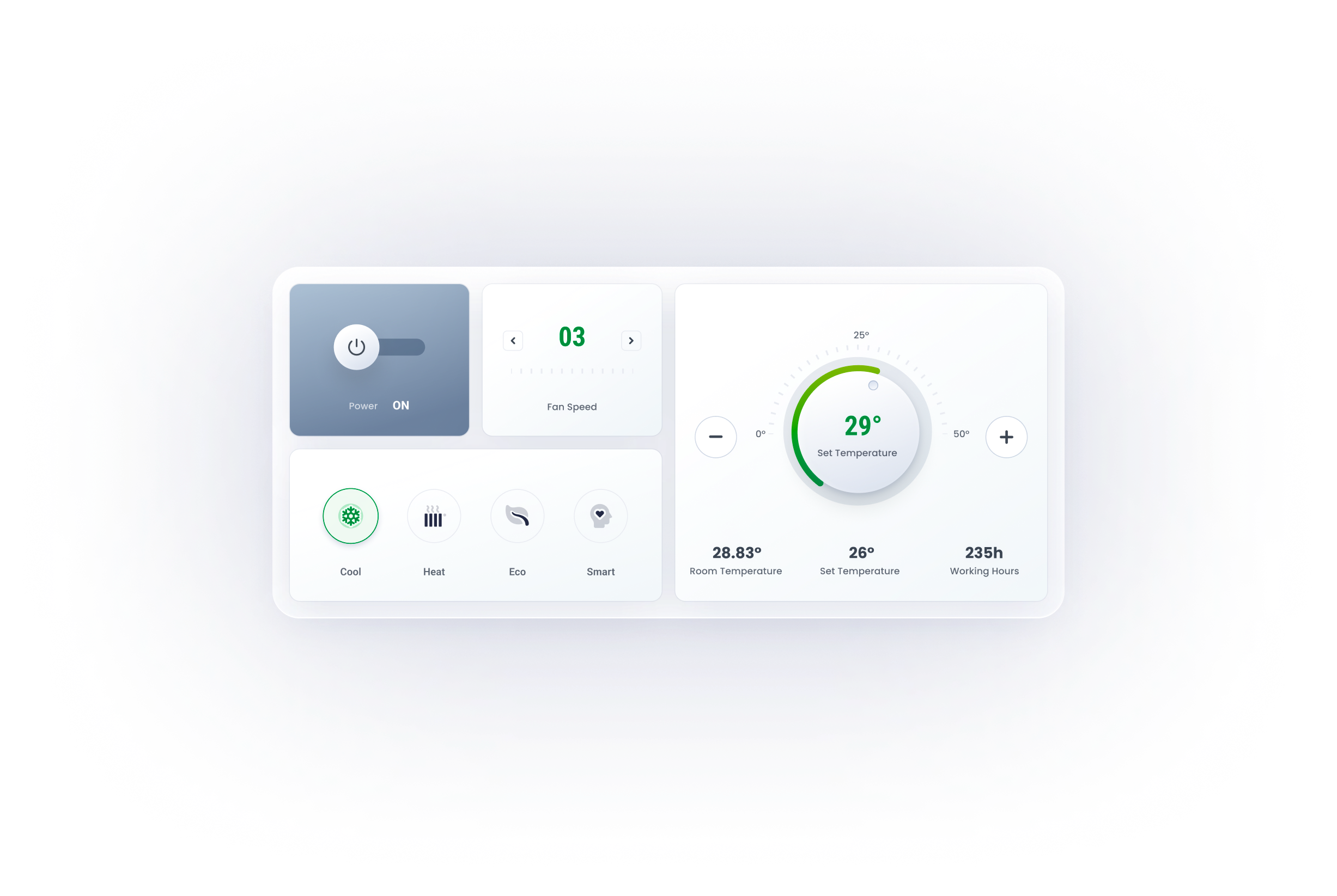
Device
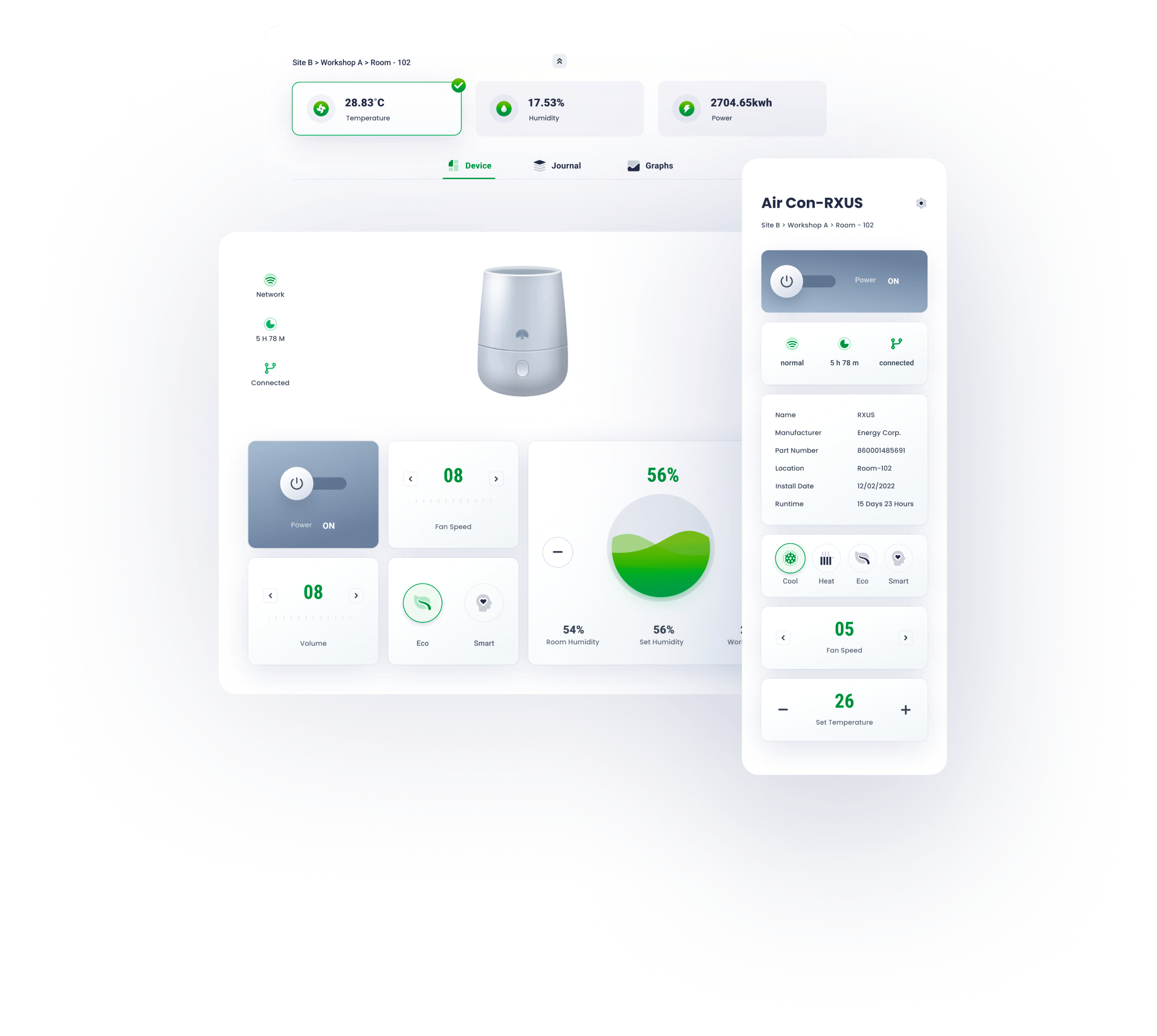
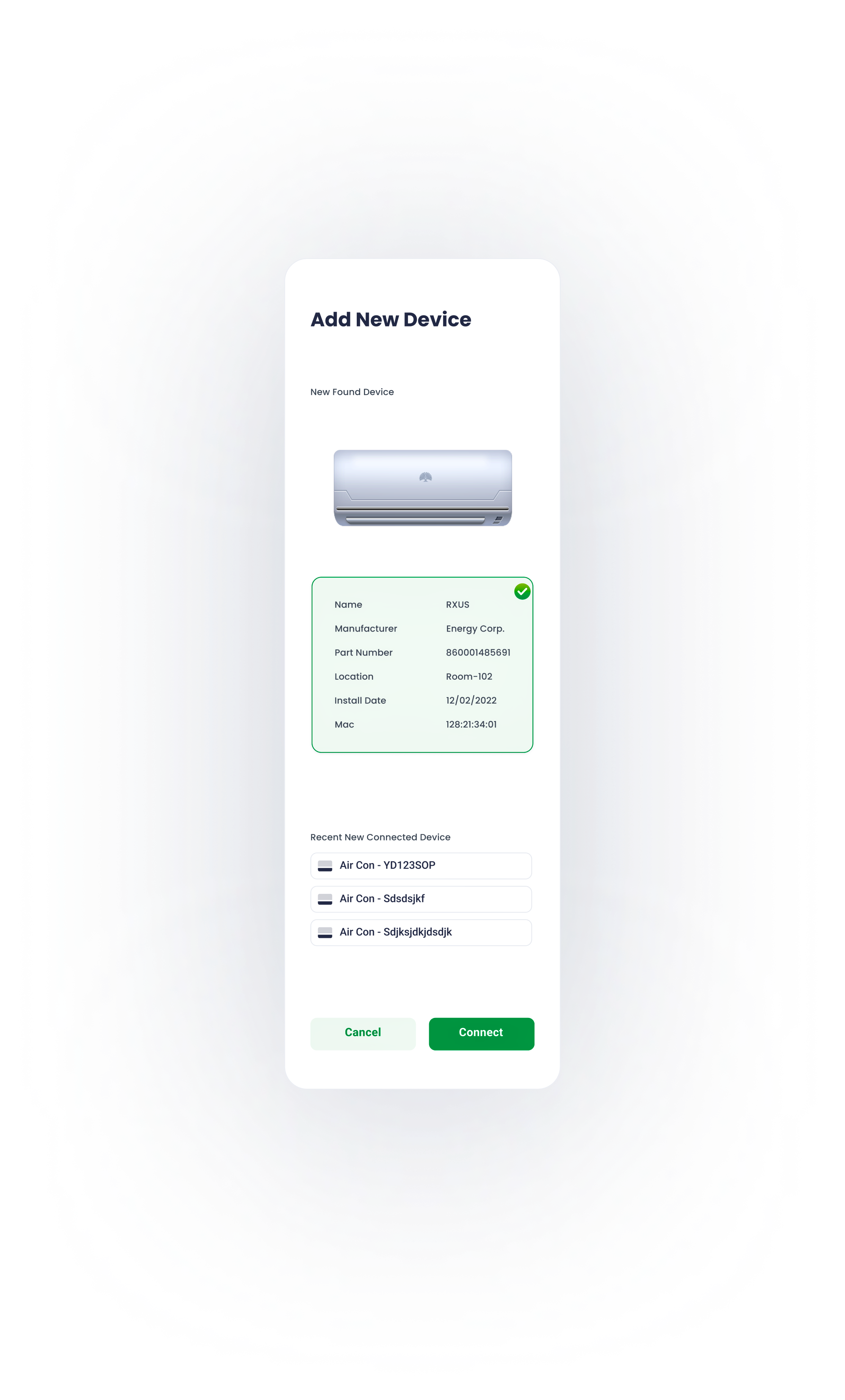
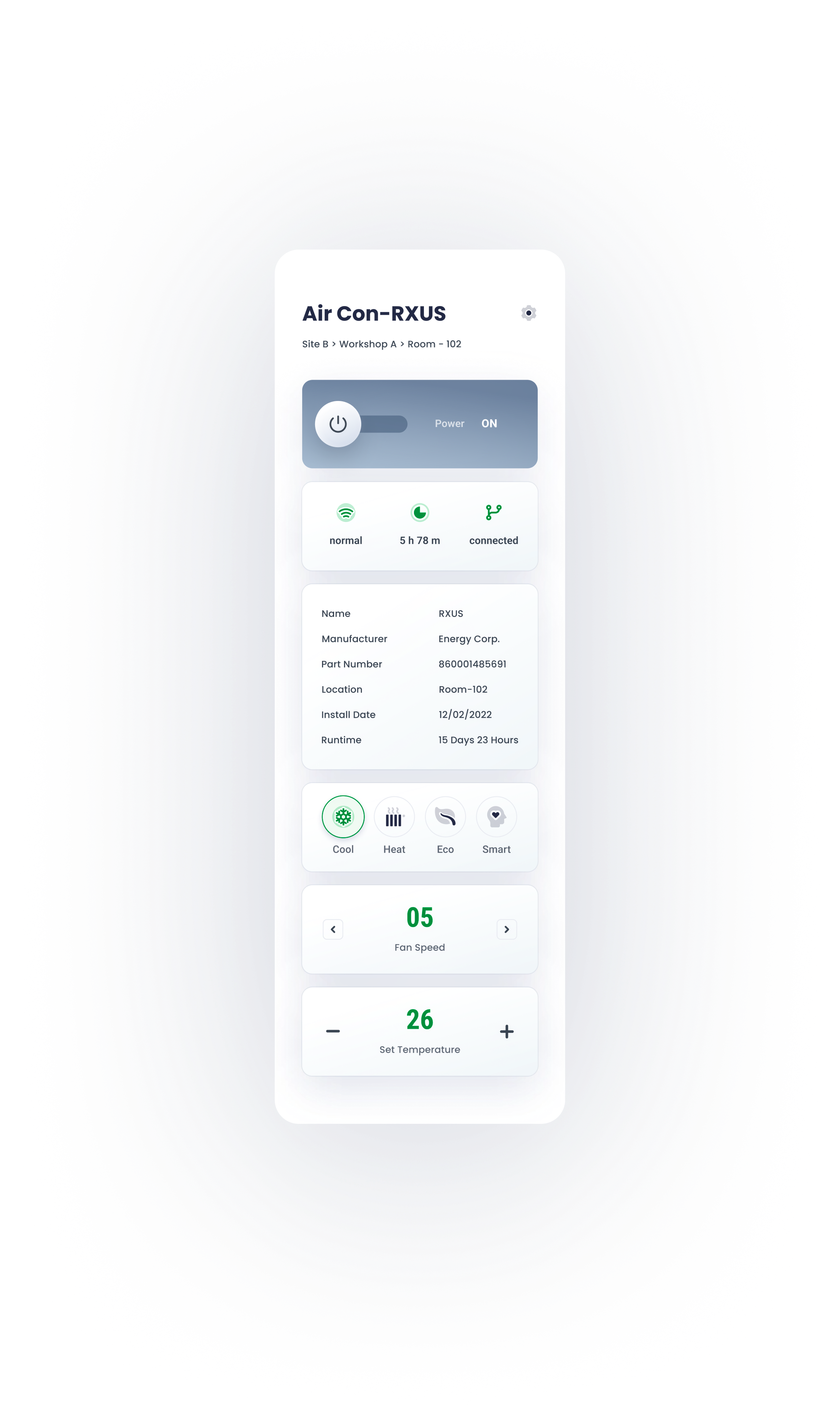
Remote control panel mimics the physical one, for a better affordance and user-friendly experience.


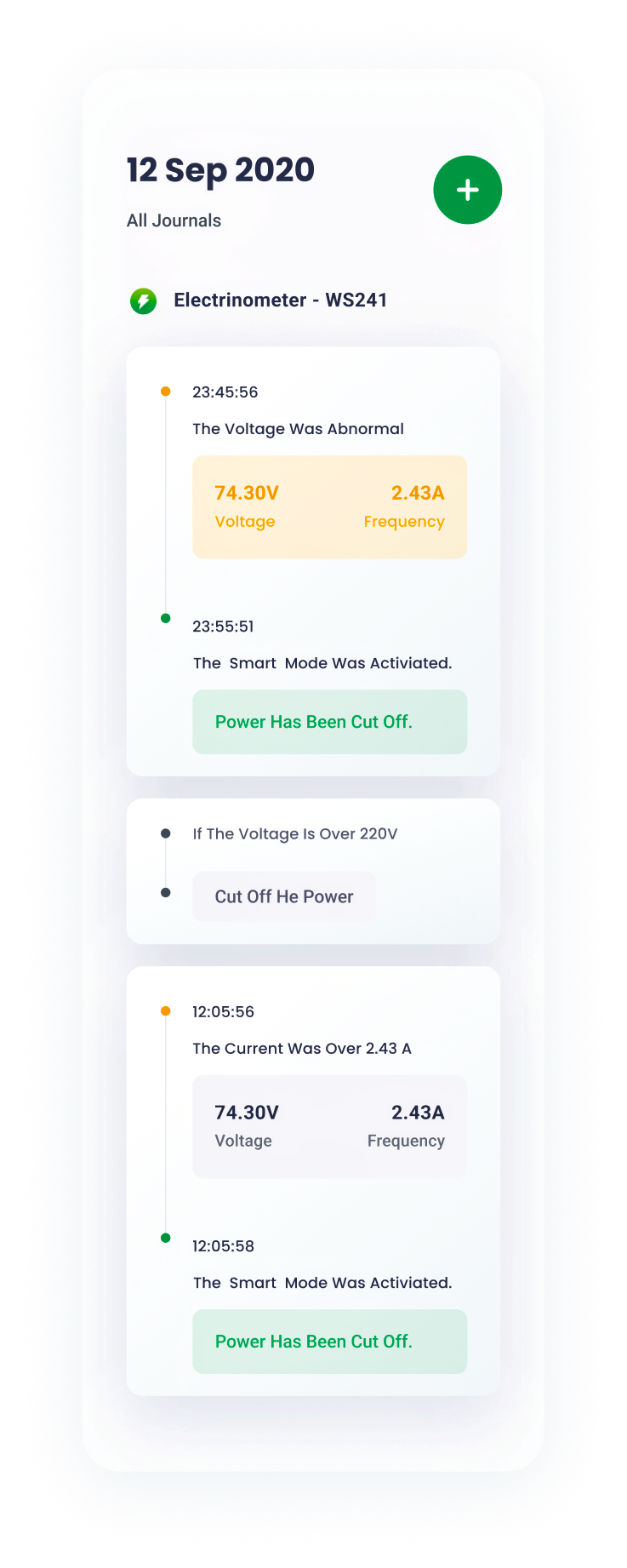
journal
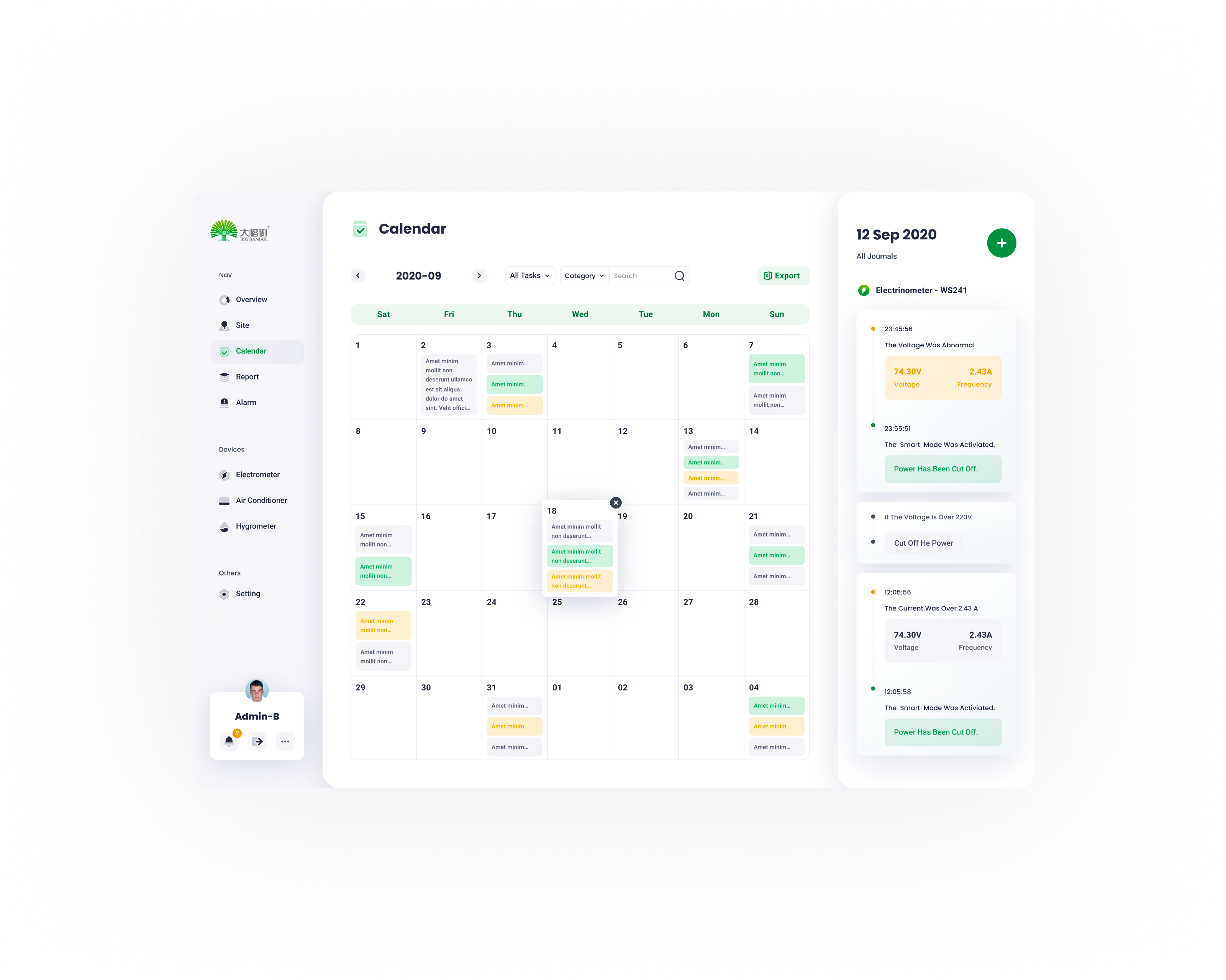
Working journals are well-organized and straightforward.


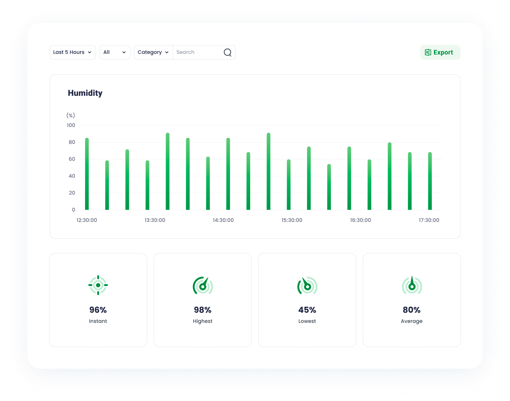
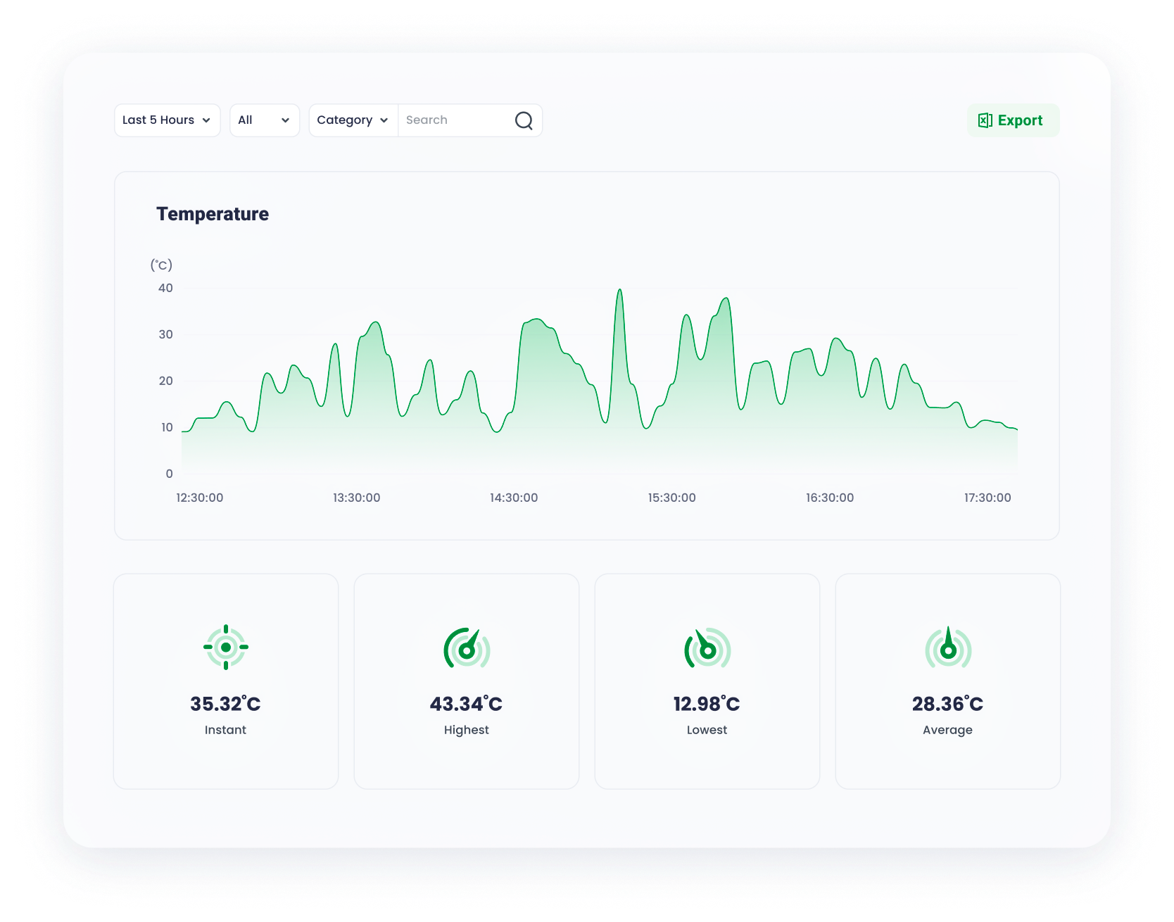
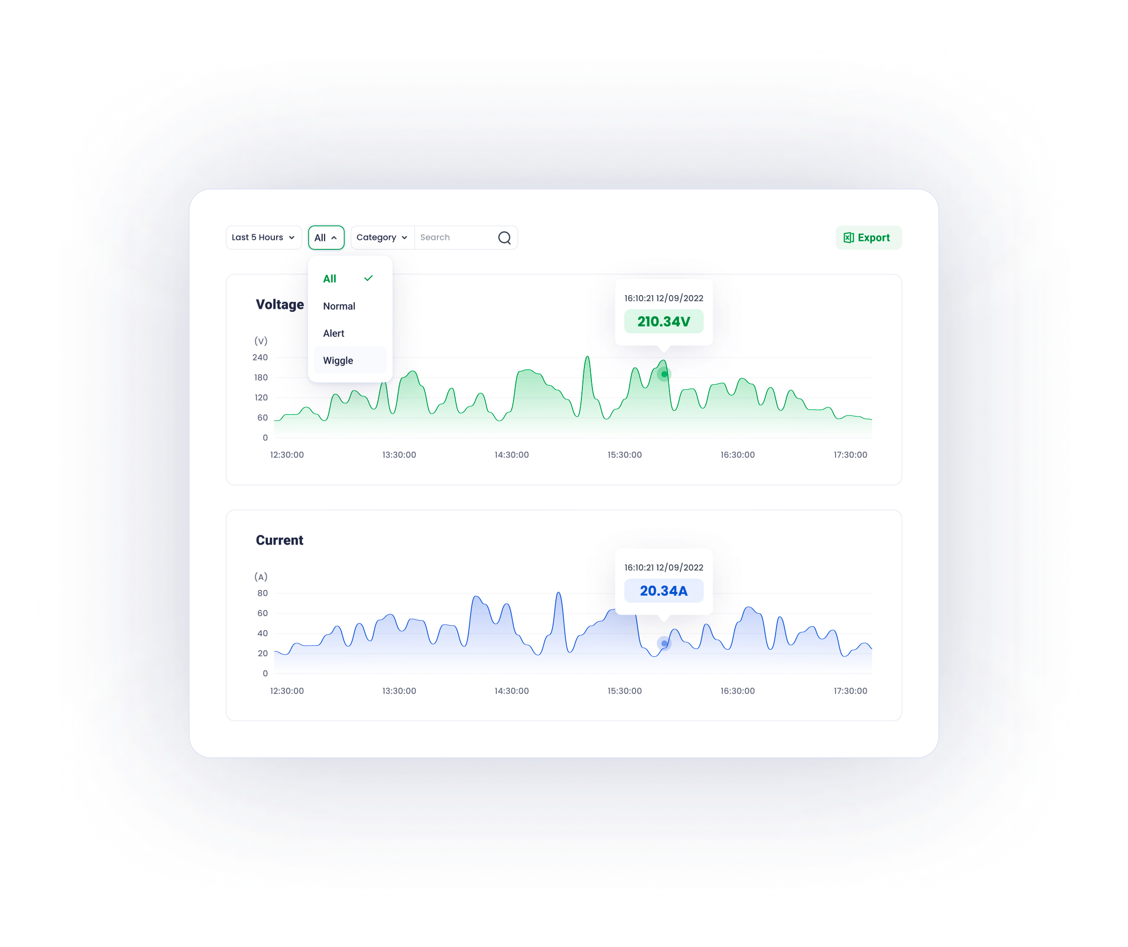
graphs
Well-designed graphs inform users of the data fluctuations over time , minimalist and data-oriented.


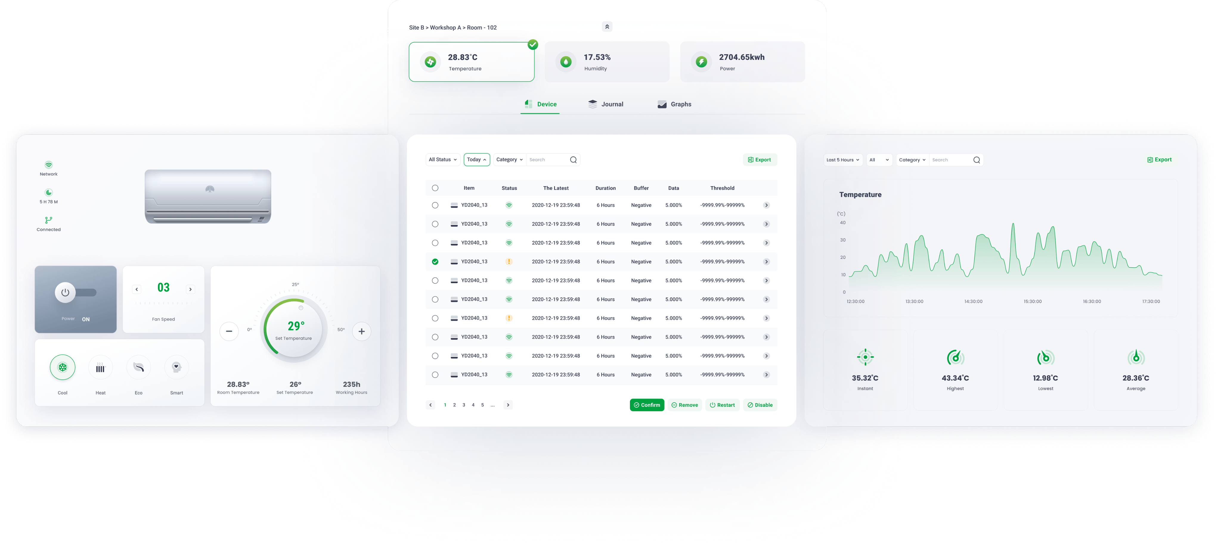
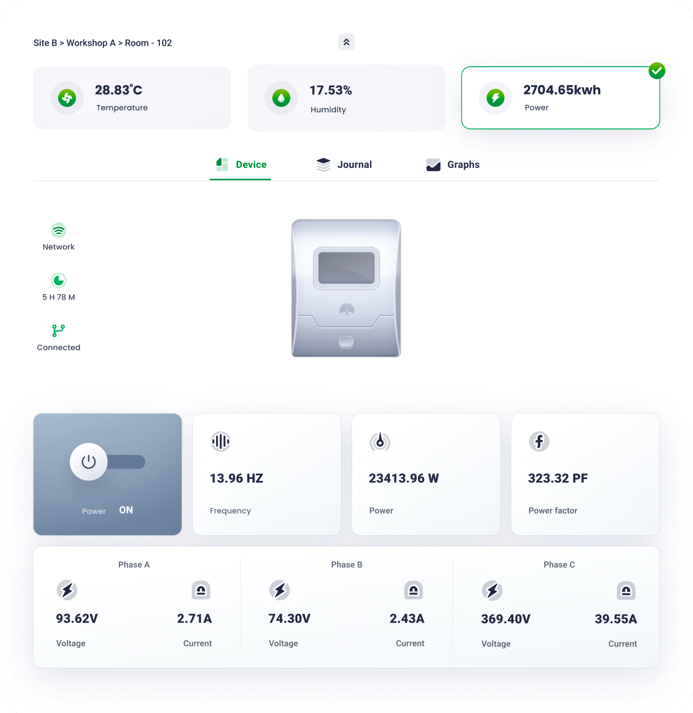
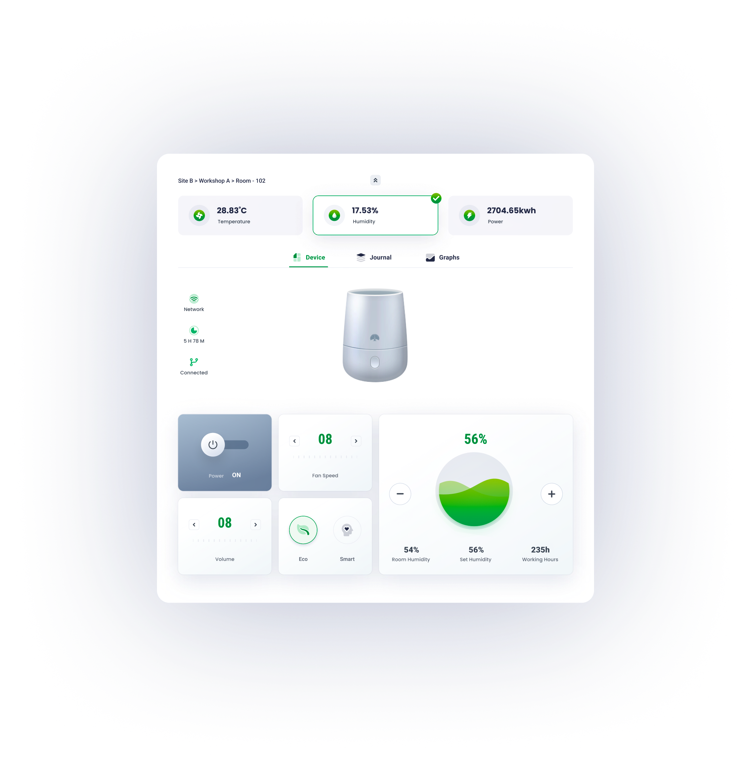
Due to hierarchy optimization and flat navigation, the site page divides a user's lengthy and difficult activity into a series of simple tasks that can be accomplished with minimal effort, resulting in a seamless and consistent user experience.


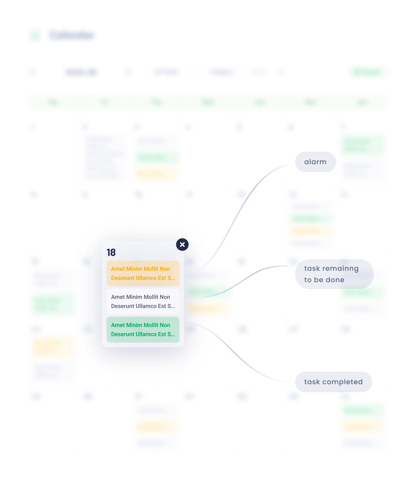
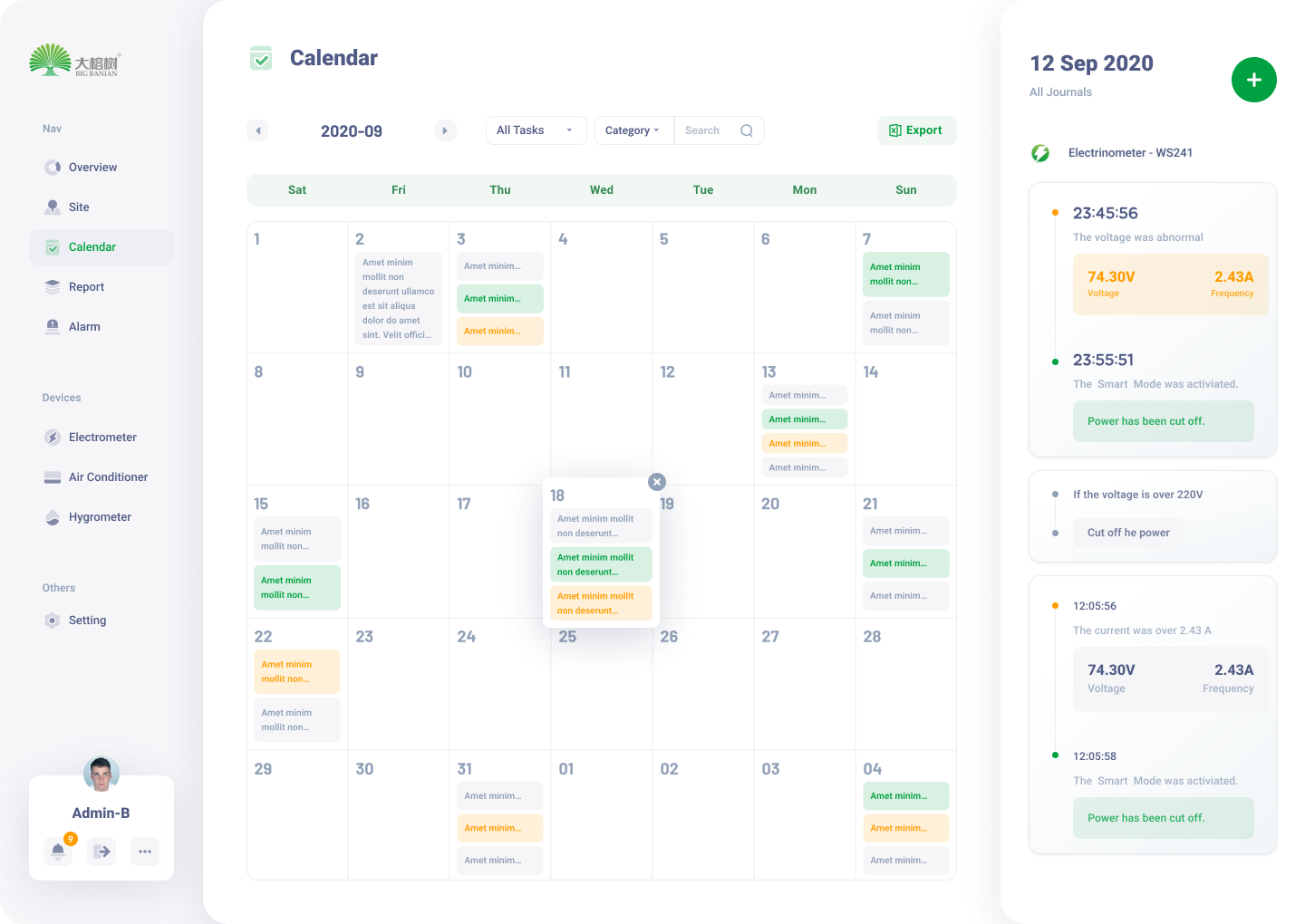
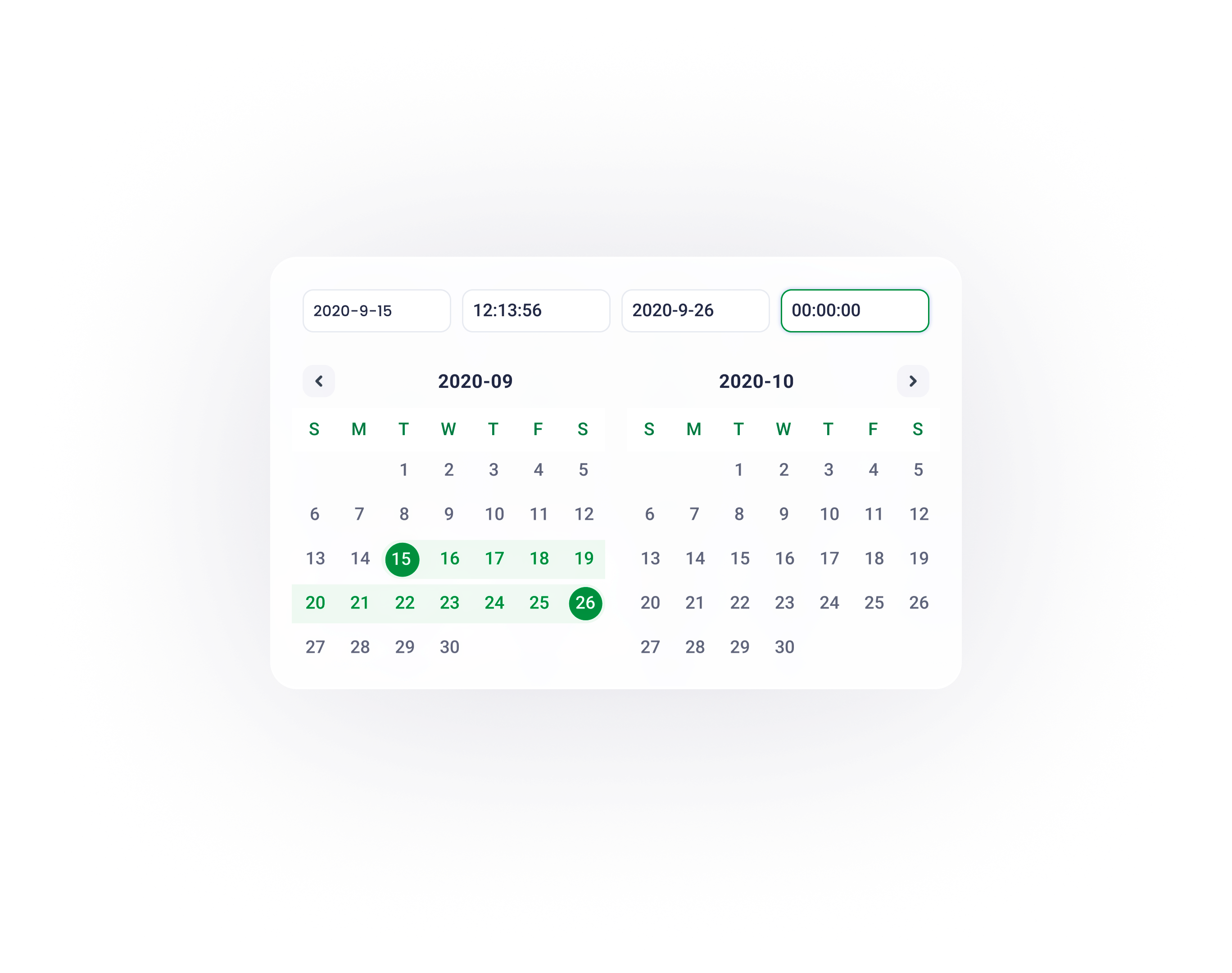
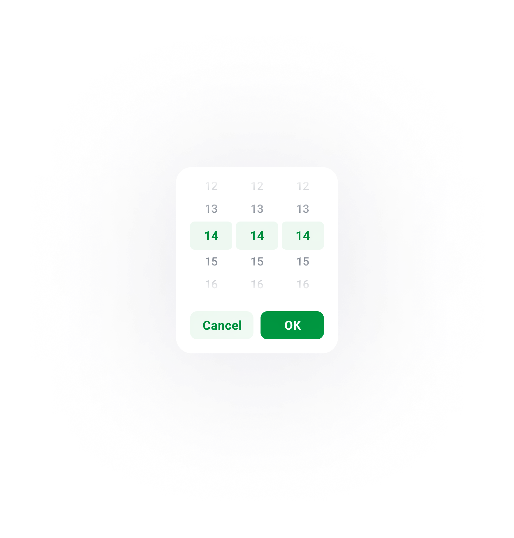
The calendar page serves as a hub of all devices’ operation journals and schedules.
08

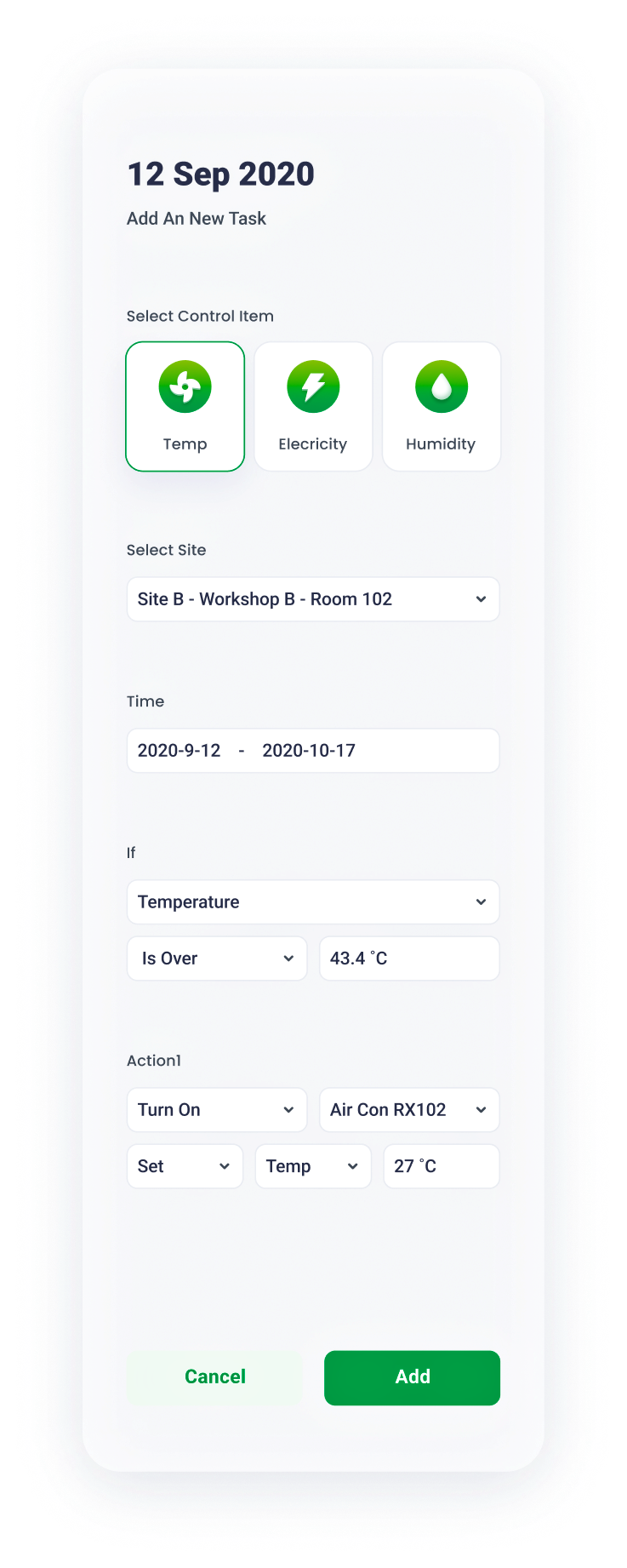
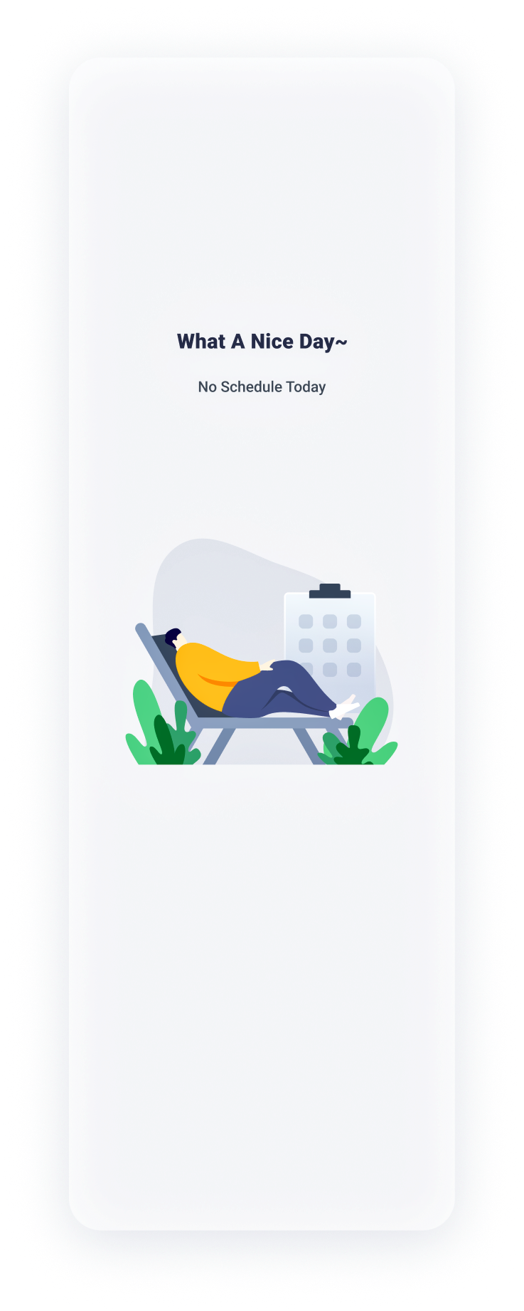
Calendar Page
09
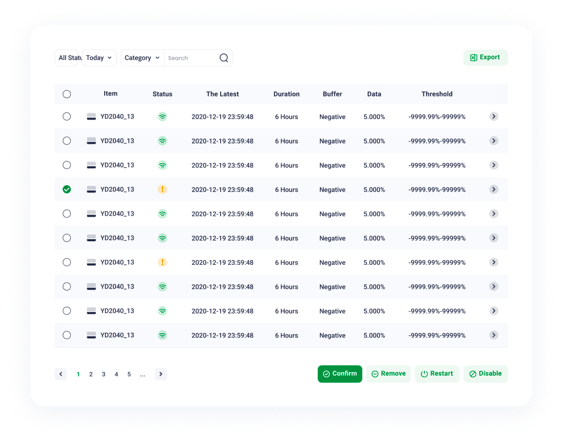
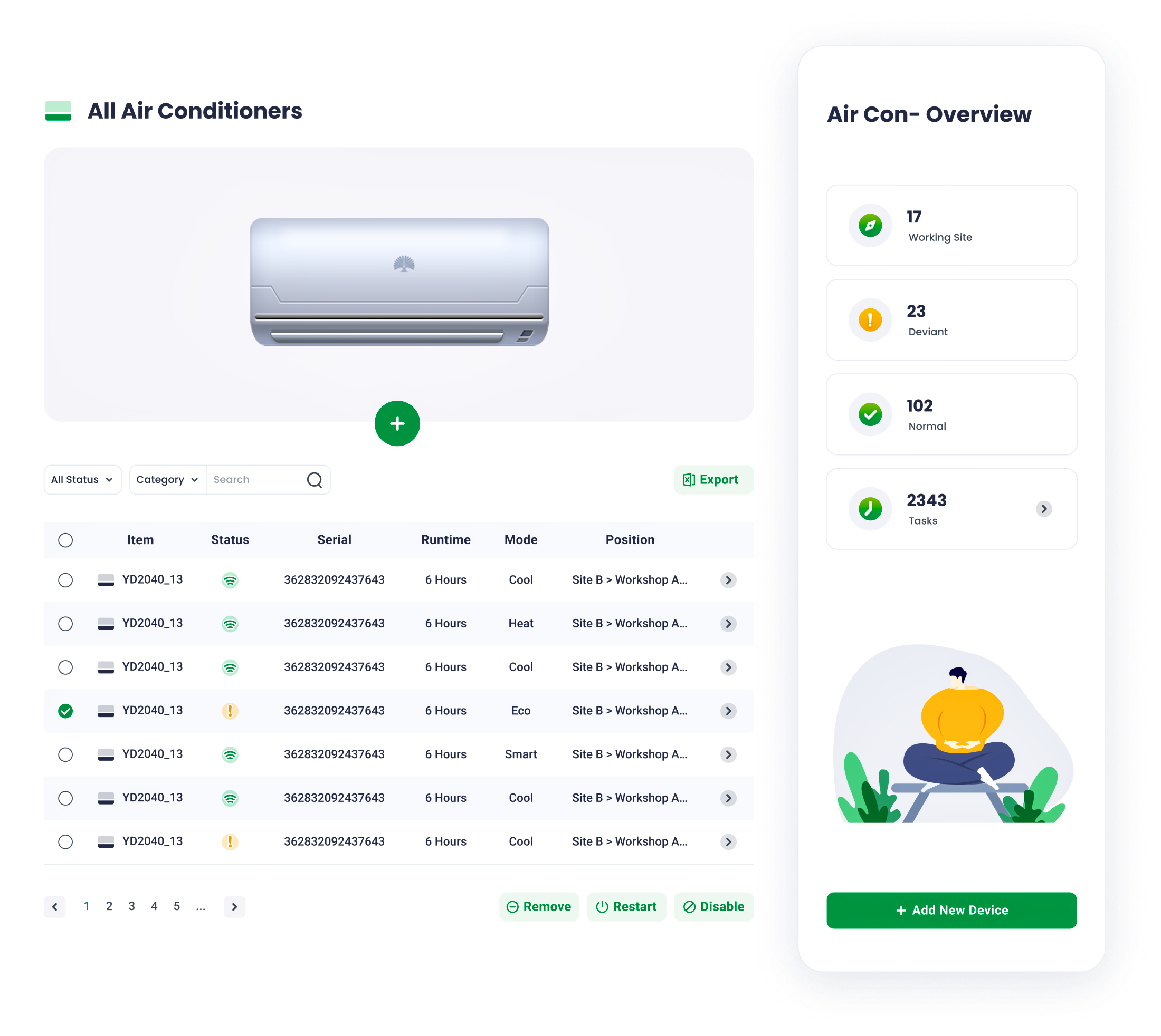
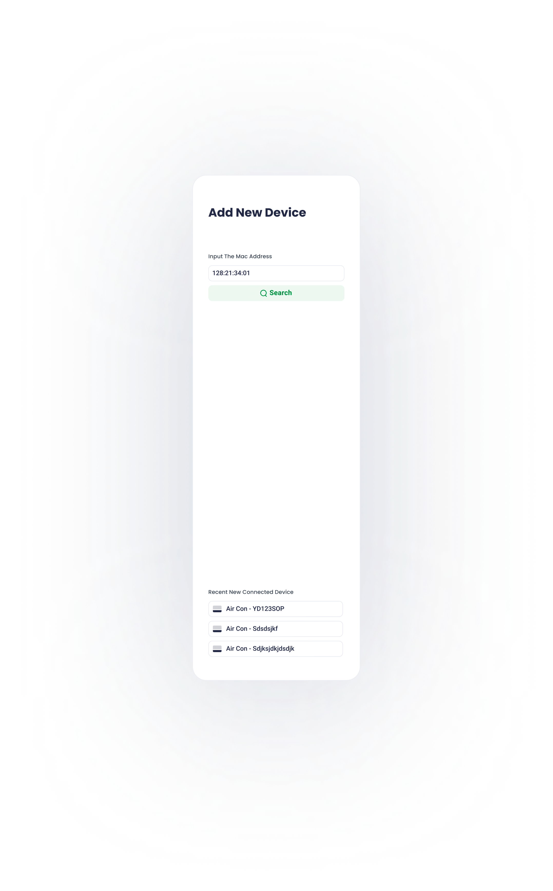
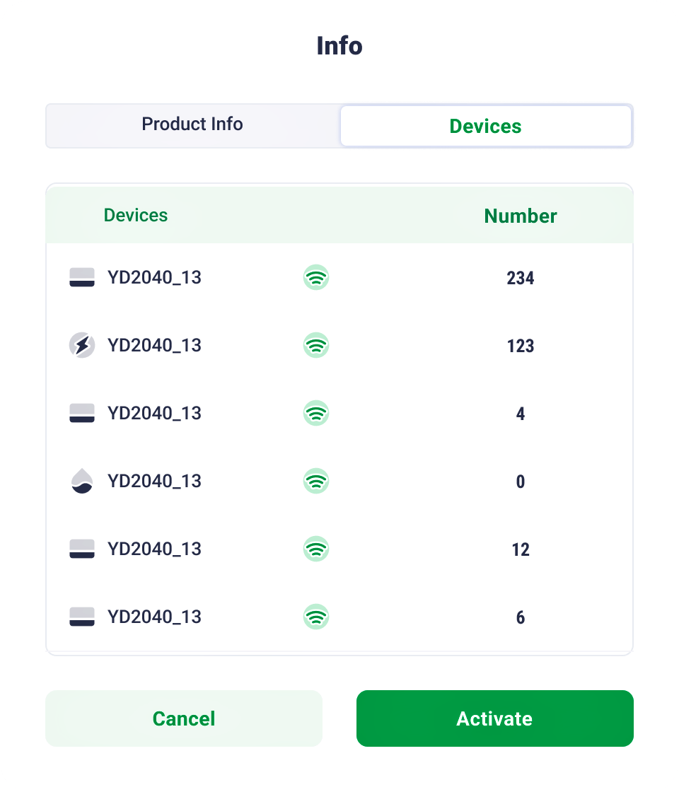
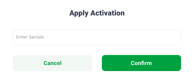
Devie configuration, installation, and status checking are all as simple as a click.
Device Management
10
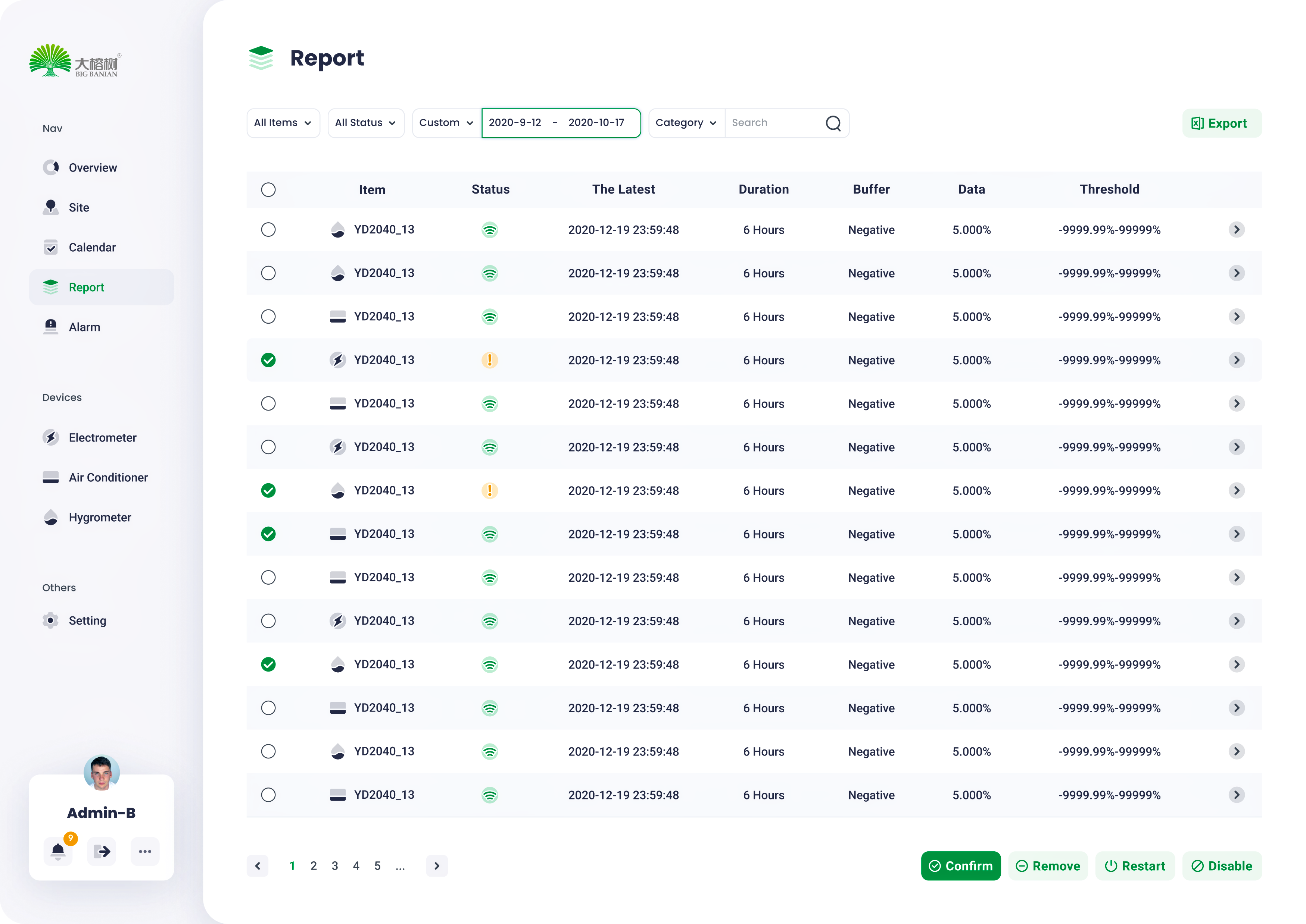
Report
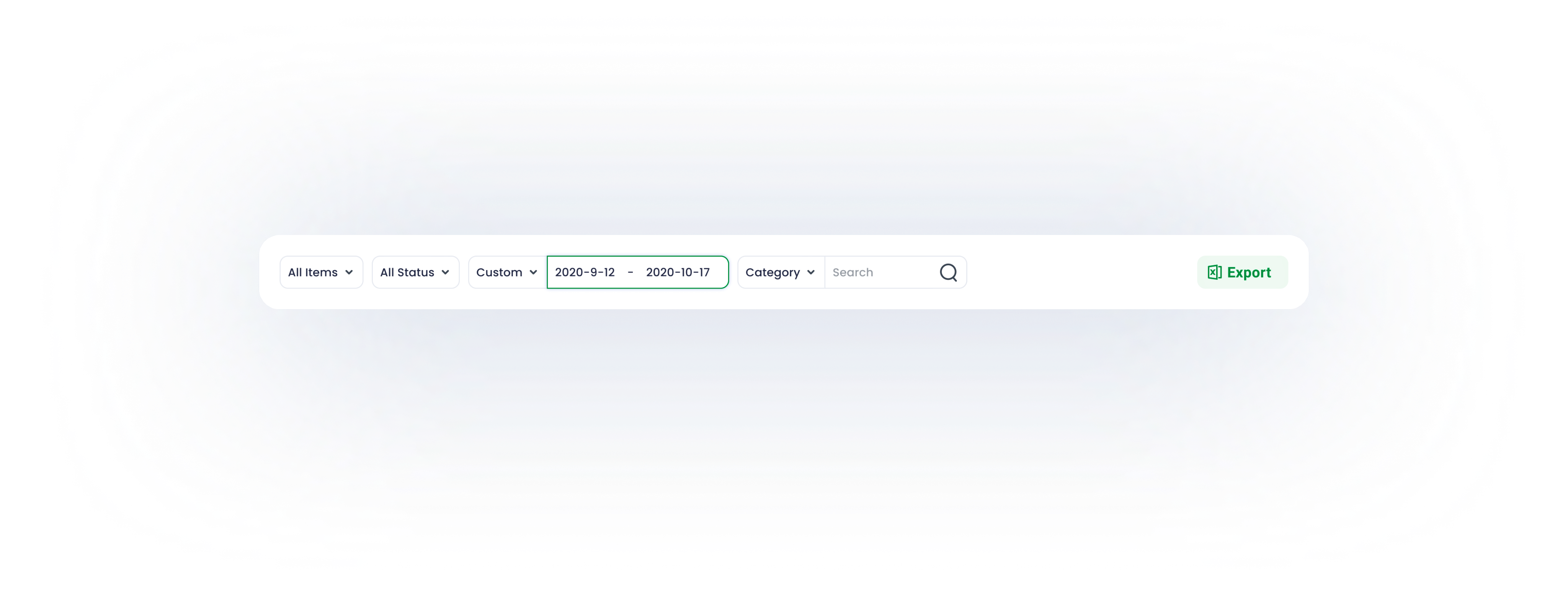
Top level filter enables users to obtain data basing on their requirements
11


Due to the modular design method, the login page fits all screen sizes.
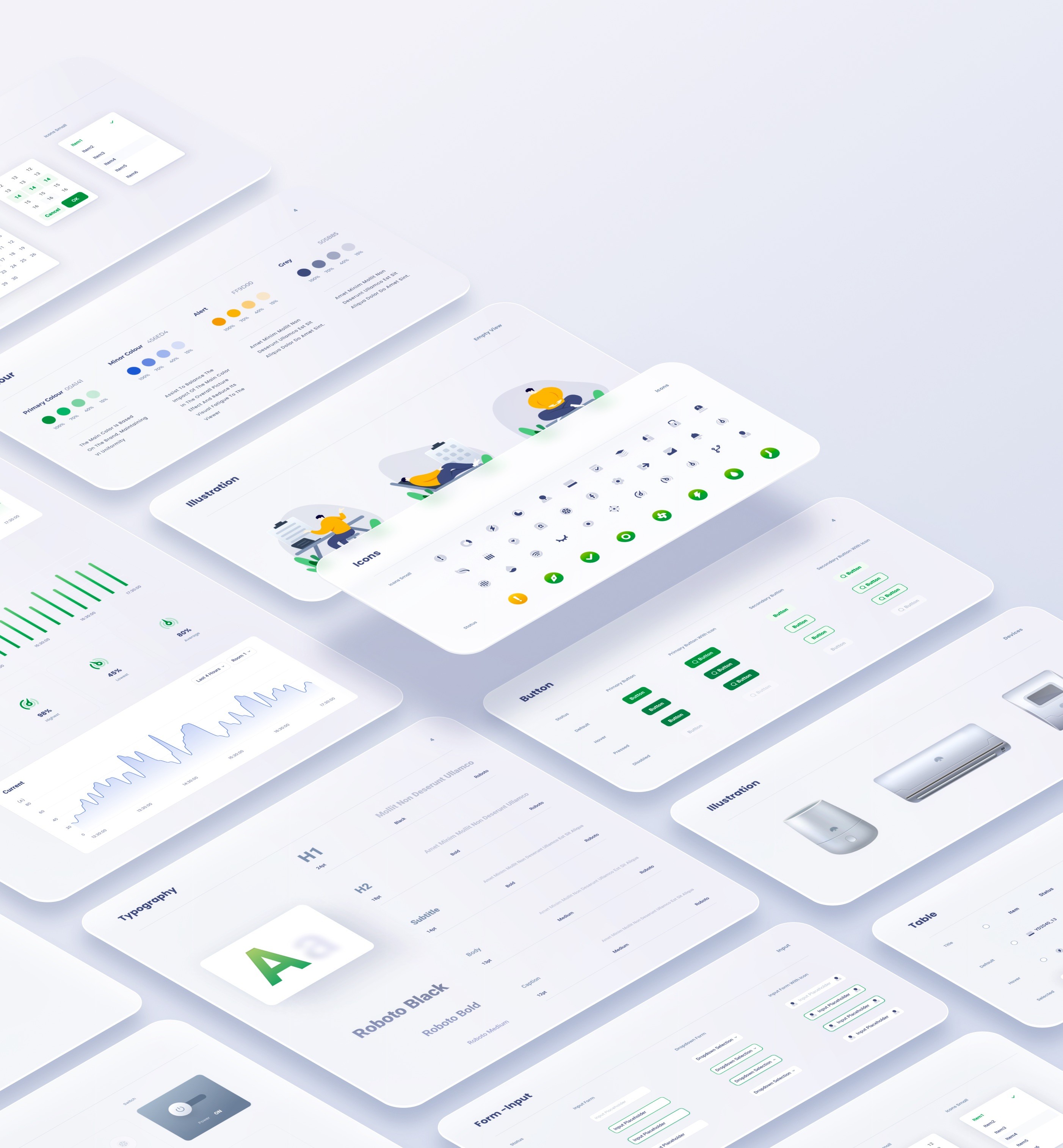
Design systems are made of many components, patterns, styles, and guidelines, which can help operationalize and optimize your design efforts.
12


big banyan -EPMS design
Project
uI / UX Designer
My Role
August 2022
time
site b
site b
site b


site a
site b
site b
site b
site b
site b
site b
site b


site a
site b

health
site b
workplace 1
work place 2
workplace 3

room 1
room 2
room 3

electricity
temperature
humid

device
graph
journals

control
status
filter
graph
key data
filter
table
overview
reports
site management
alarm
device
profile

site b
site b


Solution
在对监控后端的信息架构进行全面梳理后,出现了若干难点
Problems
因首页使用频率极高且需简化结构,我们重点对其信息架构进行梳理与优化。
Information Architecture
由于信息层级模糊,用户无法区分可调整选项与监控数据
由于信息层级过深,用户在浏览界面时遇到了困难
监控后端需要定制化。因此,在整个设计过程中,必须考虑站点、监控对象及设备的可扩展性。
what is the project?
Big Banyan是一款面向工厂、设备机房及所有需要稳定运行环境的工作场所的环境监控与控制系统。
该完整系统由设备集群、服务器与监控后端共同构成 —— 即环境与电力监控系统(EPMS)。本项目聚焦于监控后端(EPMS)的设计,旨在提升数据处理效率。
在物理世界中,物体可以被堆叠或挂载,且人类倾向于与最近的物体进行交互。基于此项行为研究,EPMS 的内容将沿着 Z 轴 并根据用户任务的紧急程度进行组织。


按信息层级组织内容 —— 层级越高偏向右,层级越低偏向左
X axis
y axis
按信息层级组织内容 —— 层级越高越靠下,层级越低越靠上
01
Z axis
Z 轴代表UI元素的视觉深度
task processing area
Including details of a journal, transient task and control panel.
major information browsing area
Including journals, graphs and overview of all key data.
navigation
The navigation works as the first step for users to start a task
基于用户行为研究,EPMS 内容被划分为三个部分
导航区
主要视图区
任务处理区
Hierarchy Optimization
设计导航时,核心原则是以最低限度的挫败感引导用户抵达目的地。从理论上讲,这意味着降低用户负荷(包含认知负荷、视觉负荷和动作负荷)。本次导航设计的主要目标是降低视觉负载。
02

03
02
01
depth of information
fixed sidebar
The fixed sidebar facilitates users’ navigation between different sites.

传统树状结构导航
在对该项目初稿进行调研后,我们发现站点页面的侧边栏采用了传统树状结构导航。
其主要优势在于该导航方式能在有限空间内容纳大量选项;然而,过多未展开的标签页导致了导航困难。
优化型扁平化导航
为了降低视觉负载,整个导航被划分为若干垂直分布的模块。根据渐进式披露原则,仅当用户滚动到该区域时才显示相关信息。因此,将这项冗长复杂的任务拆解为一系列简单任务来完成。
usability

depth of information

01
02
03
04
05

before

optimized


The usability shrinks as navigation hierarchy increases

The usability remains stable as navigation hierarchy increases
NavigationDesign
模块化设计是指将一个设计拆解为若干小单元(模块),分别创建这些模块,而后再将它们组合成一个更大的系统。
得益于其模块化特性,系统中的各个部件可以被替换、添加、移除或重新排列。这对用户而言非常有益,因为他们能够根据自身需求定制该系统。
03
Modular for responsive design
Section指的是基于功能逻辑、由组织有序的模块所构成的集合。例如,某一设备的控制板块包含了设备状态信息、模式选择等内容。
此处的页面,是根据用户任务需求,将各个功能板块排列组合而成的最终呈现。
此处的模块指的是最小的功能单元,包括开关、控制单元、状态块等
At mobile view, the nav will be folded , only appearing when triggering the hamburger icon. The task section will be seperated into an independent page.
desktop
tablet
mobile
当屏幕宽度受限时,可通过改变模块的排列方式或它们沿 Z 轴的位置来实现动态布局
At desktop view, all sections can be tiled along the x axis.
At tablet view, task section is transient and emergs only when triggered
ModularDesign


Typography is critical in establishing hierarchy ,and it requires readability on all conditions.


H1
24pt
black
Roboto
H2
18pt
Bold
roboto
subtitle
14pt
Bold
roboto
Body
13pt
medium
roboto
Caption
12pt
medium
roboto

secondary colour
456ED4
100%
70%
40%
15%
On the colour wheel, the minor colour is chosen at a 90-degree angle from the major colour. This method adds a bit more dyanmic without losing elegance.
alert
FF9D00
100%
70%
40%
15%
Alert colour for alarms and errors
grey
505B85
100%
70%
40%
15%
The grey and its variants is utilised in font for expressing hierarchy.
Primary colour
00A141
100%
70%
40%
15%
The parimary colour and its variants derive from the brand idenity.
Overview
06
Via Modular design , a series of standardized charts and graphs can be rearranged and combined according to the customer’s requirements.
07
site
management
Device
Remote control panel mimics the physical one, for a better affordance and user-friendly experience.


journal
Working journals are well-organized and straightforward.


graphs
Well-designed graphs inform users of the data fluctuations over time , minimalist and data-oriented.


Due to hierarchy optimization and flat navigation, the site page divides a user's lengthy and difficult activity into a series of simple tasks that can be accomplished with minimal effort, resulting in a seamless and consistent user experience.


The calendar page serves as a hub of all devices’ operation journals and schedules.
08

Calendar Page
09
Devie configuration, installation, and status checking are all as simple as a click.
Device Management
10
Report
Top level filter enables users to obtain data basing on their requirements
11

Due to the modular design method, the login page fits all screen sizes.
Design systems are made of many components, patterns, styles, and guidelines, which can help operationalize and optimize your design efforts.
12


big banyan -EPMS design
Project
uI / UX Designer
My Role
August 2022
time
site b
site b
site b


site a
site b
site b
site b
site b
site b
site b
site b


site a
site b

health
site b
workplace 1
work place 2
workplace 3

room 1
room 2
room 3


electricity
temperature
humid


device
graph
journals

control
status
filter
graph
key data
filter
table
overview
reports
site management
alarm
device
profile

site b
site b


Solution
Problems
在对监控后端的信息架构进行全面梳理后,出现了若干难点
Information Architecture
因首页使用频率极高且需简化结构,我们重点对其信息架构进行梳理与优化。
由于信息层级模糊,用户无法区分可调整选项与监控数据
由于信息层级过深,用户在浏览界面时遇到了困难
监控后端需要定制化。因此,在整个设计过程中,必须考虑站点、监控对象及设备的可扩展性。
what is the project?
Big Banyan是一款面向工厂、设备机房及所有需要稳定运行环境的工作场所的环境监控与控制系统。
该完整系统由设备集群、服务器与监控后端共同构成 —— 即环境与电力监控系统(EPMS)。本项目聚焦于监控后端(EPMS)的设计,旨在提升数据处理效率。
在物理世界中,物体可以被堆叠或挂载,且人类倾向于与最近的物体进行交互。基于此项行为研究,EPMS 的内容将沿着 Z 轴 并根据用户任务的紧急程度进行组织。


按信息层级组织内容 —— 层级越高偏向右,层级越低偏向左
X axis
y axis
按信息层级组织内容 —— 层级越高越靠下,层级越低越靠上
01
Z axis
Z 轴代表UI元素的视觉深度
task processing area
Including details of a journal, transient task and control panel.
major information browsing area
Including journals, graphs and overview of all key data.
navigation
The navigation works as the first step for users to start a task
基于用户行为研究,EPMS 内容被划分为三个部分
导航区
主要视图区
任务处理区
Hierarchy Optimization
设计导航时,核心原则是以最低限度的挫败感引导用户抵达目的地。从理论上讲,这意味着降低用户负荷(包含认知负荷、视觉负荷和动作负荷)。本次导航设计的主要目标是降低视觉负载。
02

01
03
02
depth of information
fixed sidebar
The fixed sidebar facilitates users’ navigation between different sites.

传统树状结构导航
在对该项目初稿进行调研后,我们发现站点页面的侧边栏采用了传统树状结构导航。
其主要优势在于该导航方式能在有限空间内容纳大量选项;然而,过多未展开的标签页导致了导航困难。
优化型扁平化导航
为了降低视觉负载,整个导航被划分为若干垂直分布的模块。根据渐进式披露原则,仅当用户滚动到该区域时才显示相关信息。因此,将这项冗长复杂的任务拆解为一系列简单任务来完成。
usability

depth of information

01
02
03
04
05

before

optimized


The usability shrinks as navigation hierarchy increases

The usability remains stable as navigation hierarchy increases
NavigationDesign
模块化设计是指将一个设计拆解为若干小单元(模块),分别创建这些模块,而后再将它们组合成一个更大的系统。
得益于其模块化特性,系统中的各个部件可以被替换、添加、移除或重新排列。这对用户而言非常有益,因为他们能够根据自身需求定制该系统。
03
Modular for responsive design
此处的模块指的是最小的功能单元,包括开关、控制单元、状态块等
Section指的是基于功能逻辑、由组织有序的模块所构成的集合。例如,某一设备的控制板块包含了设备状态信息、模式选择等内容。
此处的页面,是根据用户任务需求,将各个功能板块排列组合而成的最终呈现。
At mobile view, the nav will be folded , only appearing when triggering the hamburger icon. The task section will be seperated into an independent page.
当屏幕宽度受限时,可通过改变模块的排列方式或它们沿 Z 轴的位置来实现动态布局
desktop
tablet
mobile
At desktop view, all sections can be tiled along the x axis.
At tablet view, task section is transient and emergs only when triggered
ModularDesign

Typography is critical in establishing hierarchy ,and it requires readability on all conditions.


H1
24pt
black
Roboto
H2
18pt
Bold
roboto
subtitle
14pt
Bold
roboto
Body
13pt
medium
roboto
Caption
12pt
medium
roboto

secondary colour
456ED4
100%
70%
40%
15%
On the colour wheel, the minor colour is chosen at a 90-degree angle from the major colour. This method adds a bit more dyanmic without losing elegance.
alert
FF9D00
100%
70%
40%
15%
Alert colour for alarms and errors
grey
505B85
100%
70%
40%
15%
The grey and its variants is utilised in font for expressing hierarchy.
Primary colour
00A141
100%
70%
40%
15%
The parimary colour and its variants derive from the brand idenity.
Overview
06
Via Modular design , a series of standardized charts and graphs can be rearranged and combined according to the customer’s requirements.
07
site
management
Device
Remote control panel mimics the physical one, for a better affordance and user-friendly experience.


journal
Working journals are well-organized and straightforward.


graphs
Well-designed graphs inform users of the data fluctuations over time , minimalist and data-oriented.


Due to hierarchy optimization and flat navigation, the site page divides a user's lengthy and difficult activity into a series of simple tasks that can be accomplished with minimal effort, resulting in a seamless and consistent user experience.


The calendar page serves as a hub of all devices’ operation journals and schedules.
08

Calendar Page
09
Devie configuration, installation, and status checking are all as simple as a click.
Device Management
10
Report
Top level filter enables users to obtain data basing on their requirements
11

Due to the modular design method, the login page fits all screen sizes.
Design systems are made of many components, patterns, styles, and guidelines, which can help operationalize and optimize your design efforts.
12
